Final feedback and amendments

Screen Shot 2018-02-06 at 12.09.32

Here is our final feedback from our tutor Based on what we had a few posts ago. The reason to these changes are as followed:

  • Change the title as it may confuse the audience, you should keep it looking as dar as possible and not include any light elements within this poster.Screen Shot 2018-02-06 at 11.53.51
  • Reduce the amount of information within both posters as you want the image to do most the talking and if there is confusion then the viewers will look to the fact sheet. Change the hierarchy too of the layout just to experiment a little more.

    Doing this really did favour us and I feel that it works effectively and was incredibly good advice.

  • Change all profits to just profits as that we are unsure on the fact that all profits go to distant executives but do know that some profit goes to them. Screenshots above show evidence of the change.
  • Stress a little more on the local economy in the light poster, doing so reinforces the message that we are trying to send out and reduces potential confusion from the audience.Screen Shot 2018-02-06 at 12.08.17
  • Do not pixelate the Starbucks logo as people may think that it is a slip up in the design or it is a mistake. I was against this opinion but realised that our tutor is also our audience/ client so we should construct on the feedback given no matter what our opinion means. I understood where she was coming from so we chose to make the change. Screenshots from above show the change.

It was also mentioned that we should have a title panel for the display. This is to reduce confusion as people may find the display being two separate displays even if the styles do match.

This feedback has strongly helped us and I feel that it was crucial to get towards the end of the brief. Constant feedback is always needed and is key for professional practise. Next I will be showing photos of the display if ours goes up and also the PDF files.

Bringing in the light side

Along with our fact sheet about the good points on going local we needed to have a poster in a similar style as the current one but showing the good side of our message we are trying to send out. So I got our guy from HND 2 to get us a photo of a local coffee takeaway cup. There was an issue though, the cups from the local shop didn’t have a distinct logo on it so I had to solve this issue in photoshop.

The poster was to be based on a white background to signify the good side of the campaign and let people know that it was the light side of resolving the issue. Below is the final photo that was chosen to use in our final. As a group we were all happy with this.

clean coffee cup

I managed to get on to Beyond the Grounds website and obtained myself a good quality PNG of their logo which then I image traced and expanded for full control on changing the colours and sizing.

I touched up areas of the photo to make the background look not so smudgy like and this resulted in the cup standing out even more. Below is me experimenting with different sizes of the logo and placement of the logo to make it look as realistic as possible. This process was executed by using free transform, mainly the warp tool.

Next I shall add similar to the other poster a message at the bottom of the cup to show that buying at a local coffee shop helps the local community.

Screenshot 2018-02-05 13.31.59

Here I kept the colours strictly the same as the logo to match with the brand elements. I did this because it builds on consistency, also it backs up the point of our hashtag meaning.

Now before editing this further in illustrator I wanted to get one last bit of feedback from our lecturer to just make sure we were going in the right direction. I will be doing a separate blog post on this next.


Good information about going local

As our lecturer had told us in our feedback email and feedback form we were to create some what of a lighter side of the issue, she mentioned that we done a good job of portraying the issue though it was too dark. We should have made it a series of 2 posters and I did mention this before our test displays but we simply ran out of time.

Now was our time to create the other half of our display being “the light side”. In order to do so though we had to research fairly heavily into what good could come out of going local and facts about how going local is better for an individual anyway.

As a group we found the following facts key to use in our display. I have portrayed it in a similar way as I have with the other fact sheet (the current one) and have made it look very light giving it a very positive feel. I did this because I wanted the audience to know that it is not all doom and gloom and once they change it will be for a brighter and better future.

Screenshot 2018-02-02 19.15.47

So to match the consistency of the design from the current factsheet I had come up with this, matching the colours more to the logo to link it to being a good thing in general and being the main point.

The photo was also taken from a local coffee shop to show a very homely and sentimental view of how local coffee shops have a much easier atmosphere about them.

Next I will be asking our guy from HND 2 to take a similar photo as to the one from the first poster but instead being a coffee cup from the local coffee shop, I will then take it and go in to creating our next and potential final piece of the display.

Big changes to the main poster

First thing’s first was to strongly lean the poster towards the issue of big branded coffee shops not supporting the local economy with their profits. To back this up in the image I thought it would be necessary to have a quote written into the cup saying that all profits go to distant executives. Doing this helps guide the audience into the issue we are actually wanting to send and not the message about child slavery.

Screenshot 2018-02-02 17.29.55

I made the text blend into the picture as if it was actually printed on the cup, to do so I used blending tools on Adobe photoshop. I wanted to make the message look a little sinister too so I made the colour red to make it look bad just like the rest of the text within the picture. This is because… CONSISTENCY! The font is different to the campaign font because I wanted it to match the style of Starbucks.

Next was to change the actual message at the bottom to not only stop pointing fingers but to match the issue that we got given for our brief being local economy. What we were sending out wasn’t clear enough to match with the issue we got given and I feel we were just using the old fact as a weapon as such to blind the audience with radical facts.

So to match the rest of the poster we thought we’d take a fact from our current fact sheet being the following message in the image below.

Screenshot 2018-02-03 12.33.17

We changed it to this because it matched with what the photo was portraying and matched more with the brief. The child slavery thing had to get scrapped because it was just too much on the issue, it was almost a completely different issue that got put on top of the one we were trying to send. Keeping the style though from the old sentence with parts of it being highlighted helped push parts of the fact out to draw attention.

We also got rid of the hand prints because they were signifying the child slavery fact. We were thinking of getting rid of the pennies within the coffee beans but instead I thought that we could in fact change the meaning to them. Therefore the pennies now signify the local businesses only getting pennies worth of profit because of the existence of giants such as Starbucks that stomp on them.

From the good feedback provided to us from our audience we found that it was a huge must to kind of steer clear on pointing fingers at individuals so I came up with an idea on how we could resolve this issue. Instead of having a cross through the logo of the coffee cup I thought it would be great to censor the logo out – making it blur but leaving it still slightly obvious to who it were. I did this because it confused the audience on trying to figure out what we were trying to get at. This process was preformed on photoshop and I thought the outcome was wicked because it matched with the emotion of the poster.

Screenshot 2018-02-02 17.49.11Screenshot 2018-02-02 18.01.11

to conclude this problem solving I feel that the poster looks a hell of a lot more neater and without the hand prints the white space works very well to make the main part of the photo stand out (being the cup). Lastly I’d like to just point out that the text just didn’t go in my opinion, I felt that having it bold and italic just worked better. I know people disagreed with me but I wasn’t a fan of the new font choice so I changed it back. Below is the final look after the go ahead from the group!

Screenshot 2018-02-05 17.48.47


Critical analysis of feedback on the display

IMG_2024

Here I will be looking at our feedback and look for some constructive feedback. Overall I thought that we actually did pretty well with how much feedback we actually got, considering I didn’t see many people go to our display. I’m also happy with the fact that the feedback we got from such a simple question was so constructive, we got told as a group that we should add more questions but after the “show” I feel that we didn’t.

Most our feedback was good and there was a pattern that people understood it and in fact said that they’d go local which is fantastic. However there were a few comments such as “I like my Starbucksness” showing that they were not willing to go local.

This project is similar to my other APP project being the mass shooting piece and I feel that I can bring my research from the psychological part of it being how could I go on to change someones opinion, to make them give something up. So I looked back at this screenshot from my APP slideshow to refresh my mind.

slide-4

After critically analysing our constructive feedback I came to realisation that some of the points above wouldn’t make much sense with how we’d resolve the confusion of our poster, but some points may help! Below is the constructive feedback and I will discuss how we as a group analysed it.

IMG_2019

From this feedback we can see that the poster has worked enough to change their opinion on going local but they tell us that the information is not portrayed perfectly as that the info sheet wasn’t near to our poster in this display. From this we must place the info sheet and poster more together showing that they are more of a joint piece and possibly have the info sheet standing out as much as the poster.

IMG_2020

Similar to the previous bit of feed back this made the individual change their mind on going local. Instead of being lost with the information instead the individual was confused on the display of the coffee beans and the burnt cups within the pile. They then later on understood why. For our final display I feel that we will not be able to have the coffee beans laying around as that there will be no one to man the display where ever it would be. An idea of mine would be to maybe put the beans in a frame kind of thing but I’m just brainstorming there.

IMG_2021

Here’s a great piece of feedback and that is to say that we should not so much only focus on the dark side of the matter but also look at the bright side. We should give the audience the vision of the side that will show what would happen if the individual did go local. We should show the benefits of going local and show the good side of the matter being the solution to a better economy.

IMG_2022

Here we another good piece of constructive feedback that tells us that the individual feels that the display is trying to single out Starbucks as an individual and slate them massively. This is not the message we’re trying to convey and we’re more focusing on the problem of the local economy being so poor. This is telling us also that there are too many messages being present in our display and we need to dim it down just a little and put it more to the point. We’re going to consider another take on the poster and most probably will change a lot of it, this will happen in the next couple of days.

IMG_2023

Similar to the last bit of feedback, the individual is looking at the wrong kind of message portrayed in our piece and the information we have about local coffee shops are pretty low at the moment. I feel that we should have looked more into the facts about local coffee shops seeing if they pay well to their suppliers or if their suppliers are fairly local OR EVEN if they would eventually consider paying more to their suppliers the more popular they get and to do so some other piece of the campaign needs to come in to play.

So during the display day I heard a lot of people talk about how they like Starbucks and Caffe Nero because of their loyalty points system. In result we could introduce a scheme known as the “GoLocal Loyalty Card”. We’d pitch this idea to all local coffee shops and they’d get a certificate to say that they are supported by our campaign and are a part of the GoLocal loyalty system.

I will wait and sit on this idea till I have discussed it with my group and will work on changing the poster and bringing in the light side element to the display. I will notify the group with changes and will evident this in my blogs to come.

To conclude my understanding of our audiences opinions I will now take it all into consideration and start to amend our current poster looking at changing elements and making our statement less broad.

The display + health and safety hazards

Right so the other day was the big day and we had a fair few things to do, well I say fair few, we only had to print two things off. We did the print in our University and used glossed paper for it because we wanted to be ethical and if we had used the likes of a matte sheet it would run the inks dry within the printer and also look shoddy. Below is the finishing piece on print of the poster and we were all pretty happy with this!

We also thought it would be an idea to display our piece on a light box to boost the effect of the handprints coming through the background.

Below is how our display looked and unfortunately the positioning was very poor in the end!

To be honest I was very disappointed in the location of our display but I found the layout was very well done as that the viewers would see from left to right thus giving them the information first to look at and then the actual poster and display to see after even though these two parts are the things that are meant to grab attention. Another good thing was that the smell of the coffee beans really drew attention to the display.

As shown in the photo below you will see that our display was not very accessible to our audience and I feel that if someone was to show up in a wheelchair they wouldn’t be able to see the display as that the table was just too high.

IMG_2004

Also as you can see in the picture above that people kept standing in front of our display which turned out to hide our display from plain site resulting in not getting much attention which I found so annoying and I kept telling people to move but then someone else would come along and obstruct the view.

We also took into consideration that the coffee beans could be seen as a choking hazard so we made sure we had at least one person to man the display at all times.

The table was very sturdy so we knew it wouldn’t jog about, we stuck the info sheet to the table to prevent people picking up and taking it. We also made sure there was enough space for people to lean on the table and write on.

The reason as to why we had to use this designated table was because we needed it to plug our light box frame and the only plug socket that was available was the one in the corner. Also the frame had to lean on something. In my opinion I would have sacrificed not using the light box and moved to a better location.

The display day went well and I feel we did get a fair few comments that would help us develop our campaign further. Like I said I was disappointed in the location and a little of the team work we put into it. But we’re humans and we learn from our mistakes, I will look upon them as a method of self teaching.


Polling design

As a group we decided on having something similar to a poll box to collect feedback from the audience. This was the first piece of design that we were going to make for the display so I had to make sure that there was a style of some what. Like I said in the previous blog I had already sent a piece out to get printed… well this is it. These were to be printed on business card sized to be convenient and to be able to fit into a poll box with ease. The question we want to ask the audience is simply “how did you feel with this display?”. We also wanted to see if our display worked in anyway so we wanted to put a simple yes/no question asking if they would now consider going local if they don’t already?

We felt that the size was perfect for these 2 questions and we are only after a small sentence on the feedback that we will possibly get to see for any potential patterns within the feedback.

Below is the back of the card being simple yet bold and sticking to the campaign identity of being white and orange on a coloured background considering that the photo that is being taken for the poster is going to be on a black backdrop.

Screenshot 2018-01-26 21.23.42

Keeping with the style of the campaign I chose to go with the same font for the questions only a little lighter to expand the choices for when it comes to the poster. The italics used in the text surprisingly work well and signifies going forward to a better future I feel. I like using italics to express words that act upon creating a greater future. The use of the dotted lines was to give guidance to the audience giving them the idea on how they should answer the question but still giving them freedom with what to write.

Screenshot 2018-01-26 21.24.33

Keeping the hashtag title consistent by putting it on the back also helps to drill it into the audiences mind, to make it stick to their minds as it is also such a easy saying. I did some test prints to make sure it was all in working order and that the spaces within the dotted lines were big enough to write in and they were. Below is the final outcome and the printers I ordered them from were fantastic with their express delivery with no extra charges!

IMG_1985

Next I will be looking at editing Nicks photo in photoshop just touching up a few areas here and there.

Starting to think DESIGN!

So as I had mentioned before, here I will be discussing about the decisions we made as a group and will be critically analysing our brainstorming and each of our individual skills so then I can kind of take control in the design process.

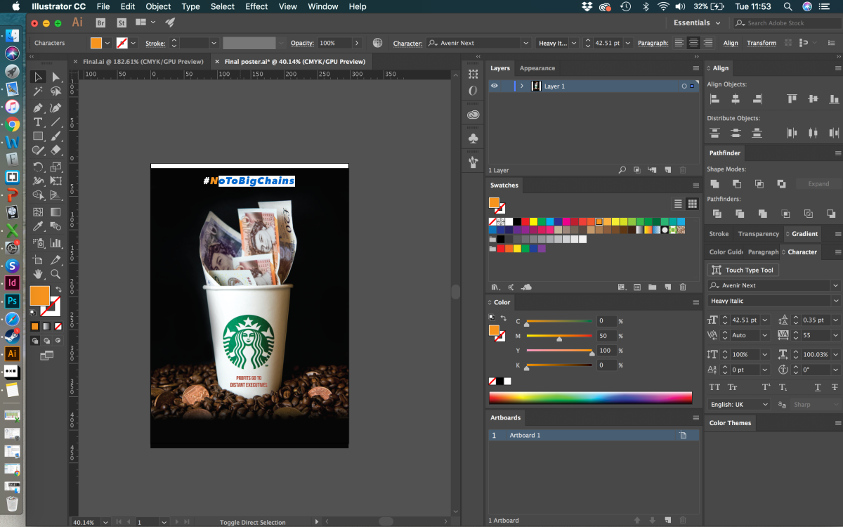
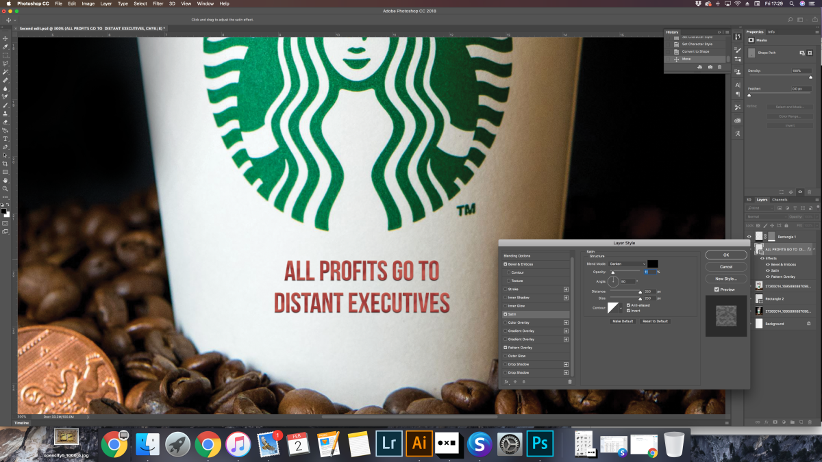
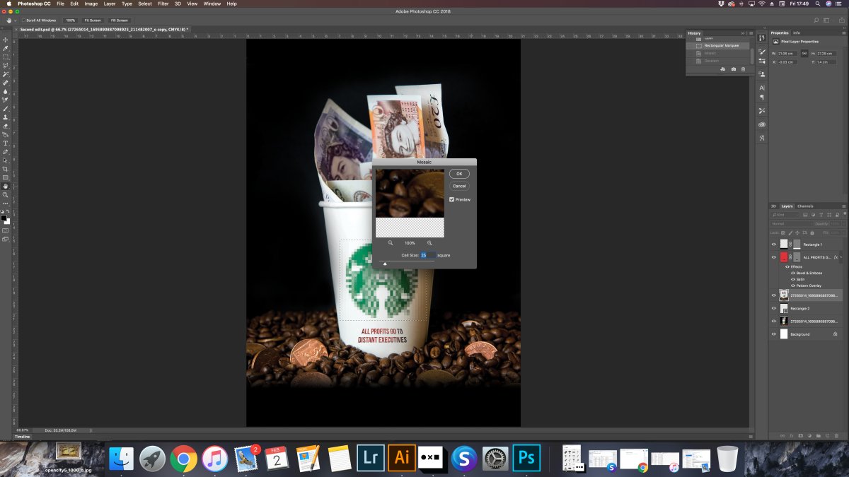
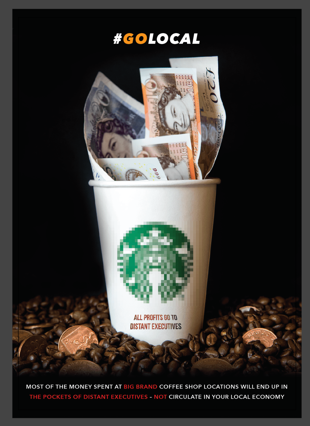
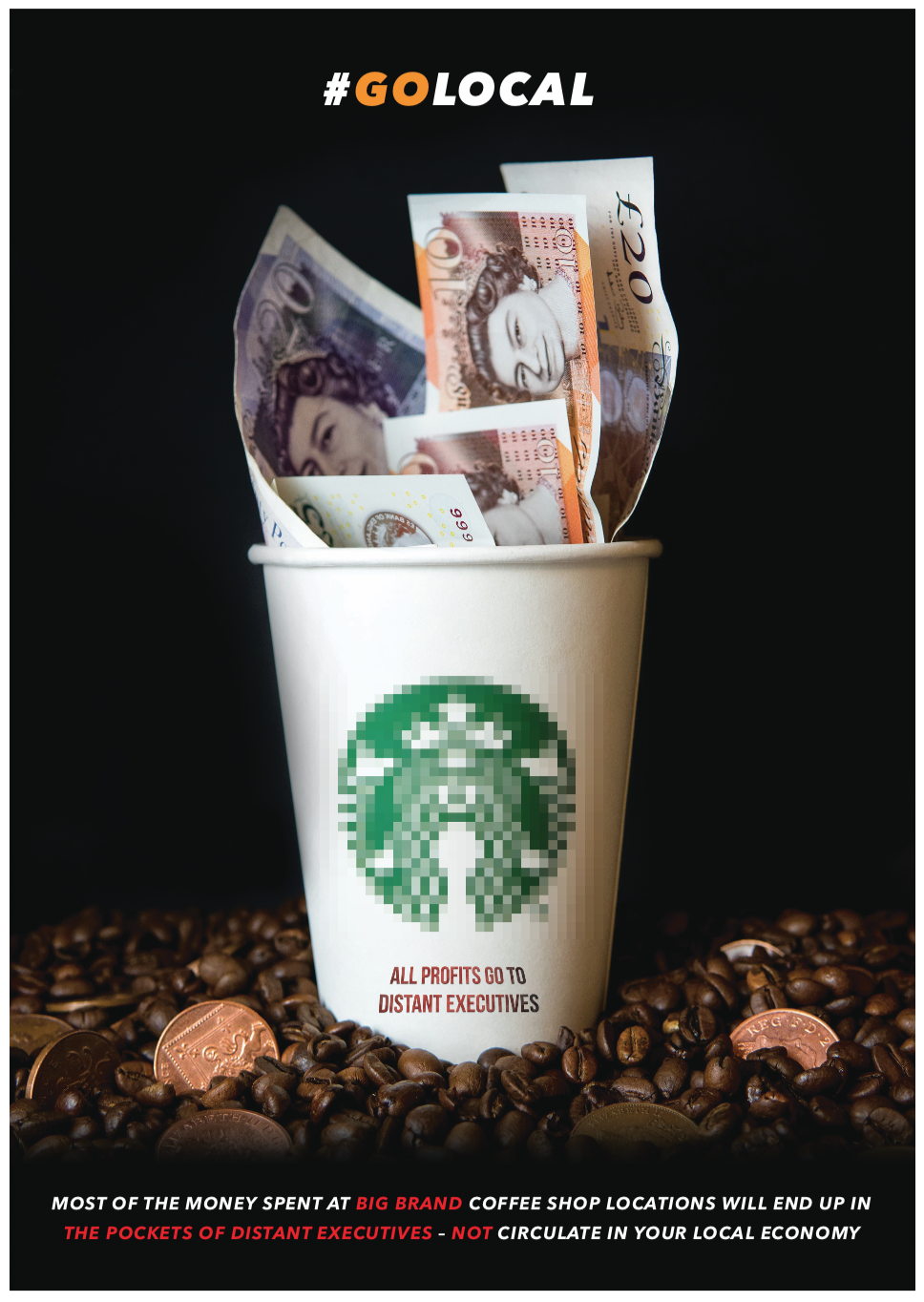
The idea was as followed, to include a photograph of a Starbucks/ Costa or whatever cup filled with notes and beneath a pile of coffee beans mixed with pennies to signify that they pay so little and charge extortionate prices for their beverages. This would be portrayed as an A3 poster we had decided, this is because it had to be a bold piece and included some detail within so it had to be printed large for clear understandment. We also discussed about including child hand prints in the background but very faintly to lean towards the fact that some companies use child slavery.

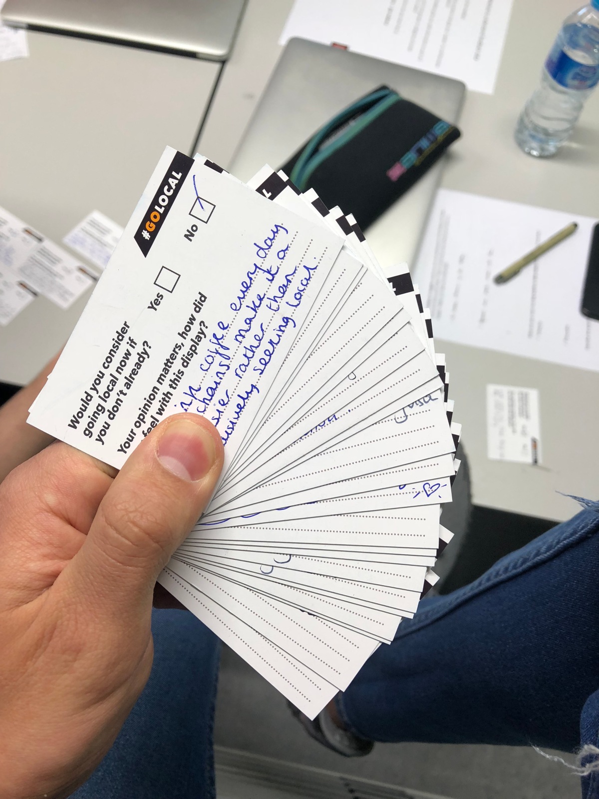
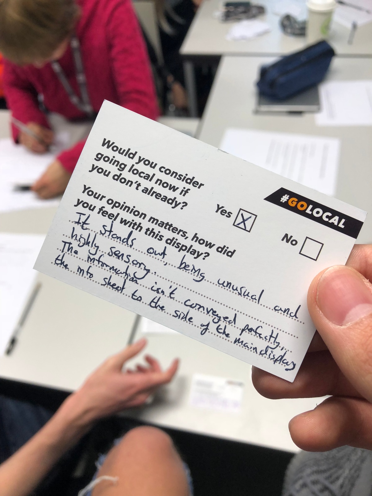
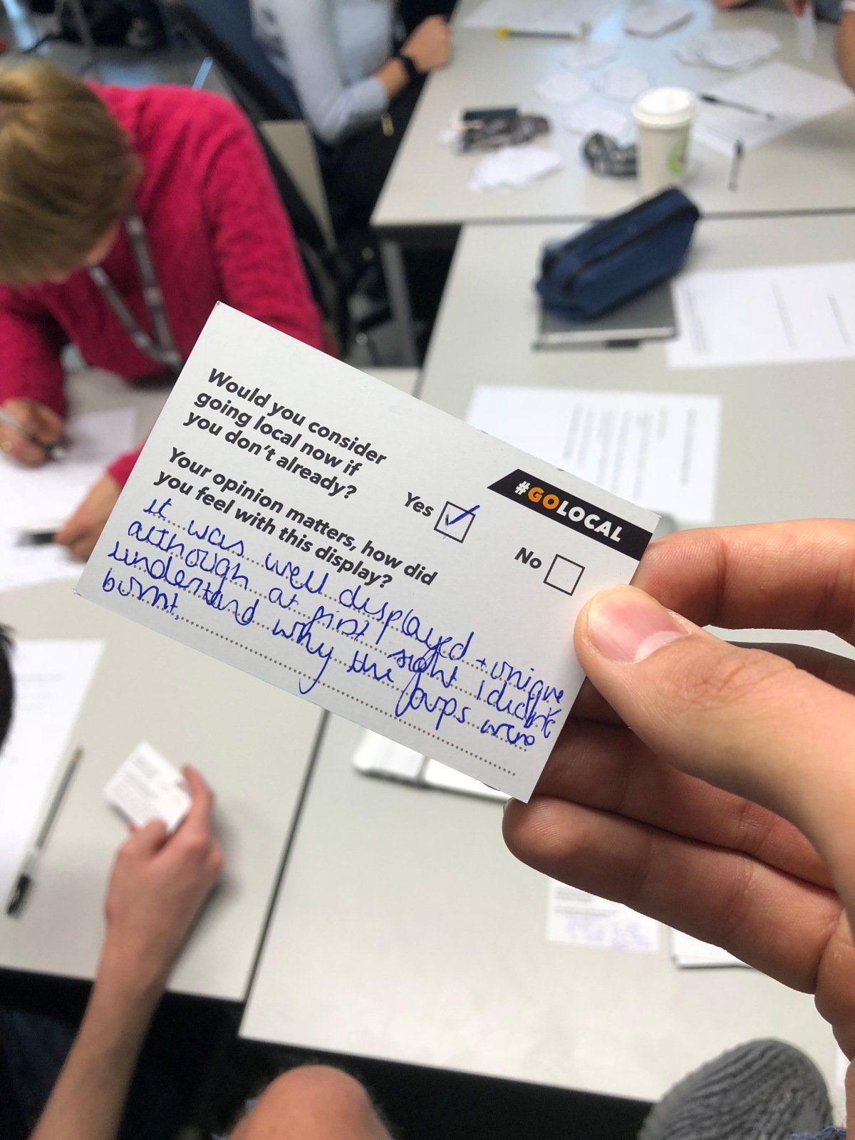
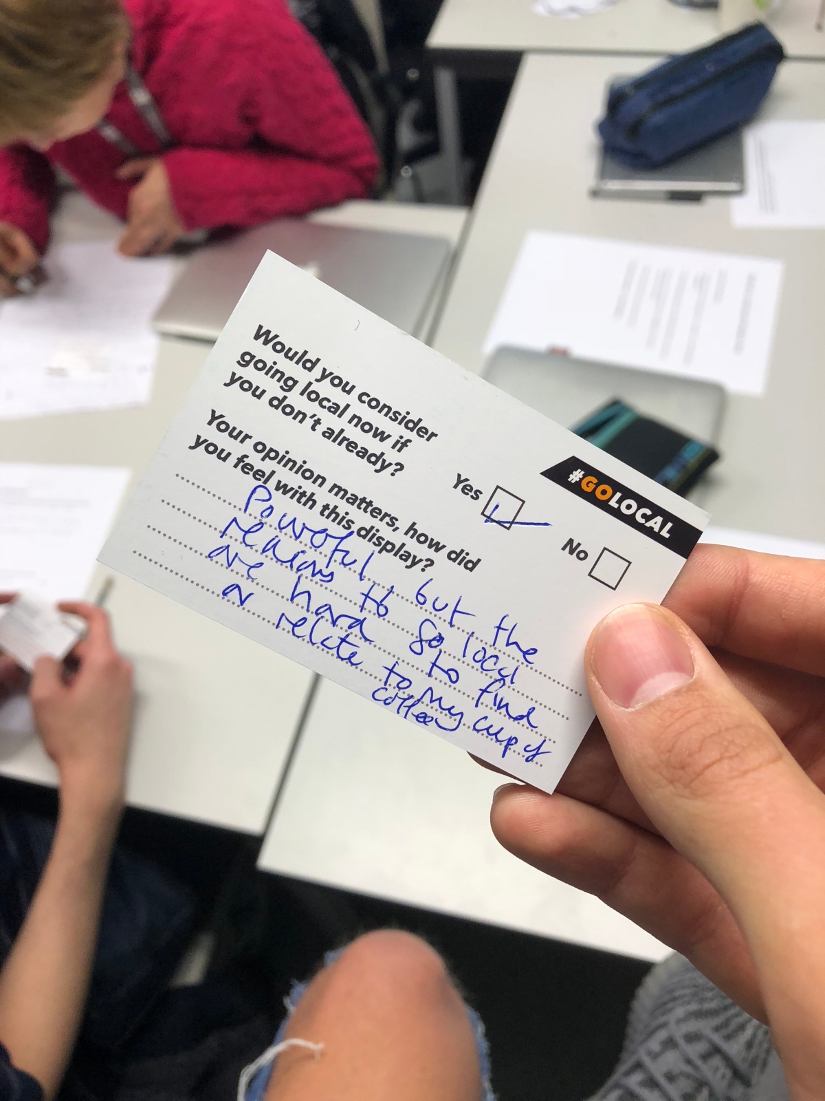
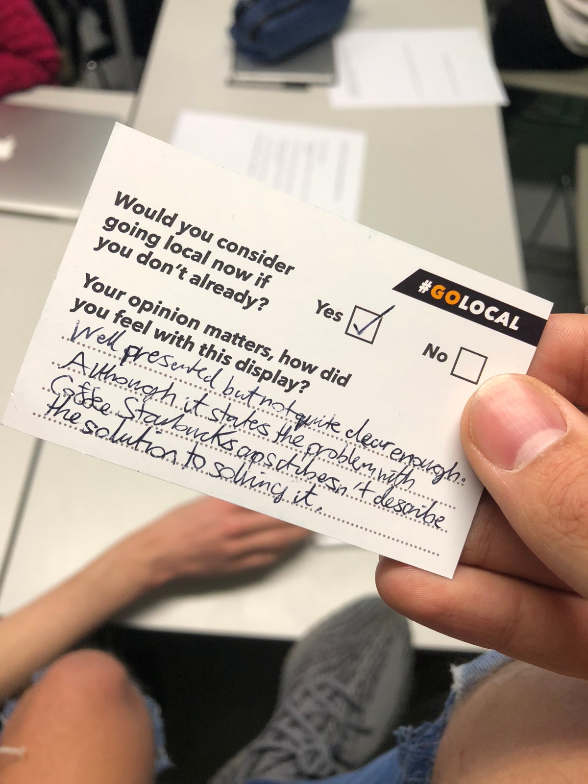
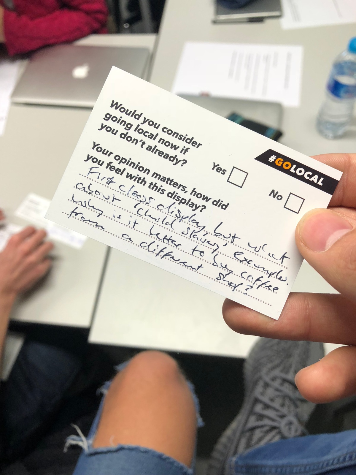
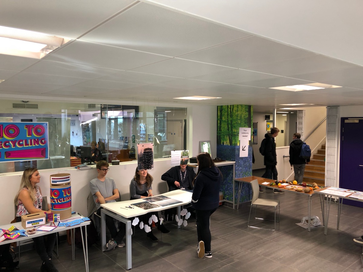
To make the piece more physical we were to get some local coffee shop cups and burn them to show that they are dying because of the top branded coffee shops branching out everywhere. These cups would all be laid out on a table either underneath or next to the poster of the display depending on our layout. We found out that we will all be present with the display so we can recommend local coffee shops to go to. We are also going to include a poll box for people to write down feedback and feelings about our display.

From group brainstorming and discussion along with looking at the others work from previous projects I grew to understand each and others strengths. So we have Nick who is fantastic at photography from HND 2, Sam who is from HND 1 with skills in illustration and crafting and Lena who is from the BA who strongly works well with animation and typography. Unfortunately all members weren’t present for the past week so we didn’t get much input from the group as a whole.

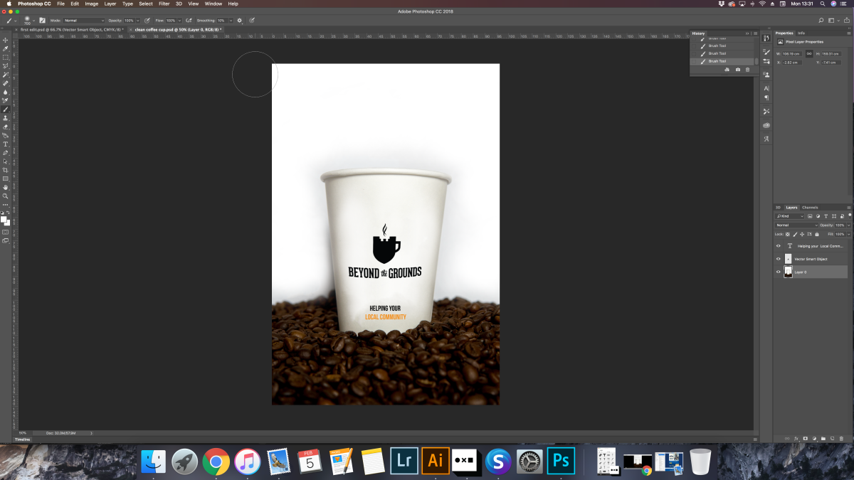
So it was pretty obvious who we had doing what job within the project, We had Nick set out to gather some coffee beans, a Starbucks cup, some pennies and a makeshift set up for his photoshoot. Below is his set up along with a RAW image of what he had shot before editing.

I had told him to experiment a little with different angles and layouts of the elements within the photo but I was extremely pleased with the first image that he shared with us and I think we will be sticking with this image. There are a few areas to touch up which I will go on to do within Photoshop and will make this evident in a post yet to come.

Sam was given the task to get a shoebox and turn in into a poll box for our audience to engage in our display. Also assigned to Sam, Nick and I was to find out a little more information. I have to admit I hate researching but felt it was only fair that we all did a fair part of it.

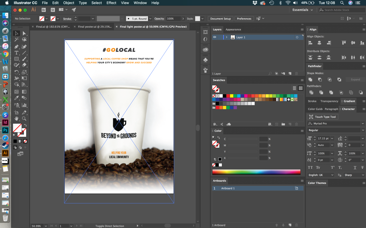
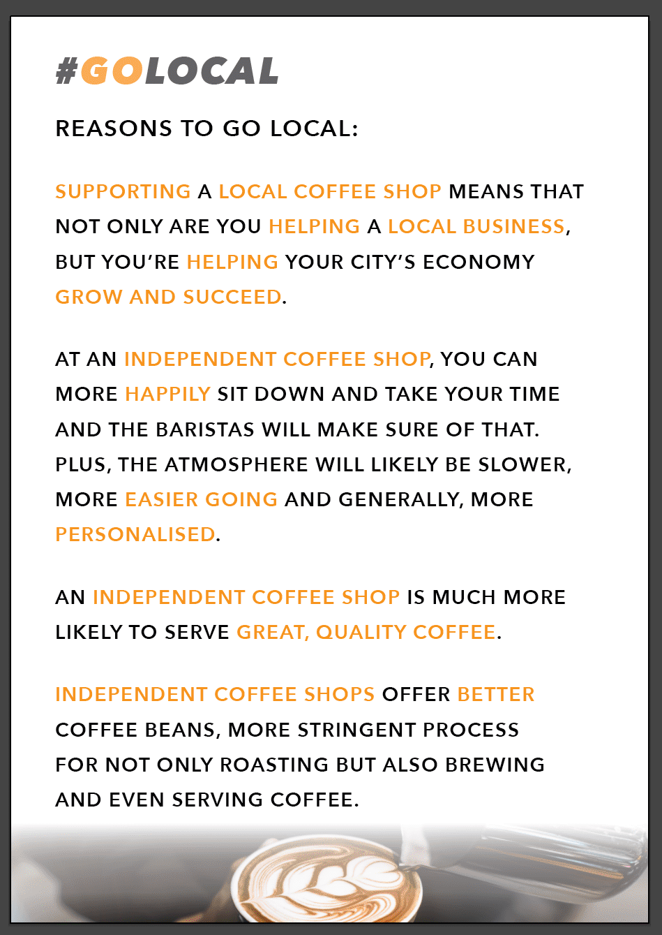
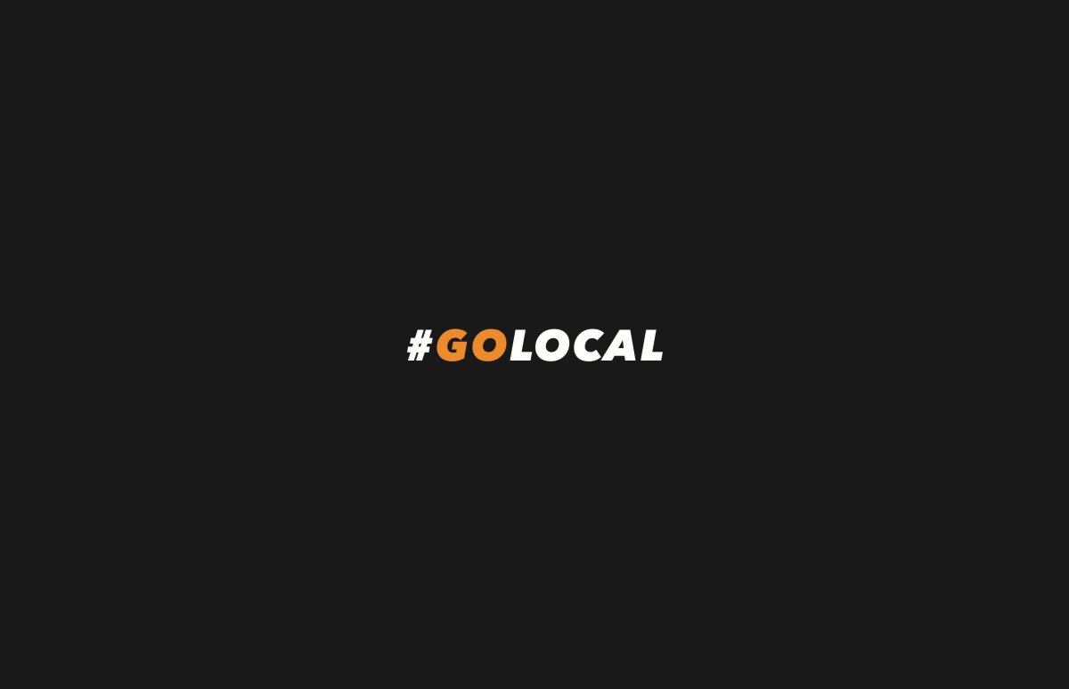
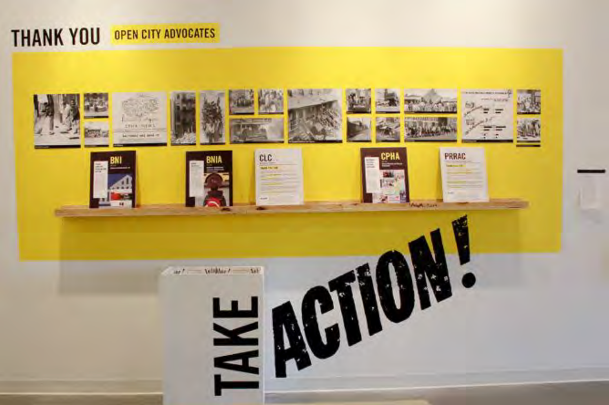
During this time, I on the other hand was designing our campaign and how we’d approach the issue. I wanted to go for something strong and powerful that could be used on social medias so it had to be a hashtag of somewhat. I had in my mind a very straight to the point hashtag being simply #GOLOCAL which I then introduced to the group and they loved the idea so we stuck with this. I went for this idea after seeing the display below because it’s kind of forcing people to do something to change something for the good. This was useful and worked as good inspiration for the title of our campaign.

Screenshot 2018-01-12 14.06.02

At first I looked at just having a black and white thing going on shown below with a nice big bold type to really stand our piece out. But then I noticed with all the text in white it may cause some confusion as to what the hashtag says so again I went to the display above and looked at the colours used within and went for a striking yet friendly colour being orange.

Screenshot 2018-01-22 19.57.14Screenshot 2018-01-22 19.56.56

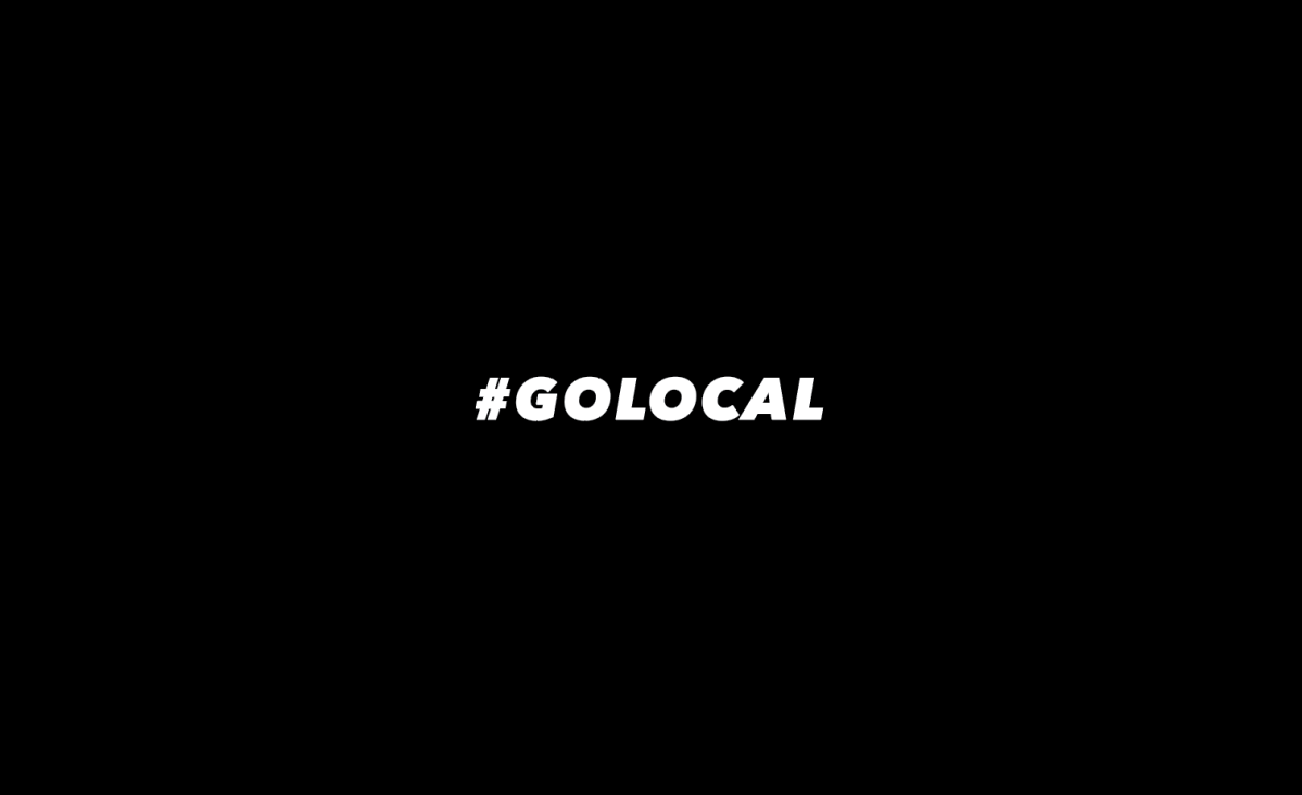
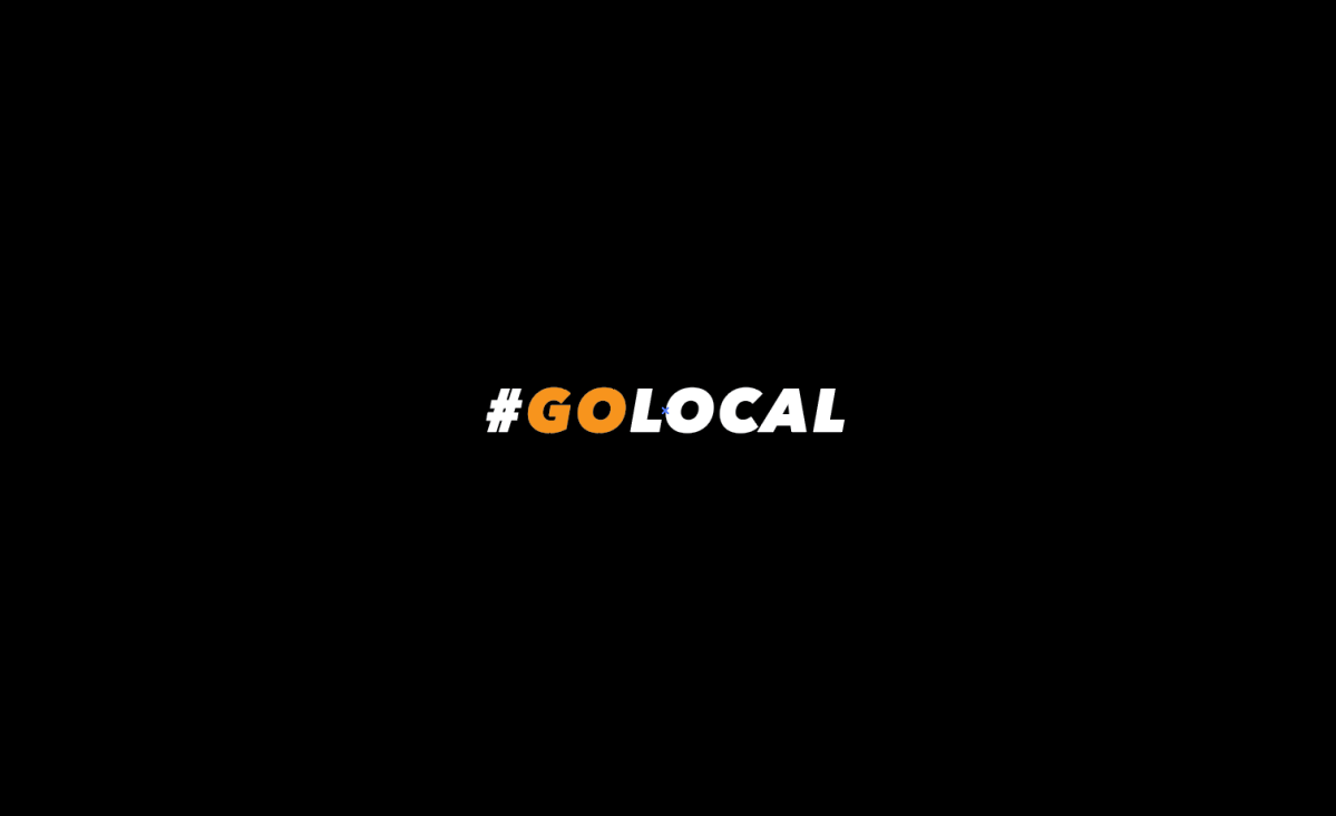
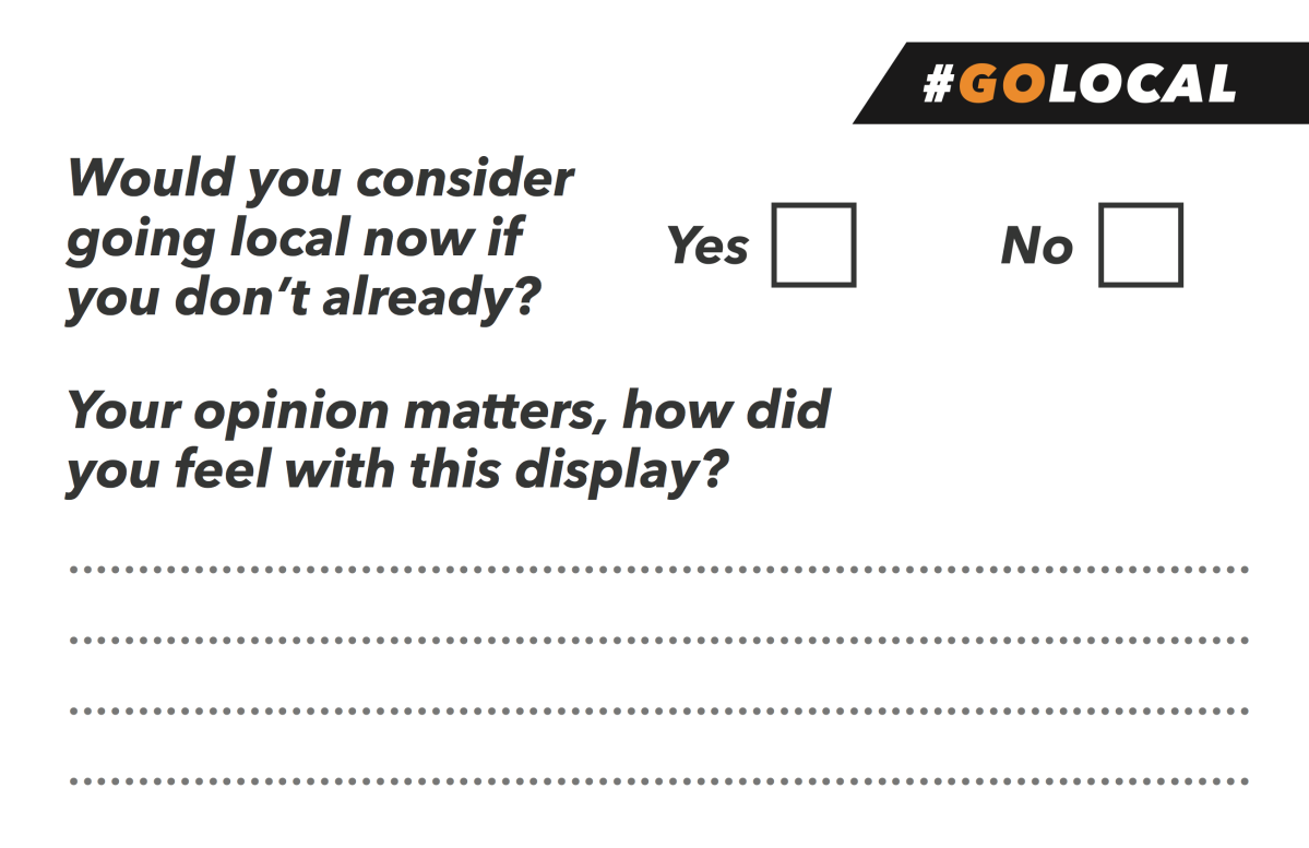
Here has solved the issue of confusion. After showing my lecturer Sancha, she recommended that we don’t print on black as it will use a lot of ink and if we had to photocopy more then it wouldn’t be good for the environment. Usually I’m one to take advice but it was too late as I already had sent something out to print by the time she gave me the advice – lesson to learn, don’t get too carried away and always ask for opinions first. I feel we won’t have an issue with the print outs as that I ordered 250 pieces just to play it safe.

Within the title I went for a very bold font to catch the eye and match with whats soon to come the striking image. The kerning was a little too tight at first so I spread it out a little just about making sure that none of the characters overlapped. It’s is all in caps to gain attention as that it is telling the audience to take action, to do something, just like the open city advocates display.

Next up I will be showing my design process of the polling system which was assigned to me. I will be implementing the logo into the piece and I will discuss how I will be trying to design ethically.