Autistic Creativity Evaluation

After finishing this long project along side a few little projects within 3 months I feel that I have gained a lot more knowledge about Autism and how to raise awareness about certain issues. I think that I had matched the clients brief by going above and beyond with not only a series of posters to raise awareness but a fully functional website for the audience to find out more about the organisation. The branding was strong and kept to the clients needs, it was successful by heavy, critical research into Autism and inspiration of what is out there already.

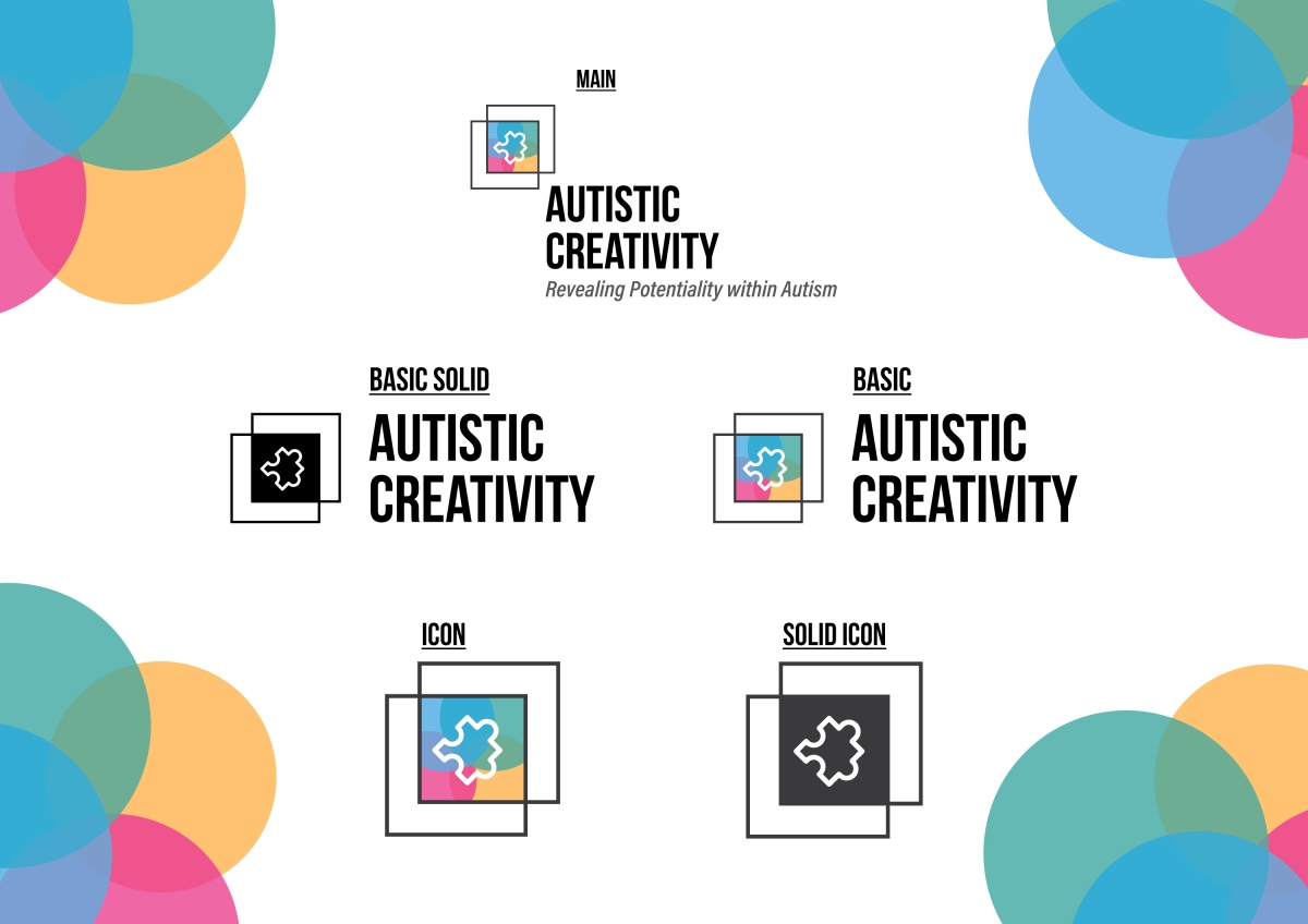
Like all my projects in the past year I had made sure that I did not waste time and kept thinking of ideas going on to paper and on screen depending where I was, this has become a great habit of mine and will help me in the real world. I thought it was necessary to research into similar organisations to really get a feel of the industry and to get an idea on how I should style my work within this project. This process was done to set the scene, to benefit myself and to give me some elements to work around as inspiration to show the audience what the organisation was all about in a simple yet effective logo.

I took lots of breaks and worked on other projects to keep my mind fresh with new ideas. Breaks were taken when needed to clear my mind and asked for feedback from people around me as I usually do. During my breaks I made sure to look on sites such as Pinterest to get some inspiration for charity logos and campaigns to get an idea on how the competition are initiating their designs. This is an important procedure because you want to see how others are successfully creating logos and designing campaigns to gain awareness.

My time management skills were well initiated and I planned out what I was going to do for the the whole duration of the project timeline. I had completed the project in with enough time to spare so I decided to create a website for the organisation to go with the campaign, originally I was not going to do this due to worries of not having enough time.

The design in my content was created in a way to express a statement so loud that it had to be heard by everyone. I wanted to keep the style running throughout to stay consistent and I feel that the use of the simple elements really helped gain attention and ease of readability.

Overall I feel that my performance was on top in this project and was very similar to my main APP project. After getting some good feedback during the many presentations from my lecturers there was a lot of positive feedback and a fair amount of constructive feedback but I feel that I did well and worked from the feedback effectively.

Only one negative thing about my project is that I feel that I should have maybe pushed the boat out to actually create the brand but I felt that the campaign was the main objective and something that I hadn’t done before.

Good design was achieved in this by considering whitespace and formatting to the campaign (not only being print but website too). I feel that I was as ethical as I could be to produce the high standard of the final deliverables. I felt that Autism was such a great thing to discuss upon as it is becoming so much more common nowadays that it needs to be addressed that there are a lot of people with autism who have such creative minds! This project was close to heart and I loved finding out more about the disability in my varied research most of which being the case studies.
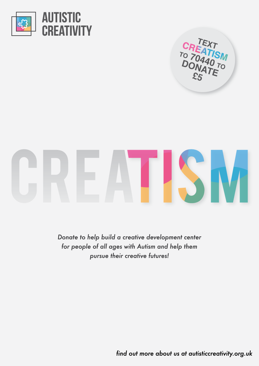
 

Printing the finals

PRINTING WAS A NIGHTMARE!

I thought I’d be smart and print early today thinking it would be a breeze but oh boy was there a lot of waiting around. It seemed like everyone had that idea in mind!!!

The printing went very well though once I queued for a few hours! the documents all came out great and I had no errors thanks to me getting prepared to print earlier on in this project (referring back to when I expanded everything on my art board). I was a little worried as a couple of things didn’t look right on screen which was the colour text in the label, it was showing weirdly because it had been expanded and had white lines in the breaks between each colour but the print came out perfect.

I will now go into a separate blog post showing my finals as PDF’s and you’ll be able to notice the white lines on there but it was not a problem! I will also be showing high quality images of the posters.

Final edits to final feedback of the website

I thought it would be important to get some feedback from a few people from the industry and the general public to get a variety of comments back.

With the public they all seemed to really like it and managed to get through the site with ease. It was great that it was accessible from any phone and web application. I made sure people viewed in on different internet apps because sometimes that changes the layout but it was all good in apps such as firefox, chrome, safari and explorer. phones such as Iphones and Samsung galaxies were used to view the site and all worked well.

The feedback that I got that was most effective was from people in the industry. They informed me on colour matching and image sizes run throughout the website. They told me that black does not work well on a grey background and that big images may as well be stretched to browser width. I made these changes and had to agree it did make it look a lot more cleaner then it already did. These were the changes.

From here you can see that I have changed the text to a strong grey and it looks less harsh, which works very well! Also the image is stretched across the browser width and does avoid pixelation.

Now I have finished the site completely now meaning I have pretty much finished this project and it has been a long one! Here is a link so you can check the site out for yourselves!

autisticcreativity.org.uk

I will be printing tomorrow so I will update on here about how it went! I have 4 things to print in A3 which hopefully won’t be so stressful!

Building the website pt 2

In my last post I said that I would be creating a button in order to subtly pushing the audience to donate, obviously this button would not direct through to a donation page but it would link to the just giving website just to create the feeling of the organisation.

I created the button in Illustrator because it was slightly difficult to do so in Muse. Illustrator is my preferred tool to design icons so that is why I used it.

I made this look to run with the style of the branding and dropped the opacity on it. I made the text bebas to run with the typography of the branding.

Screenshot 2018-05-22 20.03.23

The quality never looks great in Muse but once it gets published to the web the quality appears so much better to what it’s like in the Ai file.

Having the button in the header really finished it off for me and I felt that I had all I needed for it. Below is a look at my header.

Screenshot 2018-05-28 11.54.37

With the stats section of the website I wanted to go for a slideshow effect that ones automatically in a slow manner giving people enough time to read them. I also made this section accessible by letting the user flick through them at their own pace. To have the consistency of the brand in this section I made it so that the slide the user is on it is highlighted with the 4 colours of the brand which you can see in the screenshot below.

Screenshot 2018-05-28 11.54.55

These statements were all found online through articles and are referenced within the website, all credit goes to these authors. I had this section to back up the reasoning to what this organisation wants to do.

Next I wanted to bring the start up page to life as it looked a little too dull with just the logo showing. I thought it would be a good idea to incorporate some “bubbles” from the window element of the logo to signify the creative minds of people with autism. I wanted these “bubbles” to float to create movement to the website but I had to go and find a 3rd party extension in order to let me do it as Muse did not have the tools to do so. Below is the tool I used in order to make the circles float.

Screenshot 2018-05-28 11.54.24

Below is how the page is laid out.

Screenshot 2018-05-28 11.54.14

I included a mouse icon to let the audience know what to do as they landed on the page. this mouse was animated with a scroll effect.

After creating the pages and their layouts I went through the breakpoints to make sure the layout was perfect throughout and the typography was spot on with leading between the headers and paragraphs.

Once I did this I went on to going to GoDaddy to get the site hosted and linked to my domain name that I had brought. I had to look into this a little but it was very easy to do so once I had watched a couple of tutorials.

I will go on further to get some feedback on this and ask people how they found the navigation of the website.


Building the website pt 1

Before I get started I would like to state that this document will be the file that I will be referring to to get my elements for my website, elements being icons that I would not be able to create in Adobe Muse.

final-types

I have an idea on what I want the page to consist of. Considering that it is only going to be a splash page (temporary) I want to have bare minimum on the web page referring way back to last year on the feedback I got from lightmaker. The content I want on this page is the following, a start up page, an info page and a stats page. I saw pages but I mean sections as that this website will not consist of a menu and will be a single page JSP.

To start the website off I were to make it responsive and luckily I have got the tools to do so easily on Muse. This tool is so handy and you can easily drag and drop the extension into your muse document to create the breakpoints (this sets up each different design point).

The important thing to do first was to create the header and footer in the master page section as that this part of the website will show throughout the whole site. The header would stay pinned because I wanted the elements within to stay there throughout the scroll of the page.

Below is how I’ve set up my layers for this project. It is so important to do this to stay well organised especially on big websites.

Screenshot 2018-05-22 17.37.51

For the about page I got the content for it from the brief and altered it a little to make a bit more sense. I also did it because it had to come across a bit more nice to the audience. Below is a screenshot of the phone version on the Start up page and About page.

Screenshot 2018-05-22 18.49.00

Next I will be showing the behind the scenes of further development on the start up page and the “stats” page. I have also thought of an idea to include a donate button into the site which will be located in two locations, the header and at the bottom of the page. This is because it again is the call to action and I will do it in a subtle like way as I’ve done with the posters to keep to the tone of voice.


Changes to the posters after feedback

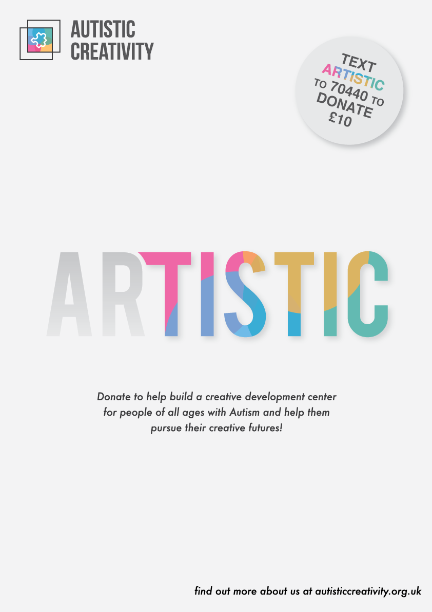
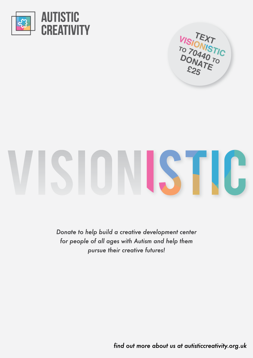
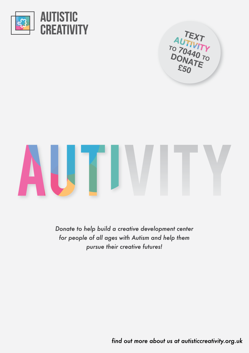
Before I made my changes to my posters I wanted to see what the posters would look like actually printed in the real world. Below are some mock ups of the posters in situations across the world. I tested it on these types of formats because they were the most likeliest places that they’d be placed, especially the bus stop location.

After creating these mock ups I did find that they were a bit too jumbled up because of the box that has the text in it. It contradicted the approach I was going for with the rest of the poster. So working from this I will go back to the drawing board and redesign the layout a little bit.

Screenshot 2018-05-21 16.30.02Screenshot 2018-05-21 16.30.57Screenshot 2018-05-21 16.31.48Screenshot 2018-05-21 16.33.49

I’d like to mention that I actually made a mistake on the Autivity poster, I had the colouring of the text the wrong way round so I did change it before changing the layout. From the screenshots I had experimented heavily on the positioning of each section of the posters and they all had to stay consistent, this was made easy for me because of the early decision of creating these posters in one file across art-boards instead of individual files.

I wanted the posters to be well balanced and I feel with this final decision I have achieved the balanced keeping the poster very clean and striking.

Screenshot 2018-05-28 10.51.17

Now to help me out in the near future when it comes to print I have expanded every element in this document so then if I want to print one out bigger or all of them I can resize the document with ease in illustrator.

Next I will be looking at creating my website to finish off this campaign, Though Muse is shutting down in a couple of years I feel that I will be using the application because it is the one I am most familiar with and I simply do not have the time to teach myself a new design system but I will in the near future as I will need to eventually switch over.

Mid crit for lecturer reviews

This slideshow requires JavaScript.

So with this presentation, I wanted to remind my lecturers what I had done for the last couple of months with the creation of my logo and the design process of my campaign.

With the feedback that I got from this I was slightly disappointed in my actions I took previously being adding the additional comments that I had found to put on the posters. They weren’t a fan of the design elements and their reasons were that it made the posters too cluttered and didn’t follow the approach I was going for with the other elements on the poster. I did begin to agree seeing as some of the messages I put in the poster came across a little too strong such as the one saying “… it’s about time people realised this”. This was some good quality feedback because it was constructive and I managed to resolve the issue by suggesting putting the statements on the website which I will talk about now.

Now at this point I felt I had a lot more time to go further with the campaign and complete it with a website to link to the poster so that if people did want to find out more about the organisation they could follow the link to the website that would inform the audience a little more.

I felt very confident in doing this and will start on it as soon as I’ve amended to the feedback I got from the presentation and set up for print. This process has again been very vital and has helped me a lot.


Adding more to the campaign pt 3

Jumping straight into it, I wanted to change a little bit to the design because after asking for feedback from a couple of people, who work in schools with people diagnosed with autism I got the thought that the logo was misplaced. Being tucked away in the bottom right hand corner didn’t push it out enough and it needs to be pushed out so that the audience has an idea on what the poster was on about.

Below you can see that having the logo in the top left corner is more effective than what I had before. It stands out more and can be the first or second thing that the audience sees straight away.

Screenshot 2018-05-01 00.11.37

Now in my previous post I mentioned that I would be looking out for some facts and some striking lines to real the audience in a little bit more on the whole aspect of autism. I searched through a few blogs and articles that linked between autism and creativity. I found a few good statements and thought they were strongly appropriate for the posters.

Below is what I feel is the finishing pieces. I am set to do a presentation to my lecturers and a couple of fellow students. I will show the presentation in my next blog and will bring up what feedback I get from them.

Screenshot 2018-05-25 17.47.23Screenshot 2018-05-25 17.47.34

Adding more to the campaign pt 2

To make it a hell of a lot easier for me I went on to creating these further posters on the same document as my current poster just with added art-boards so I can make sure the style is exactly the same throughout.

I copied and pasted the current poster over 3 times and changed over the titles for each one making sure that the text of the titles stayed in similar format and size to one another. Below are screenshots of the process that I followed to change it up.

Screenshot 2018-04-30 19.40.22Screenshot 2018-04-30 23.12.32Screenshot 2018-04-30 23.12.43

Now to change it up a little more I had an idea to make each poster unique by changing the call to actions to match each individual title with different costs across them all. I did this because I thought lets say I had one saying donate £50 by texting… to … This would be posted in a rich and with the other end of the spectrum I’d post it in a not so rich area. This is a good idea because it would bring more variety to the campaign and would also help with gaining more donations from different people on the wealthiness scale. Below is the outcome.

Screenshot 2018-04-30 23.27.23

Next I’m going to be looking into some more facts about Autism so I can change that part of each poster. This again is to make it more unique. I will also be looking for feedback too on my current status on the project to get more opinions in from all aspects.