PDF DOCUMENTS
WEBSITE LINK
HIGH QUALITY IMAGES
![]()
![]()
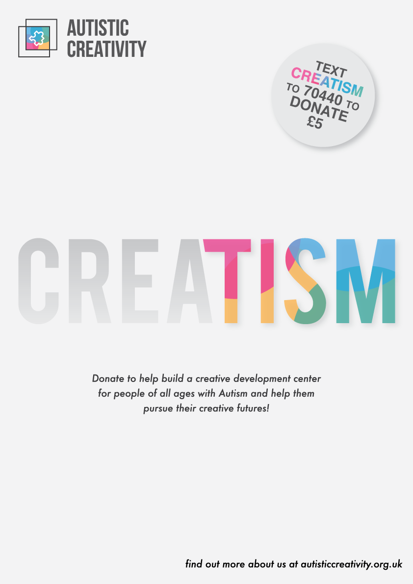
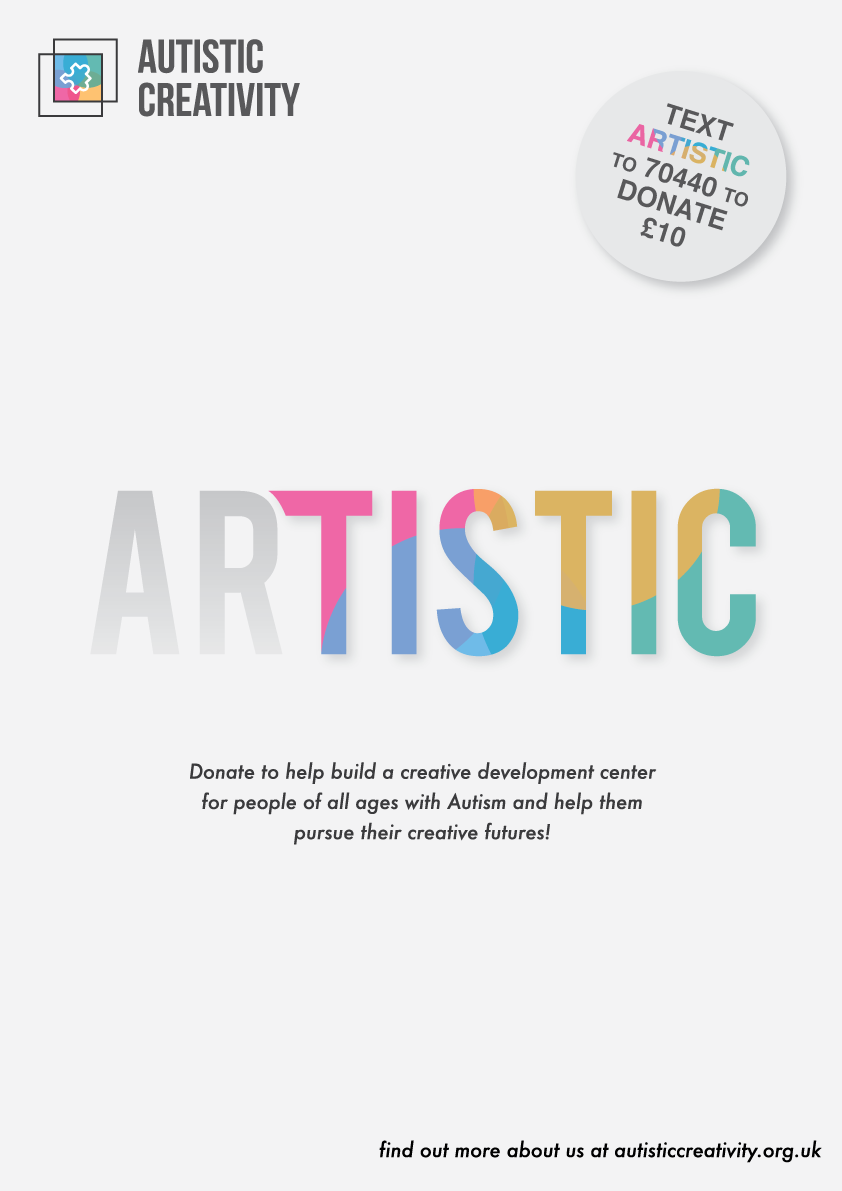
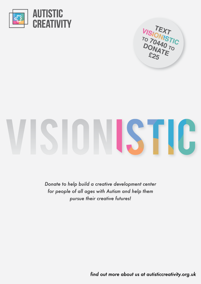
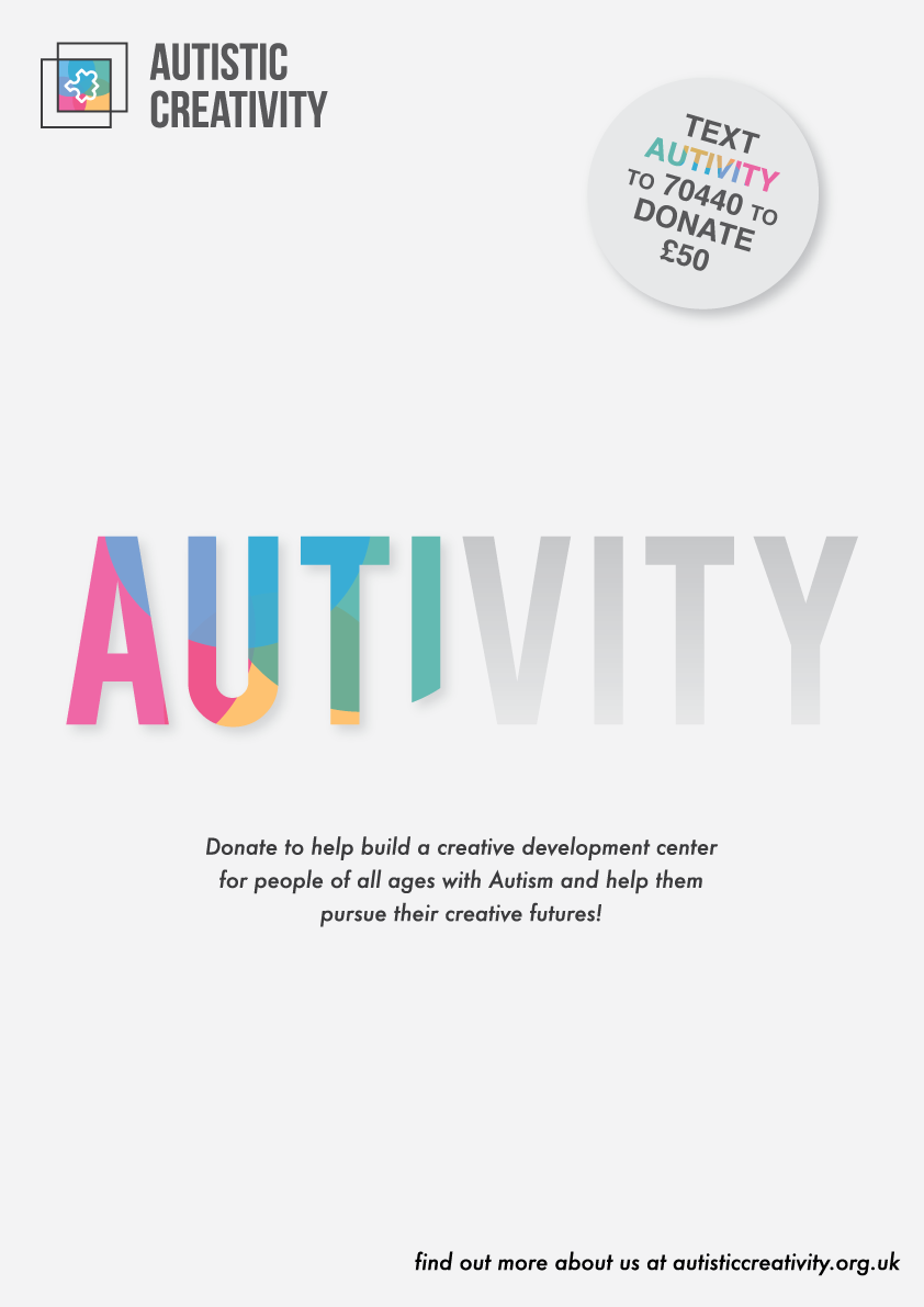
After getting more feedback on my logo I came to a conclusion that I needed to come up with some alternative options of the logo for like lets say if I wanted to print it on colour then it would clash with the colours. I had to come act as if this was a real life client of course and create a style guideline for the logo. I also wanted to verify that there were indeed going to be different layout styles for the logo and here it is.
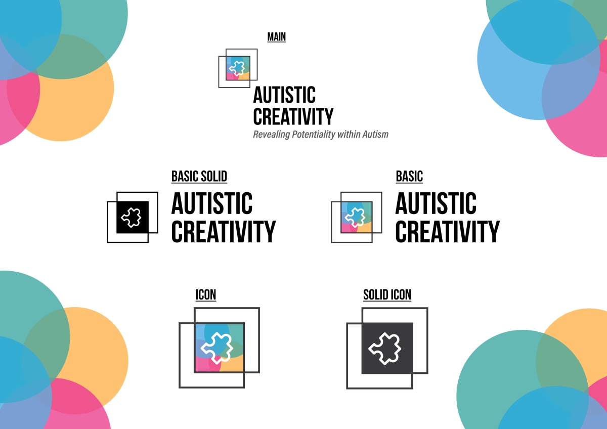
This process will open up a few more options for me to create the campaign, there will be more layout opportunities thanks to this.

Here I will be talking about why I chose this as my final piece for the logo and I will discuss upon the feedback that I got given throughout the runner up pieces.
With the last feedback I got for this I turned to the general public and asked questions such as “what do you think of when you see the logo?” (just the logo without the type) and I had accurate comments back to what my aim was for this piece. I also asked if any of them looked similar to current logos and the majority of people said that it reminded them of autism awareness but it looked unique. I asked what piece was the loudest and grabbed their attention, a couple responded with the lower cap typeface option but again the majority chose ofcourse the Bebas option.
Getting feedback really helped me decide on what version to use for my final and backed up a lot of my decisions made throughout the whole development of the logo.
Along with the type, people liked the idea of the colours used within it but they did mention that it did become a bit too busy which I agreed on strongly even before getting feedback.
Most decisions made here were based from both me and the audience and they feedback really did match what I was thinking about the logo.
Doing this part of the project for the made up client has really helped gain some ideas for the next hurdle being the campaign. This has been great professional practise with the likes of constantly getting feedback and having breaks when I needed. It was also good to break off from the project to other side projects to keep myself creative and not just stuck to one idea. Next I will be doing research into Autism and learning about different types of the spectrum.
After finishing this project within a week I feel that I have gained some more knowledge of web design and the use of wire framing to then send off to developers. I think that I had matched the clients brief in the fact that they wanted the website to stand out and highlight certain areas of what the website needs to portray such as, the team work involved, the car and the stories behind each racer.
I had made sure that I did not waste time again on the project and kept thinking of ideas going on to paper and on screen depending where I was. I thought it was necessary to research into the main Invictus website to get their brand style to show consistency. I studied their website and took into account all their styling elements. This process was done to set the scene to benefit myself and to give me some elements to work around to show the audience that they were a related organisation. I took a very few breaks when needed to clear my mind and asked for feedback from people around me as I usually do. During my breaks I made sure to look on sites such as Pinterest to get some inspiration of sports pages to get an idea on how the competition are initiating their designs. This is an important procedure because you want to see how others are successfully building their sites to gain interest.
My time management skills were well initiated and I planned out what I was going to do for the whole week. I had completed the task within the week with fair ease without stressing and this was thanks to planning my week out.
The design in my content was created in a way to not come across as too basic and I wanted it to look different to other sites. I wanted to keep the style running throughout to stay consistent and I feel that the use of the simple elements really helped gain attention and ease of navigation to the UI. While building websites it is always key to keep in mind UX/UI, without good UI there will be no traffic on the website if it is clunky and hard to navigate around.
When it came to printing and laying out my PDF in a professional manner I went to the print shop as that I wanted the piece to be bound. Unfortunately there was an issue with the print that got brought up in the presentation and it did let me down a little as the client said it was lazy though I did explain it wasn’t my fault. Also there was a couple of colour distortions and this was due to the fact that I did not put the images into photoshop to change the file type to CMYK but instead just dragged them straight off the web. This I admit was a rookie error but during the presentation it did not get brought up.
Overall I feel that my performance was on top in this project after getting some good feedback during the presentation from the client. There was a lot of positive feedback and a few bits of constructive feedback but I feel that I did well. After seeing the others work though I do feel that I could have done a little better because I was at first a little unsure on what they wanted the outcome to be.
At the beginning I was a little lost at how I could show this piece off as that I was getting very annoyed with the adobe app known as Adobe Muse. For something like this I felt it was too clunky so I asked the group and they recommended to use a web app known as InVision. InVision was great for me and I picked up on it very quickly and easily and I do want to look into it a little more as there is great use for it in the future.
This experience made me more confident in working on prototype web apps to show off my thoughts. This has opened up doors for some personal projects I have in mind and I will indeed look a lot more into InVision.
Below is a slideshow of my PDF that I laid out for Lightmaker. I did this so they could have something to take away with them so it’d remind them of my work. It was to just show briefly what the aims where in my decisions.
The presentation went really well I thought, I ran them through my website through invision nice and slow so they could take everything in. I didn’t hesitate on any of my designs which was good because it shows that I was confident in my actions within this project. Below is a video of how I showed my website to the guys.
Next I will be evaluating my process and reflect on my actions that I made throughout the short project. I will also talk good design and discuss upon some feedback that was given.
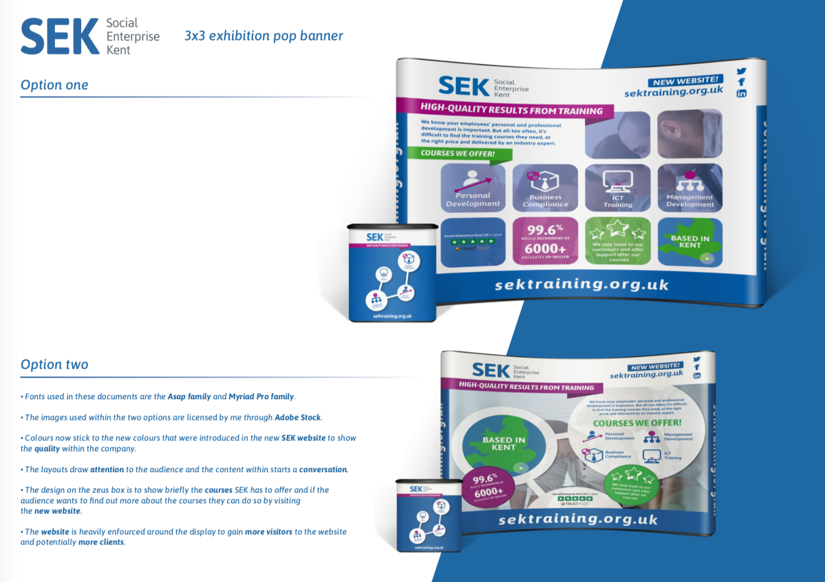
After finishing this project within a week I feel that I have achieved some more knowledge of the industry of graphic design. I think that I had matched the clients brief precisely and considered each specification wisely in the final outcome to stick to the style of their brand. With this project I worked on it straight away and really acted on it as if it was an actual client in the real world (kind of is!). I took into consideration that the final display had to start a conversation and it had to draw people in especially business owners. I feel that as an individual I displayed the content that SEK wanted to portray in a rather unique way and after studying the other students work in our group the evidence was clear.
Like my other projects in the recent past I made sure that I did not waste time on the project and kept thinking of ideas even before the brief was given to us. To get a real feel of my client I studied their new website a bit and decided to set up a challenge for myself to rebrand them, this process was done to set the scene to benefit myself. I took breaks when needed to clear my mind and asked for lots of feedback from people around me as I usually do. This is such an important procedure seeing that you could become biased and like your own work even if it didn’t match the client/ brief. A big break was placed in the middle just to clear my mind a little to then go back and create a new layout.
I took this opportunity of working in such a short amount of time to gain and improve on my time management skills. I was also very confidential throughout my progression as that I recognised a bit of traffic on my blog, I was a little worried this could be other students, most probably not seeing as most the views were from America.
The design in my content was created in a way to not come across as too niche but it had to be simple enough to understand at first glance. I feel that the use of the simplistic icons really helped gain attention to the piece.
When it came to printing and laying out my PDF in a professional manner I did it myself at the university as after a few goes printing myself I feel very confident now in what I used to get so worried about! I did have a lot of time on my hands as that I had finished the design within 1 day along with the other design in another day.
Overall I feel that my performance was on top in this project after getting some real good feedback on the hand in date. I feel pretty confident that I may win this competition and I will add to this blog if I succeed in that. I was devastated that I didn’t win the last one last year so I really made an effort in this piece as that it would really help for my future career. This experience made me more confident in working on bigger print outs as I was never so sure on what the font sizes should exactly be but after seeing the mock ups of my design I feel a lot more at ease about the specifications of the documents.
After finishing this projects over the month I feel that I have achieved a lot. I think that my group and I had matched the brief correctly and considered each one of our time wisely. After a few practise displays we were fast to think of a concept to work on and did not sit on our hands for too long in this one. I took into consideration that the final display must raise concerns and bring forward a striking conversation. I fee that as a group we found a problem and displayed it in a rather unique way – The posters were both very different yet they kept consistency at the top by having a similar style run throughout the brand campaign.
I made sure that our group did not waste time on the projects and kept bringing forth ideas and pushing overs for their opinions and ideas to bring up experimental concepts for the display. I took breaks when needed to clear my mind and asked for lots of feedback from people around me, this was consistent throughout the last few days with regular meetings with my group and occasional emails back and forth to my lecturers to be sure I was keeping on top of the outcomes to not only my brief but the others within the group.
I took this opportunity of working in a group to gain some kind of management skills for my future. I have to admit that I was not on top of my attendance at the beginning of this project though I feel I redeemed myself by just throwing myself into the project and working from home to get some knowledge behind me on what the project was all about. Once I attended a few workshops I felt confident enough to take control and kind of give off a role model feel to the students in the HND – I’m not gloating. I feel though that I read the other students in my group well and identified their strong skills very soon which was very handy. Doing so straight away helps because you will know who will do the specific workload the best.
The design in all our content was created in a way to not come across as sinister but yet it had to be so powerful to show the local problem but in an approachable way. At first we didn’t get it with our BETA display which did come across too dark and did confuse the audience. Throughout the further design we kept in mind the target audience and I kept showing parts of it to friends, family and lecturers to gain outside opinions from both professional and normal people.
As a group getting our ethics right and along the same lines was essential as that we all had to agree on the given choice of topic that we brought forward. going to certain exhibitions and looking as previous displays on ethical issues really gave me an insight of how I should base the design of our display around with yet a unique look and way around it.
Getting the feedback from our prototype display was so crucial and I was indeed pleased with the constructive feedback that we got, even though it wasn’t a lot and this was due to the unfortunate placement of our display. However we overcame this issue as a group and took it on the chin. After critically analysing our work along with the feedback we knew full well what we should do to problem solve this matter of confusion.
There was talk in my blog not so long from now of having a GoLocal loyalty system yet unfortunately it got scrapped due to how much time we had left and I felt it would be too much content to fit into one display, it could further on go on and branch out from the campaign. I noticed this before I discussed with the group and didn’t want to inform the others because I didn’t want to stress the group out in any way. When it came to presenting the displays to the other groups I then came to the idea that I was right to not go further with it as there were other groups who tried to cram in a load of things and thus doing so made the audience (the other groups) feeling confused about what the message is.
When it came to printing our pieces we done it ourselves at the university. This is because of how much time we had on our hands, we needed the print quick so we couldn’t go to a high quality print shop though we managed to do a great job of it by ourselves and we only needed a few copies so it would have been pointless to go to a big print shop because they usually only work in bulk. Saying this though I did use an online source to print out our feedback forms as we guessed we’d need a lot and the turn around time on them were super fast and this was a case of professional practise. I thought quickly in the act and thought on how we’d get around printing costs and such. I have a few printing contacts so I laid them all out picking the one that would work best for us in a matter of minutes.
Overall the group and I’s time keeping skills were on top and I again feel that I had redeemed myself by just jumping straight into the project with no hesitation by really building the bridge in our group to make us all feel as comfortable as possible working with each other. After getting my final response from people with the printed versions, I am very proud of my group and I and I’m extremely happy to call this work mine. I used to hate working in groups but now I really do enjoy it.
I feel that this campaign has potential and I will probably go on to further developing it.

Here is how I’d like to see the display and I have laid it out on screen to get a real feel for it. I did this to avoid wasting time on the day of setting up so I and our group could just quickly put it up and leave without any further experimentation.
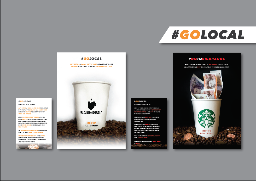
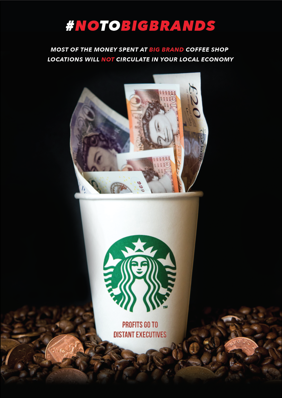
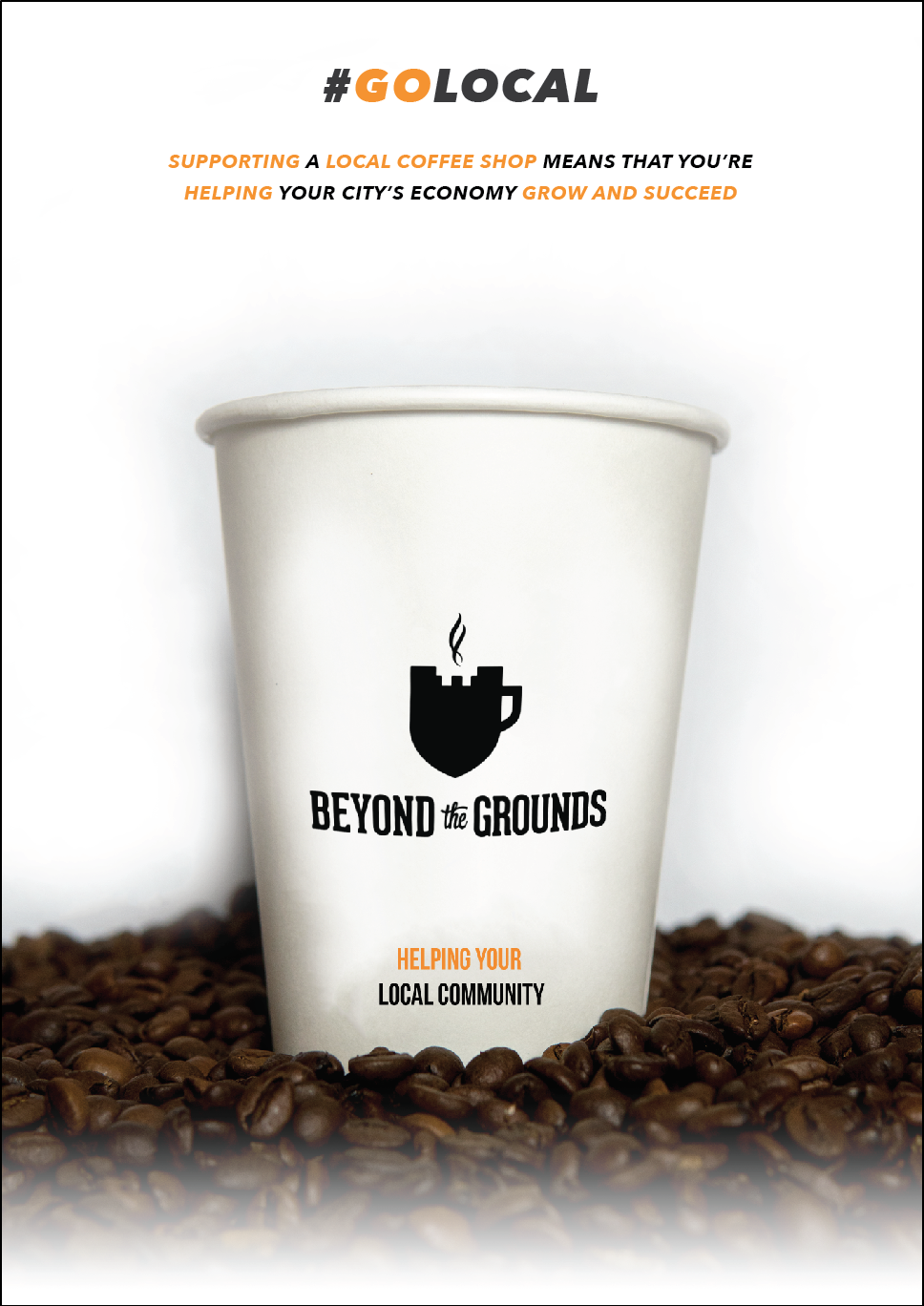
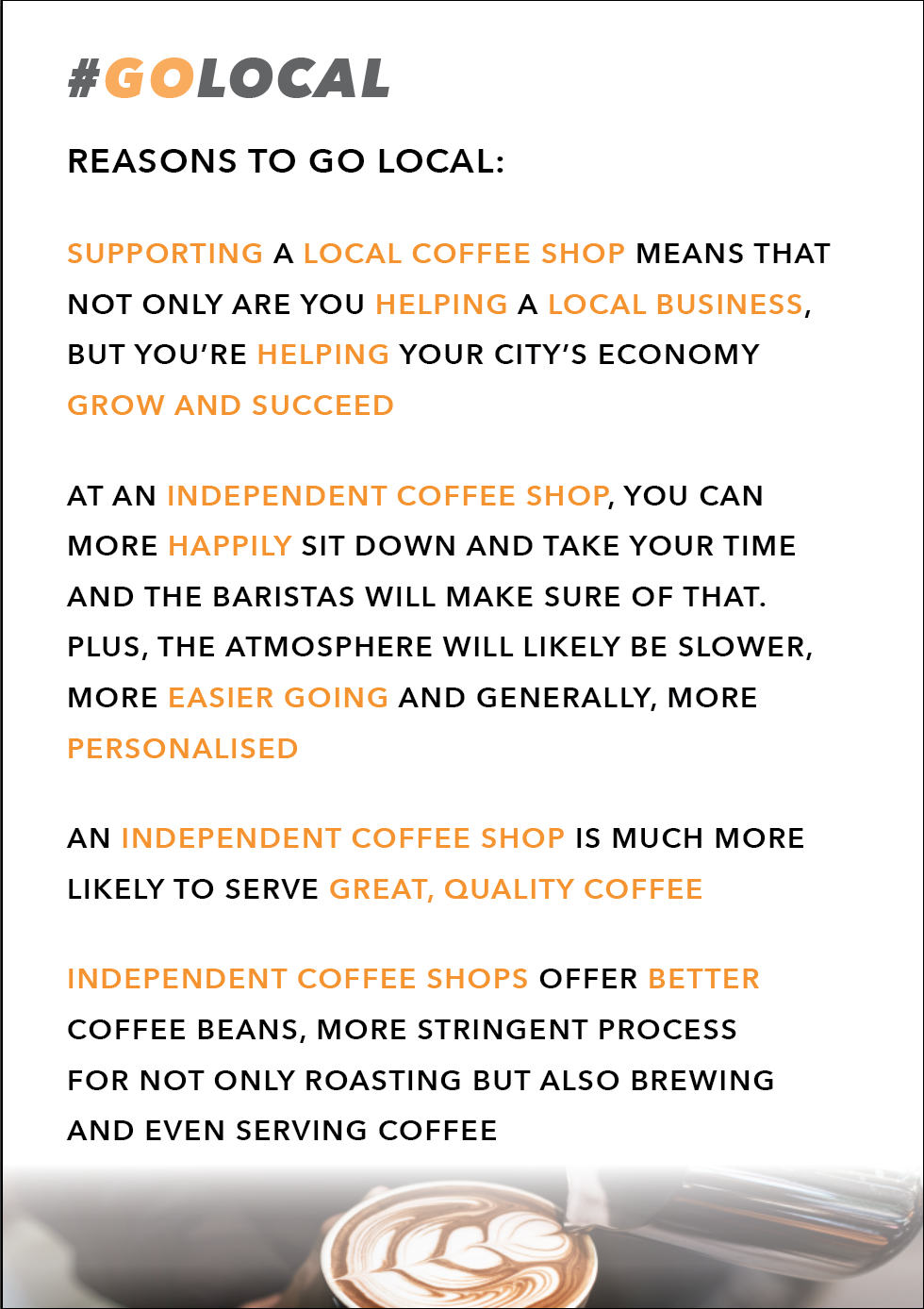
Laying it out this way builds a great balance with the content of our display by really contrasting the two colour ways. Having the good side of the discussion first was key because we had to show somewhat of a solution to the issue. We didn’t want people to get flung into the dark end of the issue straight away. However the dark poster really does stand out and draws attention to the display.
After presenting our work to the other groups we were informed that we should go first and we got some amazing feedback from them, I was very surprised and super happy with this as I did have a few doubts. Comments did arise though as to why the lighter coffee cup is a closer than the darker one, We countered the argument by saying it is to say that the local coffee shops are better and stronger and help out more than the actual pathetic big brands. Another argument came up saying why is the colour palette different in each poster, countered again with it confuses the audience as to which poster is good and which is bad. Doing so reinforces the background colours and photo content. One last comment got brought up being that why the gradient at the bottom of the light poster? I answered we’re not too sure but now I feel that it creates a heavenly feel to the poster, again reinforcing the other good elements within the poster.
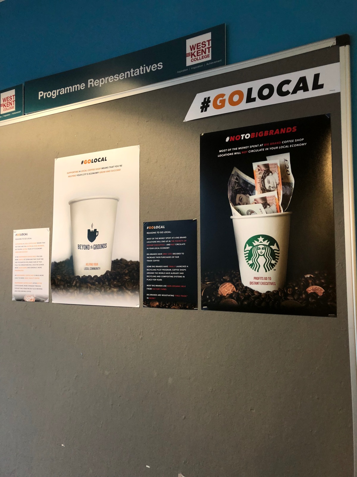
Here is the final, physical look of our display and we all felt it worked very well and there were no changes to be made from how I laid it out on screen. I just had an idea just now that would have been handy if we had more time and that was to have the posters smell like coffee beans or even have some coffee beans glued to the posters to cover up the gradients? Just spitballing there but I thought it would be a cool easter egg kind of thing!
Next I will be doing my evaluation of this project and discuss how I worked within a group and managed all the tasks I had to do within the project.