Here is our final feedback from our tutor Based on what we had a few posts ago. The reason to these changes are as followed:
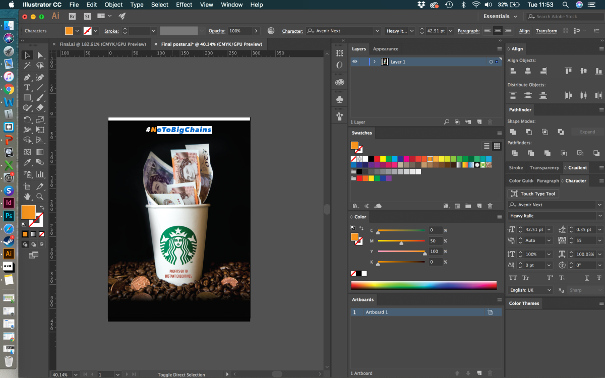
- Change the title as it may confuse the audience, you should keep it looking as dar as possible and not include any light elements within this poster.
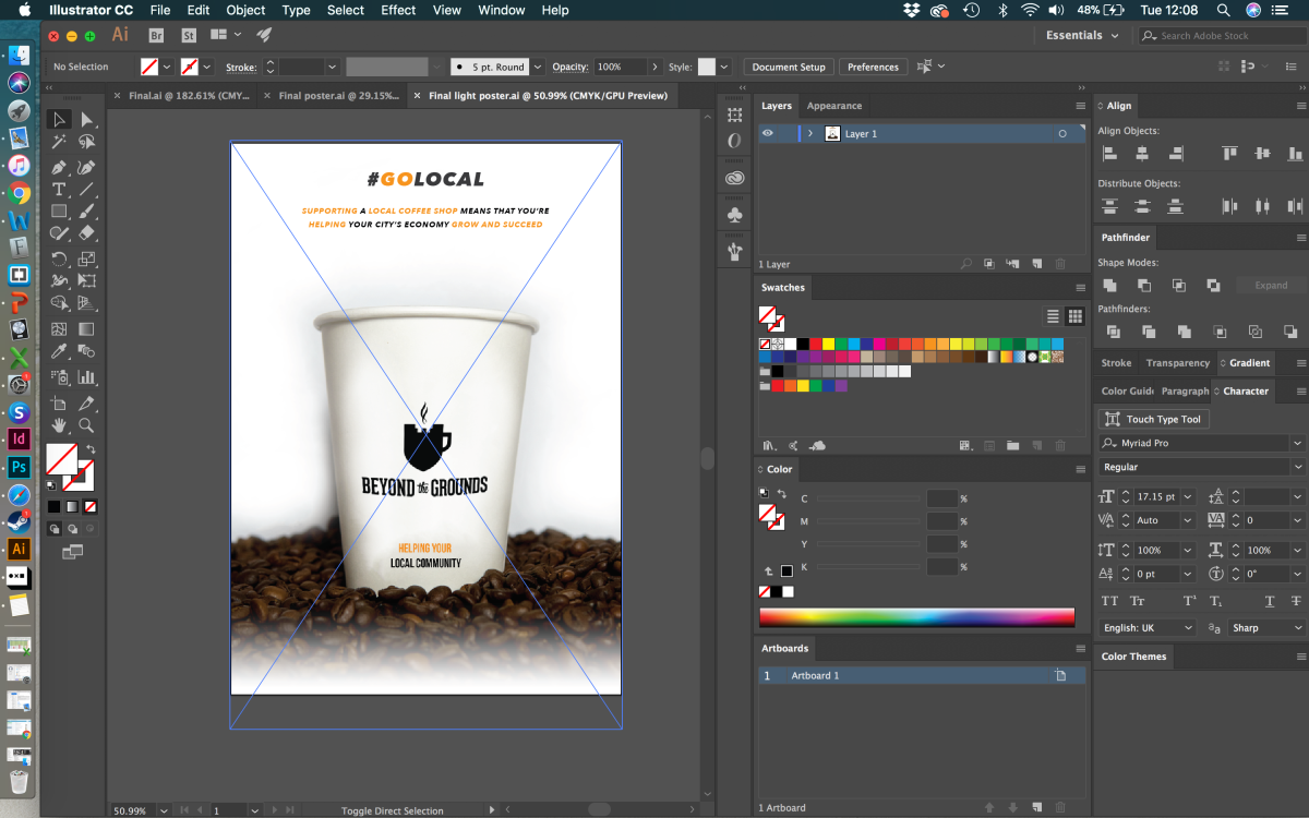
- Reduce the amount of information within both posters as you want the image to do most the talking and if there is confusion then the viewers will look to the fact sheet. Change the hierarchy too of the layout just to experiment a little more.


Doing this really did favour us and I feel that it works effectively and was incredibly good advice.
- Change all profits to just profits as that we are unsure on the fact that all profits go to distant executives but do know that some profit goes to them. Screenshots above show evidence of the change.
- Stress a little more on the local economy in the light poster, doing so reinforces the message that we are trying to send out and reduces potential confusion from the audience.
- Do not pixelate the Starbucks logo as people may think that it is a slip up in the design or it is a mistake. I was against this opinion but realised that our tutor is also our audience/ client so we should construct on the feedback given no matter what our opinion means. I understood where she was coming from so we chose to make the change. Screenshots from above show the change.
It was also mentioned that we should have a title panel for the display. This is to reduce confusion as people may find the display being two separate displays even if the styles do match.
This feedback has strongly helped us and I feel that it was crucial to get towards the end of the brief. Constant feedback is always needed and is key for professional practise. Next I will be showing photos of the display if ours goes up and also the PDF files.
