Here I will be looking at some inspiration for my logo. I will be looking at existing logos to try and get a feel on what my logo should look like. I will analyse each logo and the elements within them.
It’s a little hard to see this one but I like the use of the puzzle piece in it to represent people with autism. I do feel though that the use of a jigsaw piece is becoming a little too consistent throughout charities for autism and I would like to think outside the box and possibly come up with a game changer. However the colours are good and simple which I like to signify the creativity of an individual with autism.
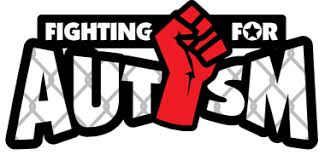
With this piece I really like the use of a strong font to signify that the given charity is trying to fight for the rights of people with autism. This piece looks like a creative piece though I feel it is a bit too strong along with the red fist in the air and the chicken wire masked into the type of “AUTISM”. With a bit of work on this piece I believe it could be very powerful with a good balance.
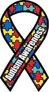
Of course it wouldn’t be right to not include this piece as it is so iconic. Again I like the colours along with a obvious yet subtle appearance of the puzzle that is masked into the ribbon itself. I don’t really like this logo as I think the thick strokes are way too harsh and don’t come across gentle to signify who they are.
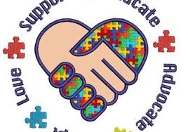
I like this logo because it shows that people are uniting as one. However I feel that this is a bit too much and is almost alienating people with autism which may show in an offensive manner.
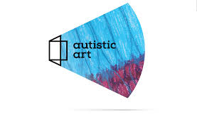
Probably one of my favourites here, I really like the design of this logo and I like how it doesn’t look so cliche. It is a very artistic design and I like what it is trying to signify with the shapes and colours used. The logo seems to show the stroked shape being a window and blowing out to show the colours to represent the creativity of ones mind and environment. If this is correct or not I am not sure. I will research into this interesting piece on Behance and will do a separate blog for it as that it was an incredible campaign and I could look at it for some inspiration for my campaign.
Next I will be going on to illustrator to mock up some logo ideas and will possibly take to the sketchbook for some other initial designs. Looking through these logos and analysing them in a critical matter has given me some kind of idea on what to do with my project.
