Here I am going to be looking on the web for some inspiration and I’ll be looking at a few awareness posters and donation posters to do so. During my time surfing the web I was thinking that there wasn’t much good content and the content on sites like behance and pinterest were way too complex concepts. They were interesting but I thought that for this project I didn’t want the piece to be interactive to an extent but instead eye catching!
I am going to be looking at a few posters and I will preform a PMI on each one/ set.
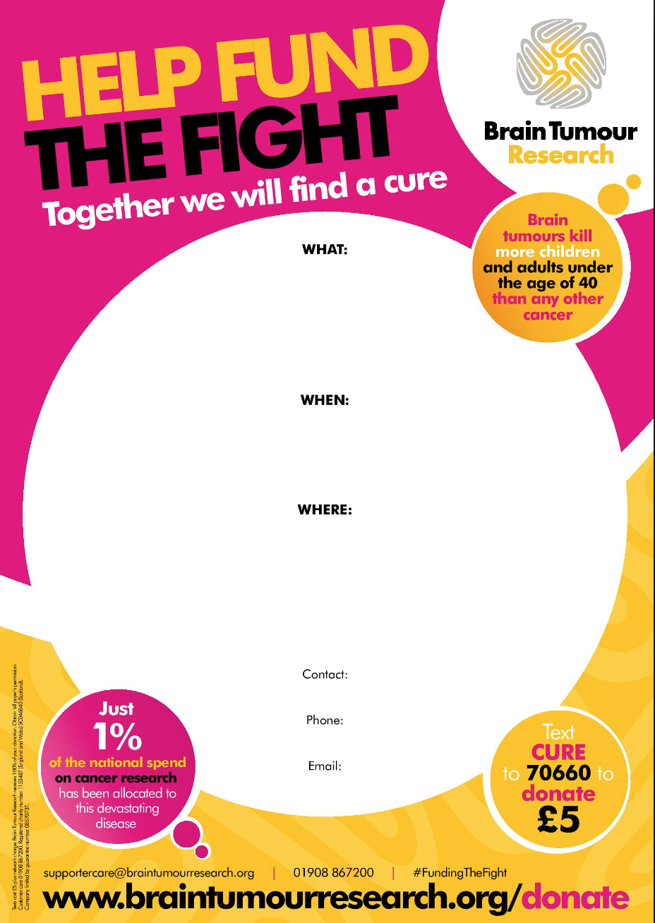
With this poster I like the bright colours that attract the audience, they’re also not too harsh to the eye. The colours work well together too. I like the big simple elements within the piece and feel that they work quite effectively. The hierarchy of the poster is a little all over the place with the speech bubble quotes but does work in a way. Having the call to action at the bottom feels slightly misplaced because maybe it should be at the top? I do get it though that it is at the bottom because it’s giving the option after informing the audience. From this poster, I will take in to consideration the use of big bold font that’ll match to the style of my logo. I will also refer to the use of the big simple elements. What I will keep in mind for potential future projects is the format of the piece that it is in fact a poster to give to fundraisers to help promote and gain donations for what they are participating in.
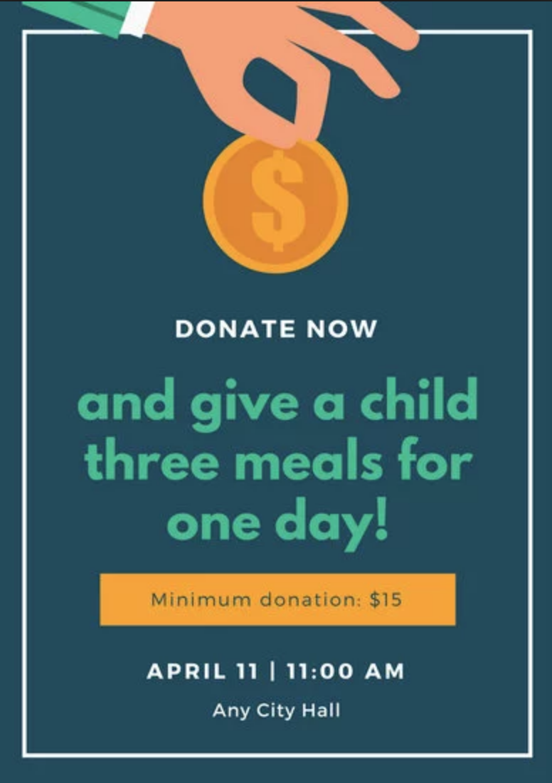
One of the things that I like in this poster is the fact that it is so simple and in which, it should be as it is informing the audience of an event. A simple illustration is good and yet subtle as it doesn’t dominate the page so much to a point where the audience thinks that it’s just a money grabbing ad. There is a good structure to the poster and the text is very clear for the audience to read from a distance. My only problem with this piece would be the fact that it may look a bit too dull and to match with Autistic Creativity, I feel that it would not portray the learning difficulty. I would look to this in a more corporate brief that promotes something less lively.


With these final two that are in fact a set from a campaign, I found that their simplicity was perfect. I like the use of simple imagery and fairly strong typefaces but not too strong to distract the audience. The imagery on the studio backdrop works well with the other elements within these posters. I will look back to these as that they state facts on the posters to raise awareness. They’re simple but again maybe too bland as they don’t vary in colour which is a downfall for these pieces. Lastly the logo at the bottom does not really work well and would work better if it was the first thing the viewers see so they know what the poster is about.
This is an exercise that I preform in most of my projects and it is crucial to know what is already out there so you can see competition and look for the inspiration. I will now go on to going on screen and discussing my idea on a collaboration campaign.