Experimentation and justification on the last bits and decisions

Here I will be explaining what I have done to achieve this final look of the menu for the charity and pub.

Throughout the menu I have looked at the spacing between each paragraph style and applied it to each section in accordance of the first page. This is to keep the style consistent and gain more of a flow. I have also made sure that all the elements of each page are aligned to the middle to stick to the design.

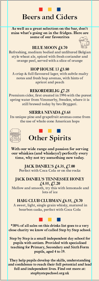
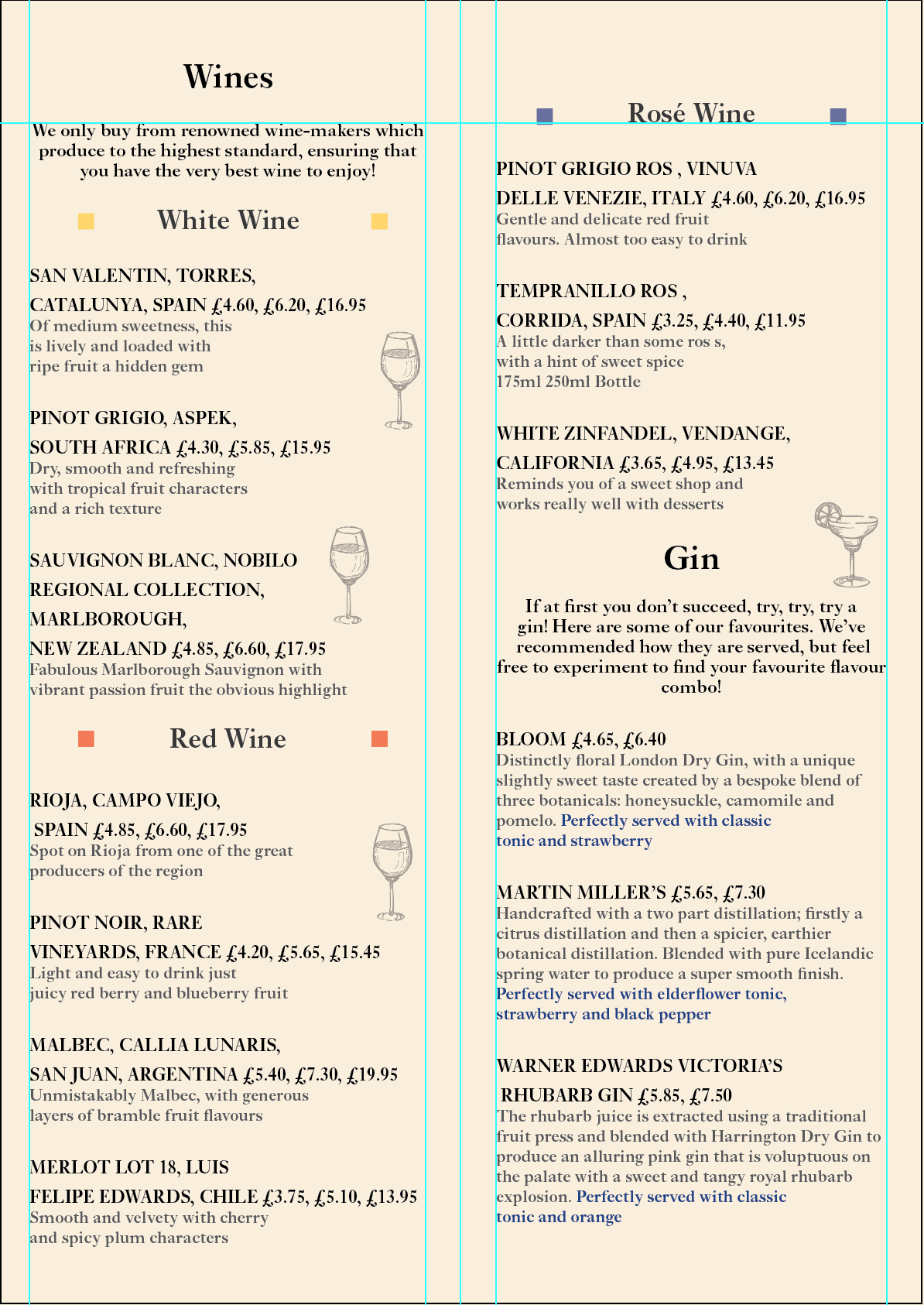
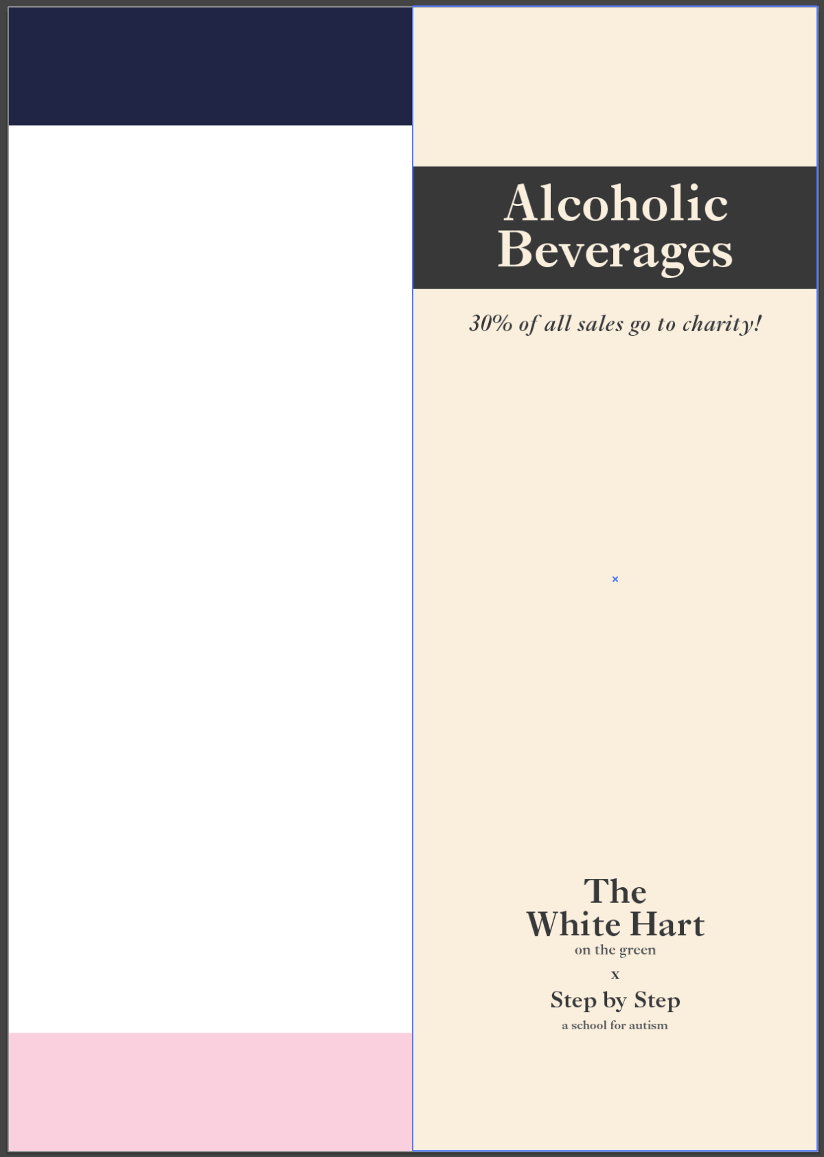
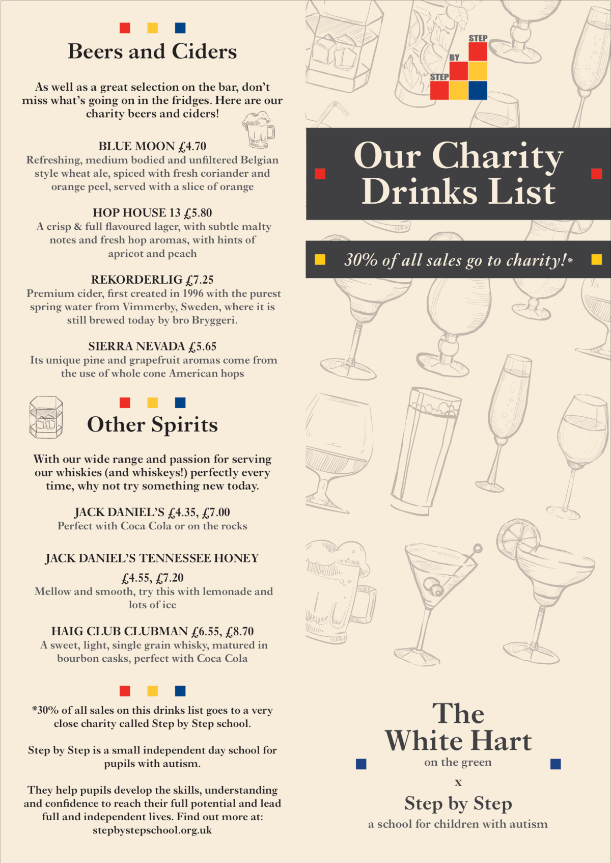
I have also changed the opacity of all the illustrations to about 50% to 60% just to make sure they don’t disappear off the page. My lecturer did tell me that I may want to consider using greys instead of the opacity option to stay on the safe side but I decided to flatten the document layers by exporting it to PDF. Doing it this way does the job for you and transforms the transparent elements into solid colours. During my test print it was done from an Ai file, that’s what caused the illustrations to go missing.

Screenshot 2017-12-04 22.46.34

The text had to be amended based on some final feedback from the charity. They wanted it to be a little more shorter and only highlighting the main points being a slight description of what they do. If the viewer wants to find out more they can simply look up their website.

Screenshot 2017-12-04 22.46.49

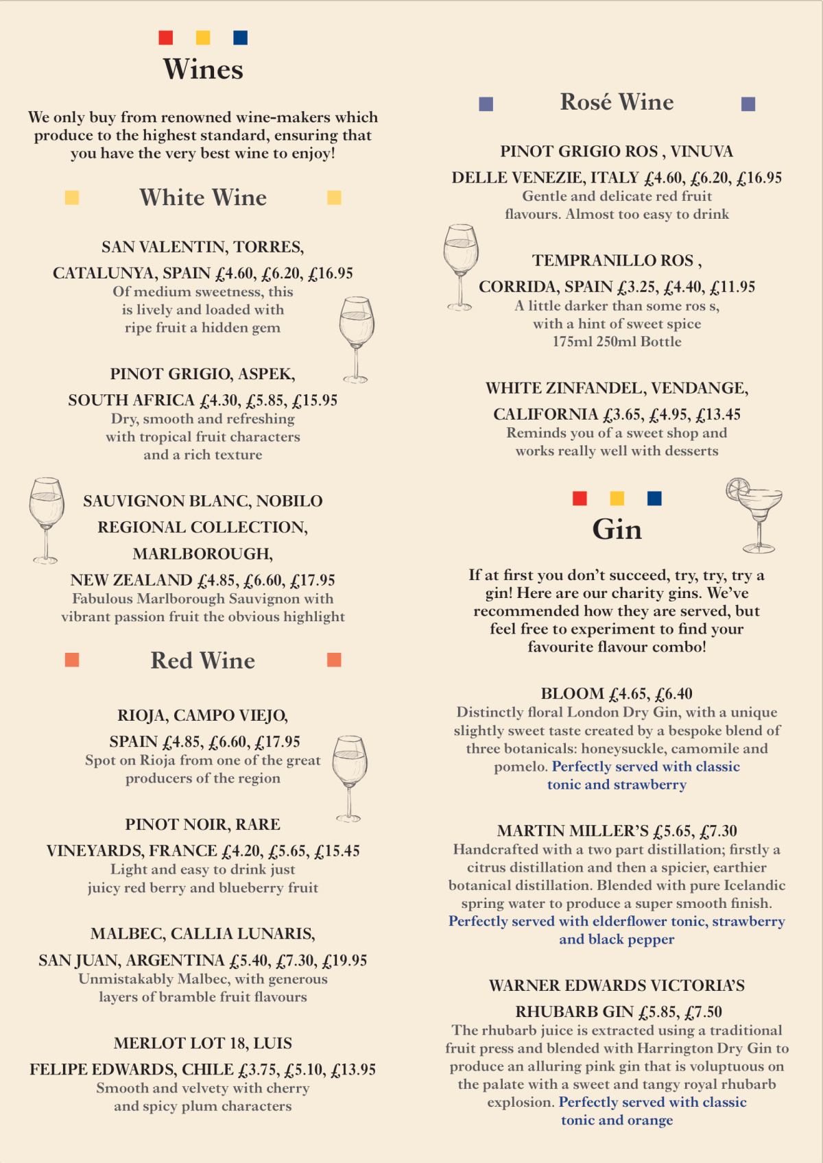
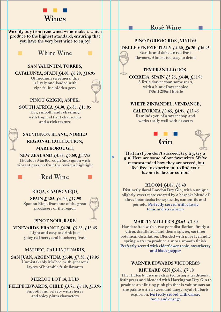
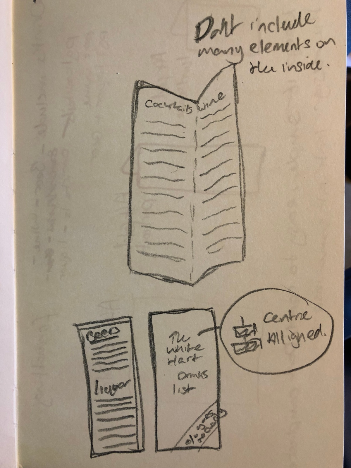
I decided to look critically into the placement of the illustrations now as they could clash with the text, a few pieces from the wines list did in fact clash or come too close to the text to I adjusted the placement of them.

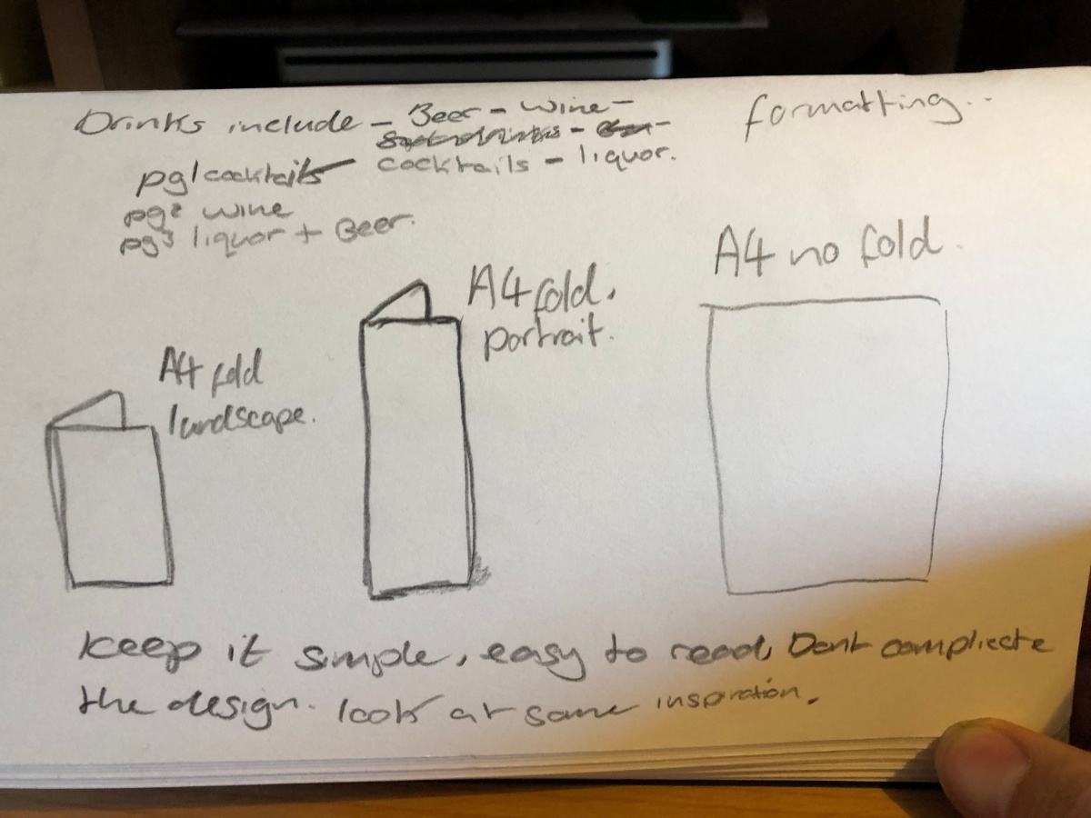
The reason why I didn’t include the glass sizes on the gins, wines and other spirits list was simply because I didn’t want the menu to become too crowded and the viewer could easily ask the waiter what the sizes are but they may even already know because, in the pubs main drink menu it has all the sizes labeled.

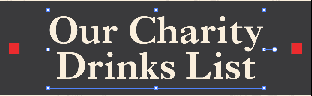
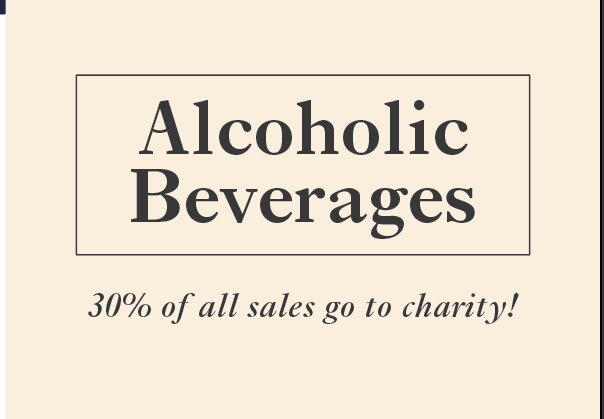
Why didn’t you just use their current menu and add icons to the drinks that were on the charity list? – I wanted this to stand out a lot as it was such a great cause and I thought if it was just a little amendment to their current drinks menu it wouldn’t gain much attention. Also all the other menus are dark on their tables, this one would strongly stand out with its bright colour which is also vintage looking, keeping it classy.

I will be going onto printing this piece and doing a final blog showing the outcome and the PDF. The print will be produced on thick card paper with a matte finish to stick to the formatting of the pubs other menus.


Designing the last page

Taking into consideration everything that was mentioned in my feedback I will now go on to completing the style by finishing off my final page which concedes of beers, ciders, other spirits and a small bit of information about the charity which links to the * on the front cover.

Screen Shot 2017-11-28 at 12.45.47

Keeping consistent with the new elements I have placed the formation of the squares the same to represent the main headings within the page.

Screen Shot 2017-11-28 at 13.37.56

Keeping the hierarchy approach of what I have used in the last two pages I’ve kept the importance of each bit of text very clear. The bio at the bottom is only temporary as that I do not know what the client wants to include in this part so I will have to ask her and she’ll get back to me.

As you can see that I have stuck to the feedback by keeping the text very visible, made sure that there is no loose wording around and kept consistency with the two brands. I also kept white space to the maximum.

Now I will be going through a few slight adjustments before finishing up such as the opacity of the illustrations throughout the menu. I will ask the charity for the information content and speak to my lecturers one last time before print just incase they notice anything that may slip up.


Feedback amendments

Here I will be analysing the feedback that I had got and I will be amending my menu to the standards of the feedback and also my own feedback on the menu.

change size of text at bottom of front page – The text could be a little too small to read for some viewers especially the bits that are a lot smaller than other areas.

Screen Shot 2017-11-28 at 13.11.32Screen Shot 2017-11-28 at 13.11.17

With this bit of feedback I amended it straight away as that this was in fact key to change as it heavily considered the audiences point of view. Increasing the text size a few more points made it a lot easier to see, and avoided the possibility of it not being seen easily.

Inside, make sure there is no lonely text hanging about – These bits of text can be seen as a waste of space, if there’s a word on its own drop a few other words down to bulk the line out.

Screen Shot 2017-11-28 at 13.31.13

Here I made my paragraphs more bulky by doing what Tim suggested to consider. Also referring back to my research in looking at typography in lists. It makes the document look a lot cleaner which isn’t surprising! I also felt the need to break up the page just a little more with some elements from the charity brand, because I said that the menu was lacking the brand.

Screen Shot 2017-11-28 at 12.40.17

Inside, maybe consider Aligning the text to the left – text to aligned to the left is usually to inform the reader.

Screenshot 2017-12-04 21.05.54.png

This bit of feedback didn’t really justify itself as it doesn’t look right. The balance is not right now and I feel it doesn’t go well with the consistency of the rest of the menu – ie the front.

The front page, Consider using a different title and look into whether or not to have all lower caps or caps lock on just the first letter of each word.

Screen Shot 2017-11-28 at 13.44.20Screen Shot 2017-11-28 at 13.44.02

Redoing this area of the front page has worked to make the title look somewhat equal. I felt it didn’t really work with the first word being the only one with its first letter capitalised.

Doing this has helped a lot and has given me some things to consider when it comes to finishing off the menu ready for print.


Experimentation on the inside pt 1

Moving on to developing the inside pages I will consider my findings about laying out text and will keep in mind my knowledge on leading and font sizes.

Going back to my blog from when the pub gave me their content I will start to lay out the text as followed.

I’m going to be keeping the font the same throughout because I want to keep consistency of the pubs brand alongside the elements that run the consistency of the charity brand. This will bring balance to both brands.

Below shows how I have placed in the text. I have made the title of the drinks along with the prices bold by keeping them a dark text and with the leading being fairly large to make it easy to read. The bio of the drinks are decreased in size but only by a couple of points, still being able to be read easily. I will check this though on a test print once I have finished this experimentation session.

Screenshot 2017-11-27 21.15.24

Here is how the leading and text size looks on the character palette for the drink bios.

Screenshot 2017-11-27 21.15.32

Though the layout is no where near to how I want it to look I went on further to laying out the text. Below is the result.

Screenshot 2017-11-27 22.12.06

I saw that one of the drinks on the list were in fact not suppose to be included on the list so I took it off. I made the background colour the same and chose not to put the pattern over it as that it would again clash with the content of the page. Instead I added a couple of the wine glass illustrations to the piece to add some flavour to it.

To help bring in consistency of the charity brand I chose to again, like I did on the front cover, lay the boxes aligned to each sub heading which was: White Wine, Red Wine and Rosé Wine. This was done to indicate each area of the pages. Below is the other page to the DPS that also included Gin as I had made space for it seeing as I had to still place the beer and other spirits section in on one page. Gin is also very fancy and pricey as well as wine so to keep these drinks on the same DPS I felt was necessary.

Screenshot 2017-11-27 22.41.52

I added an illustration of a glass of gin to the gin section only where there was a bit of white space, it was hard to find a slot for it because it was too text heavy but I think I found a good place for it and didn’t feel the need to add another one because then it would get too busy.

On the Gin list you can notice some blue text, this is to highlight the section of the bio giving their audience a suggestion on what they can drink it with. I chose blue as that it represents one of the charities brand colours. I chose blue because it is a friendly colour and easily visible. Red would become too dangerous looking and Yellow was too bright against the background colour.

Conclusion to these two pages is that the style works well with the font and elements within, it will most likely need looking at again as there will be a few issues with it as I can already see there is a fair amount of lonely text laying here and there. I will revisit this DPS after implementing the style from these pages on to my last page.

Experimentation on the front cover pt 1

To start off with on my design route I thought it may be necessary to style the charity’s logo in the same way I did with the drink illustrations. Below you can see that I have tried it out. I will be keeping that version on the side to see how it looks once I’ve finished my first design.

Screenshot 2017-11-27 18.47.25

I am going to be going for an A4 sized document that will be standing tall folded. This is to bring as much attention to is as possible because if you think about it, in pubs, restaurants, bars, etc today they mostly always have their drinks list the most biggest and visible menu standing on the table, because it’s showing the things that bring in the most revenue. It’s the same when they want to show offers.

To start off with, I wanted to make the front cover stand out and draw attention to the menu. I thought it would be a good idea to state what the menu is, what pub it is and what charity is involved, also a small bit of information to tell the audience what the menu is for.

Screenshot 2017-11-27 18.47.35

An ‘x’ was used to signify the collaboration of the two organisations. The font I used was based on the content of the pubs website. They seem to be a high end pub with a very modern approach as well as a traditional approach. I did search a few other fonts for this but this font had a happy approach to it as well as sticking to the style of the pubs brand. Thus leant the style of the menu a little towards the charity.

Having a headings style approach to this section worked effectively avoiding clutterness. Doing this created a hierarchy. I’m also placing this part at the bottom as that it is not so important as the title of the menu. People already know where they are.

Now onto the title, it had to stand out and be different to the bottom section. A good way to do so is to place a box behind the text and making it the colour of the other text that is on the page then inverting the colour of the title. The text colour matches the vintage warm colour of the background.

I did also experiment with making the title stand out more with placing boxes around it like so below, but came to a decision to not do this because it didn’t look right.

Screenshot 2017-11-27 18.48.33

As I can see is that it’s too harsh and not so natural with the font. Also with the piece of info below it it just made it look really bad looking.

Next I will be experimenting with how I could place the illustrations onto the cover to make the cover stand out and have some depth to it.

Content for charity drinks list from the pub

Wines

We only buy from renowned winemakers which produce to the highest standard, ensuring that you have the very best wine to enjoy!

White Wines

SAN VALENTIN, TORRES, CATALUNYA, SPAIN £4.60 £6.20 £16.95 Of medium sweetness, this is lively and loaded with ripe fruit a hidden gem

PINOT GRIGIO, ASPEK, SOUTH AFRICA £4.30 £5.85 £15.95 Dry, smooth and refreshing with tropical fruit characters and a rich texture

SAUVIGNON BLANC, NOBILO REGIONAL COLLECTION, MARLBOROUGH, NEW ZEALAND £4.85 £6.60 £17.95 Fabulous Marlborough Sauvignon with vibrant passion fruit the obvious highlight

Rosé Wine

PINOT GRIGIO ROS , VINUVA DELLE VENEZIE, ITALY £4.60 £6.20 £16.95 Gentle and delicate red fruit flavours. Almost too easy to drink

TEMPRANILLO ROS , CORRIDA, SPAIN £3.25 £4.40 £11.95 A little darker than some ros s, with a hint of sweet spice 175ml 250ml Bottle

WHITE ZINFANDEL, VENDANGE, CALIFORNIA £3.65 £4.95 £13.45 Reminds you of a sweet shop and works really well with desserts

Red Wine

RIOJA, CAMPO VIEJO, SPAIN £4.85 £6.60 £17.95 Spot on Rioja from one of the great producers of the region

PINOT NOIR, RARE VINEYARDS, FRANCE £4.20 £5.65 £15.45 Light and easy to drink just juicy red berry and blueberry fruit

MALBEC, CALLIA LUNARIS, SAN JUAN, ARGENTINA £5.40 £7.30 £19.95 Unmistakably Malbec, with generous layers of bramble fruit flavours

MERLOT LOT 18, LUIS FELIPE EDWARDS, CHILE £3.75 £5.10 £13.95 Smooth and velvety with cherry and spicy plum characters

Gins

If at first you don’t succeed, try, try, try a gin! Here are some of our favourites. We’ve recommended how they are served, but feel free to experiment to find your favourite flavour combo!

BLOOM £4.65, £6.40 Distinctly floral London Dry Gin, with a unique slightly sweet taste created by a bespoke blend of three botanicals: honeysuckle, camomile and pomelo. Perfectly served with classic tonic and strawberry

MARTIN MILLER’S £5.65, £7.30 Handcrafted with a two part distillation; firstly a citrus distillation and then a spicier, earthier botanical distillation. Blended with pure Icelandic spring water to produce a super smooth finish. Perfectly served with elderflower tonic, strawberry and black pepper

WARNER EDWARDS VICTORIA’S RHUBARB GIN £5.85, £7.50 The rhubarb juice is extracted using a traditional fruit press and blended with Harrington Dry Gin to produce an alluring pink gin that is voluptuous on the palate with a sweet and tangy royal rhubarb explosion. Perfectly served with classic tonic and orange

Beers & Ciders

As well as a great selection on the bar, don’t miss what’s going on in the fridges. Here are some of our favourites

BLUE MOON £4.70 Refreshing, medium bodied and unfiltered Belgian style wheat ale, spiced with fresh coriander and orange peel, served with a slice of orange

HOP HOUSE 13 £5.80 A crisp & full flavoured lager, with subtle malty notes and fresh hop aromas, with hints of apricot and peach

REKORDERLIG £7.25 Premium cider, first created in 1996 with the purest spring water from Vimmerby, Sweden, where it is still brewed today by bro Bryggeri.

SIERRA NEVADA £5.65 Its unique pine and grapefruit aromas come from the use of whole cone American hops

Other Spirits

With our wide range and passion for serving our whiskies (and whiskeys!) perfectly every time, why not try something new today.

JACK DANIEL’S £4.35, £7.00 Perfect with Coca Cola or on the rocks

JACK DANIEL’S TENNESSEE HONEY £4.55, £7.20 Mellow and smooth, try this with lemonade and lots of ice

HAIG CLUB CLUBMAN £6.55, £8.70 A sweet, light, single grain whisky, matured in bourbon casks, perfect with Coca Cola

First actions for 2nd APP project

My first initial actions for this project is to go to the sketch book and have a think on how I want to portray this menu. I want the menu it to be unique and different from other pub menus but then I want it to be easily readable.

Firstly I’m going to look slightly at how to format the menu. Most menus in pubs are A4 size, occasionally A3. Though the way it is laid out differentiates across many pubs.

IMG_1772

Here are the layouts I’ve been looking at and a little more in detail below. I’m keeping in mind to keep it very simple and big enough to involve elements from the charity and pub itself on top of the drinks list too.

IMG_1775

I will next be looking at the style The White Hart already have, looking at elements and type within their brand. I will also look at step by step school and what they are about, I already know because my mother helped set the place up!