Here I will be analysing the feedback that I had got and I will be amending my menu to the standards of the feedback and also my own feedback on the menu.
change size of text at bottom of front page – The text could be a little too small to read for some viewers especially the bits that are a lot smaller than other areas.
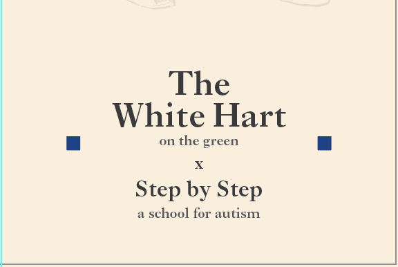
With this bit of feedback I amended it straight away as that this was in fact key to change as it heavily considered the audiences point of view. Increasing the text size a few more points made it a lot easier to see, and avoided the possibility of it not being seen easily.
Inside, make sure there is no lonely text hanging about – These bits of text can be seen as a waste of space, if there’s a word on its own drop a few other words down to bulk the line out.
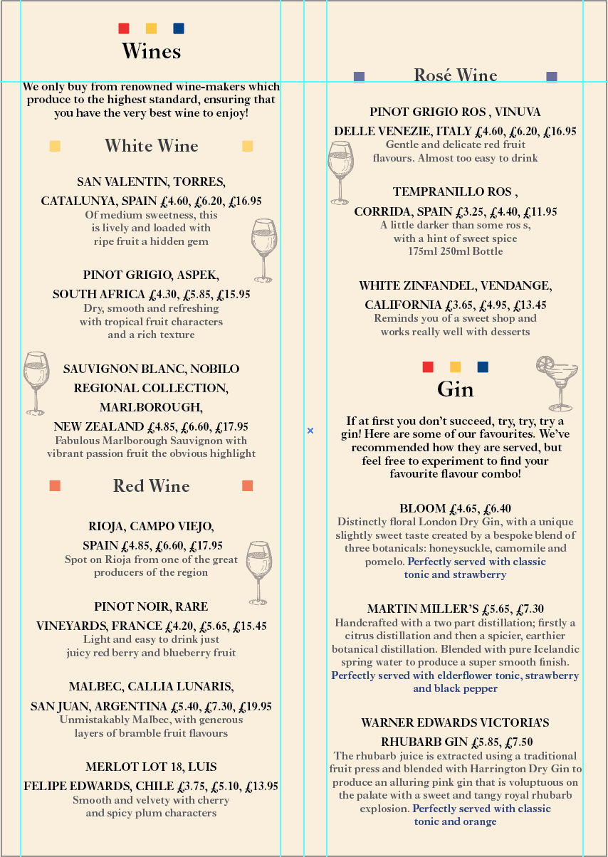
Here I made my paragraphs more bulky by doing what Tim suggested to consider. Also referring back to my research in looking at typography in lists. It makes the document look a lot cleaner which isn’t surprising! I also felt the need to break up the page just a little more with some elements from the charity brand, because I said that the menu was lacking the brand.

Inside, maybe consider Aligning the text to the left – text to aligned to the left is usually to inform the reader.
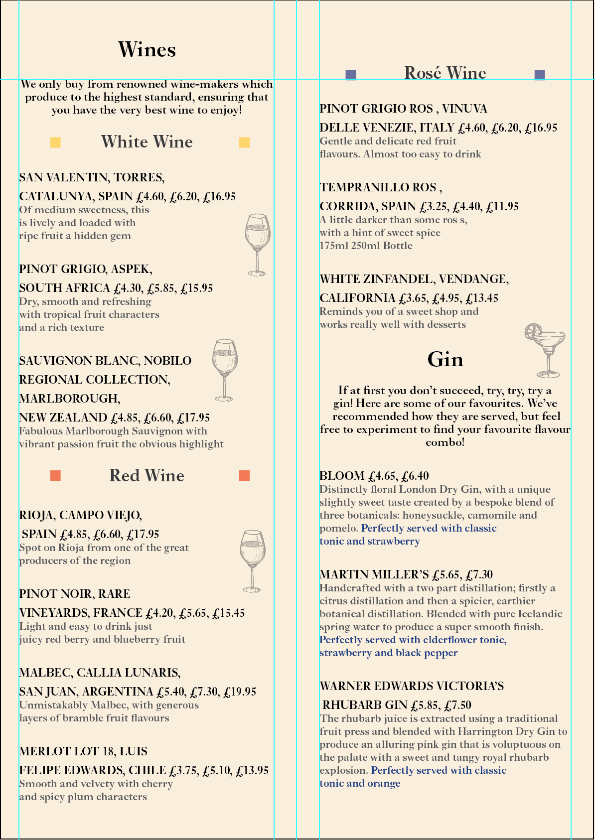
This bit of feedback didn’t really justify itself as it doesn’t look right. The balance is not right now and I feel it doesn’t go well with the consistency of the rest of the menu – ie the front.
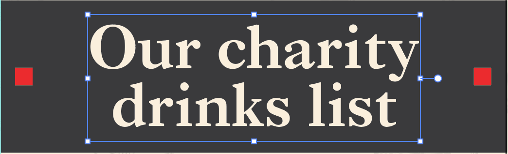
The front page, Consider using a different title and look into whether or not to have all lower caps or caps lock on just the first letter of each word.
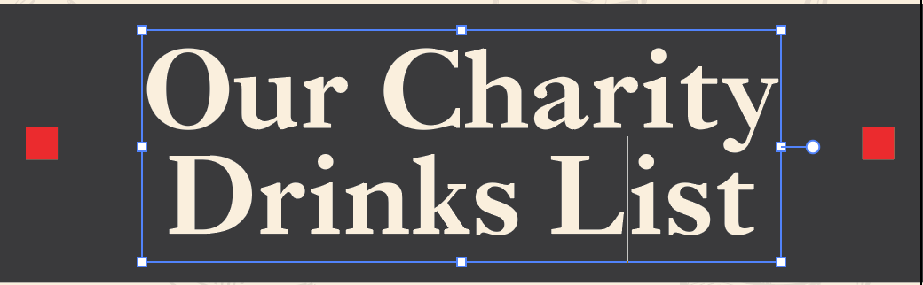
Redoing this area of the front page has worked to make the title look somewhat equal. I felt it didn’t really work with the first word being the only one with its first letter capitalised.
Doing this has helped a lot and has given me some things to consider when it comes to finishing off the menu ready for print.
