Moving on to developing the inside pages I will consider my findings about laying out text and will keep in mind my knowledge on leading and font sizes.
Going back to my blog from when the pub gave me their content I will start to lay out the text as followed.
I’m going to be keeping the font the same throughout because I want to keep consistency of the pubs brand alongside the elements that run the consistency of the charity brand. This will bring balance to both brands.
Below shows how I have placed in the text. I have made the title of the drinks along with the prices bold by keeping them a dark text and with the leading being fairly large to make it easy to read. The bio of the drinks are decreased in size but only by a couple of points, still being able to be read easily. I will check this though on a test print once I have finished this experimentation session.

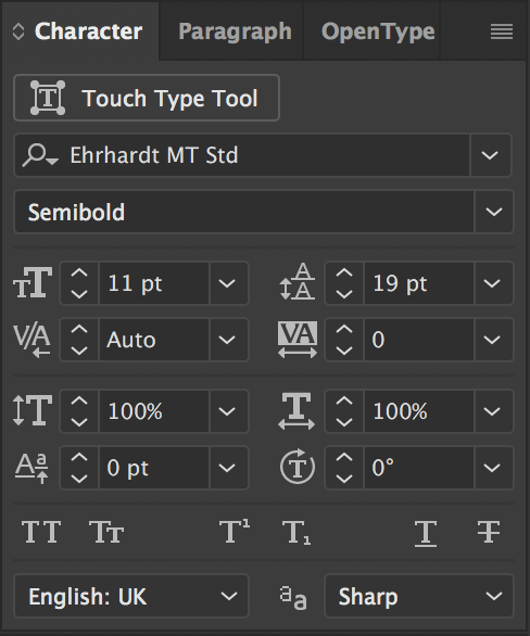
Here is how the leading and text size looks on the character palette for the drink bios.
Though the layout is no where near to how I want it to look I went on further to laying out the text. Below is the result.

I saw that one of the drinks on the list were in fact not suppose to be included on the list so I took it off. I made the background colour the same and chose not to put the pattern over it as that it would again clash with the content of the page. Instead I added a couple of the wine glass illustrations to the piece to add some flavour to it.
To help bring in consistency of the charity brand I chose to again, like I did on the front cover, lay the boxes aligned to each sub heading which was: White Wine, Red Wine and Rosé Wine. This was done to indicate each area of the pages. Below is the other page to the DPS that also included Gin as I had made space for it seeing as I had to still place the beer and other spirits section in on one page. Gin is also very fancy and pricey as well as wine so to keep these drinks on the same DPS I felt was necessary.

I added an illustration of a glass of gin to the gin section only where there was a bit of white space, it was hard to find a slot for it because it was too text heavy but I think I found a good place for it and didn’t feel the need to add another one because then it would get too busy.
On the Gin list you can notice some blue text, this is to highlight the section of the bio giving their audience a suggestion on what they can drink it with. I chose blue as that it represents one of the charities brand colours. I chose blue because it is a friendly colour and easily visible. Red would become too dangerous looking and Yellow was too bright against the background colour.
Conclusion to these two pages is that the style works well with the font and elements within, it will most likely need looking at again as there will be a few issues with it as I can already see there is a fair amount of lonely text laying here and there. I will revisit this DPS after implementing the style from these pages on to my last page.
