Here I will start to design my poster through Adobe Illustrator. I will be working on an A4 art-board and will be bringing in elements that I have been working on in the past few days.
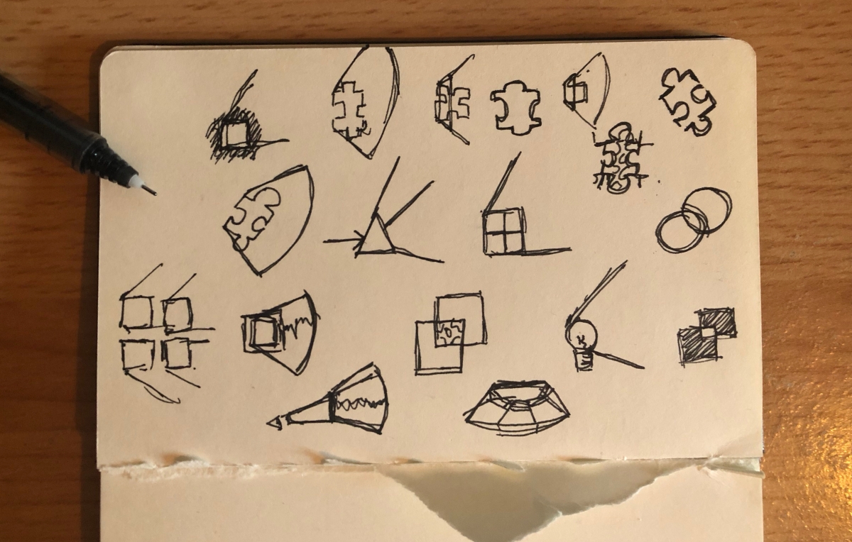
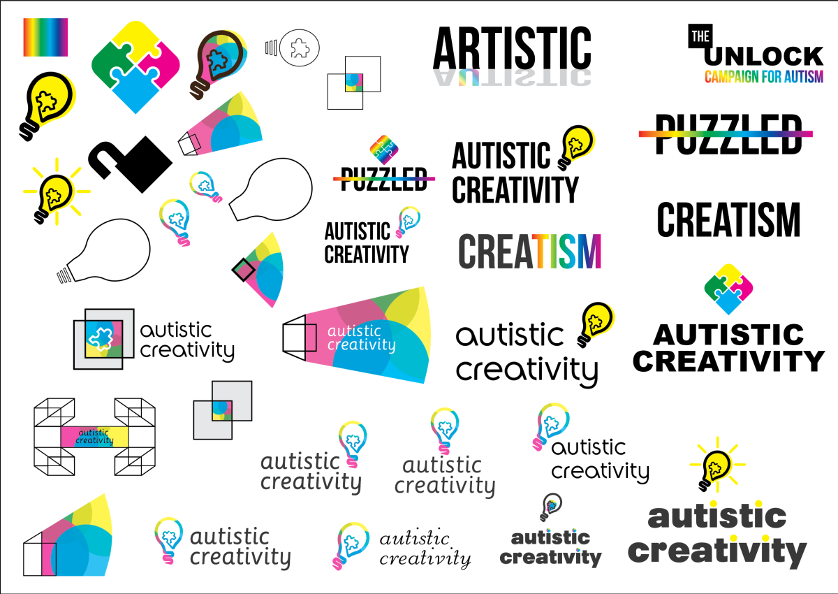
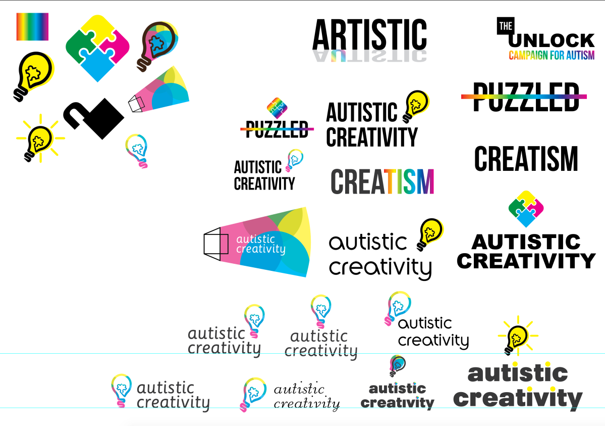
To start off I wanted to illustrate a piece similar to what I found while looking for inspiration and below is what I had come up with.

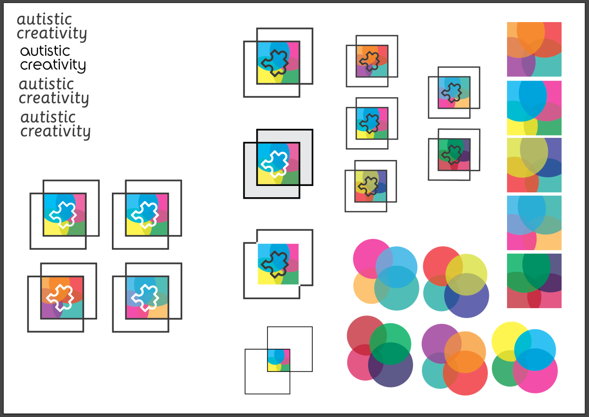
I designed this to look as if you were investing into the creative mind of an individual with autism. I really liked this piece and I liked the simple style of it and I am now going to go on to adding more elements, including the title piece.
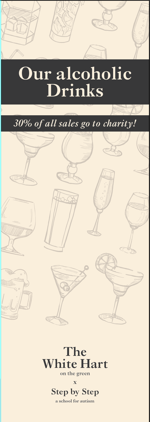
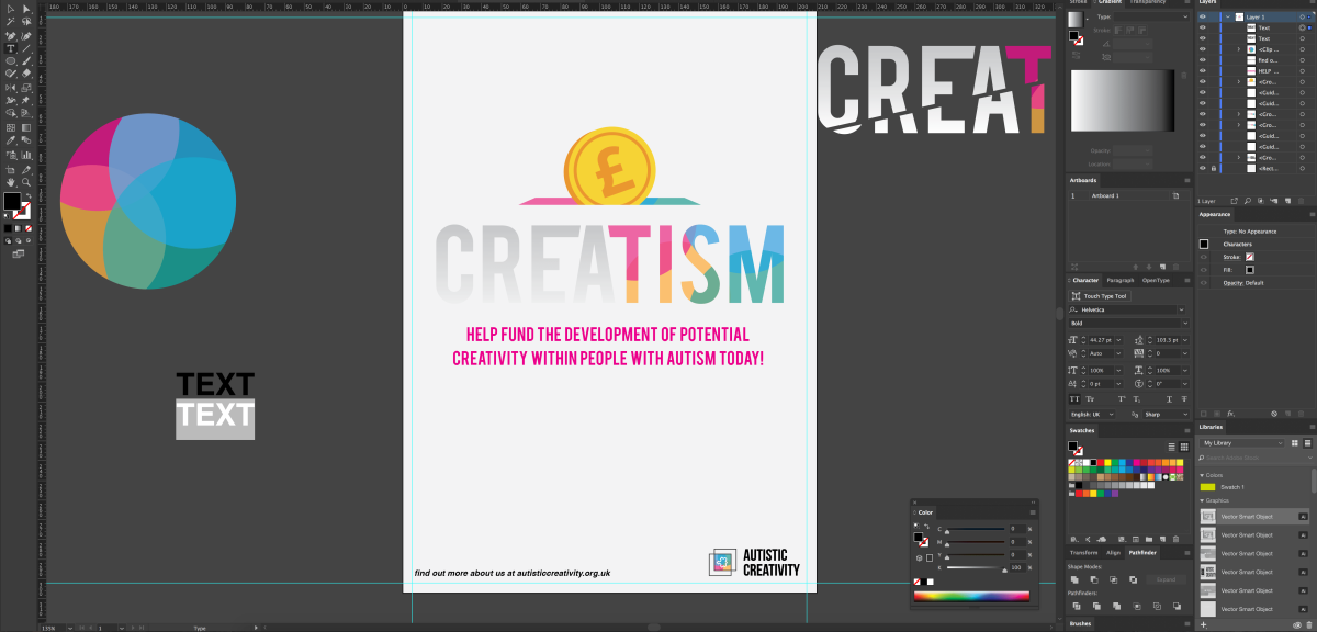
Below I have added the logo and some text to inform the audience alongside the title of the campaign. Now from here I feel that the coin illustration doesn’t actually fit the piece as much as I wanted it to. Also the piece of text below looks awful at the moment especially in that colour so I will be putting this aside as well as the coin illustration.
Now looking at the inspiration below I felt the need to include the element that would direct the audience on what to do in order to donate.
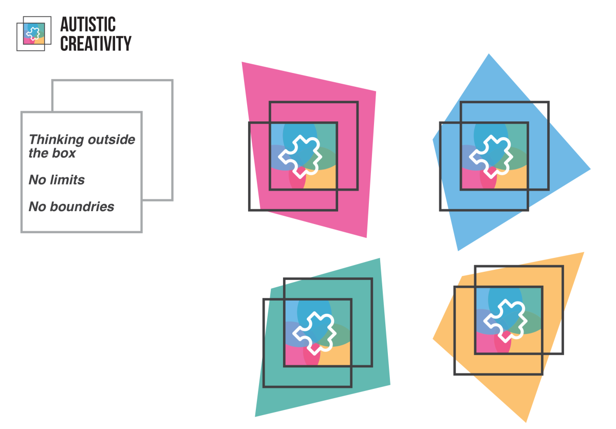
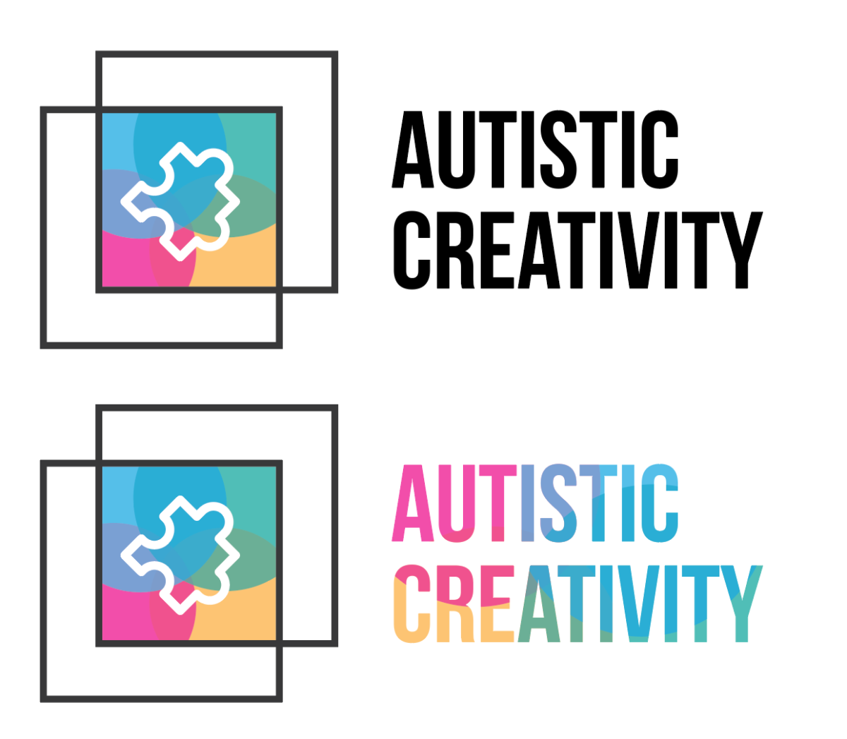
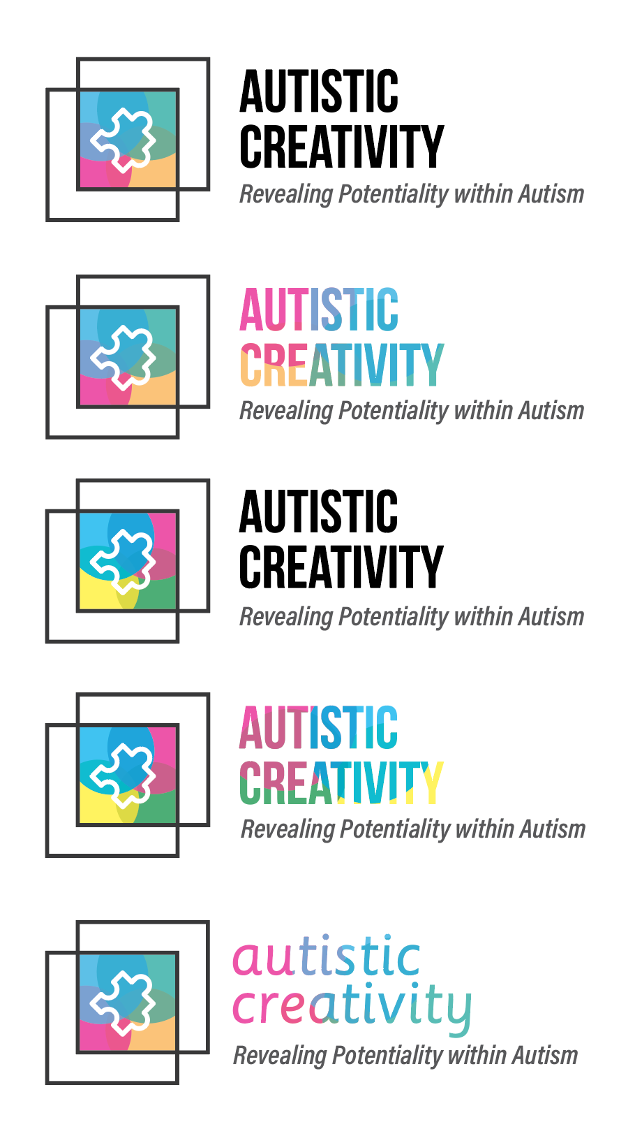
From the inspiration, I took elements from my logo and mixed it together to create something more striking towards the audience. I made two different versions of the “label” as I’d call it. Below are the two experimentations.
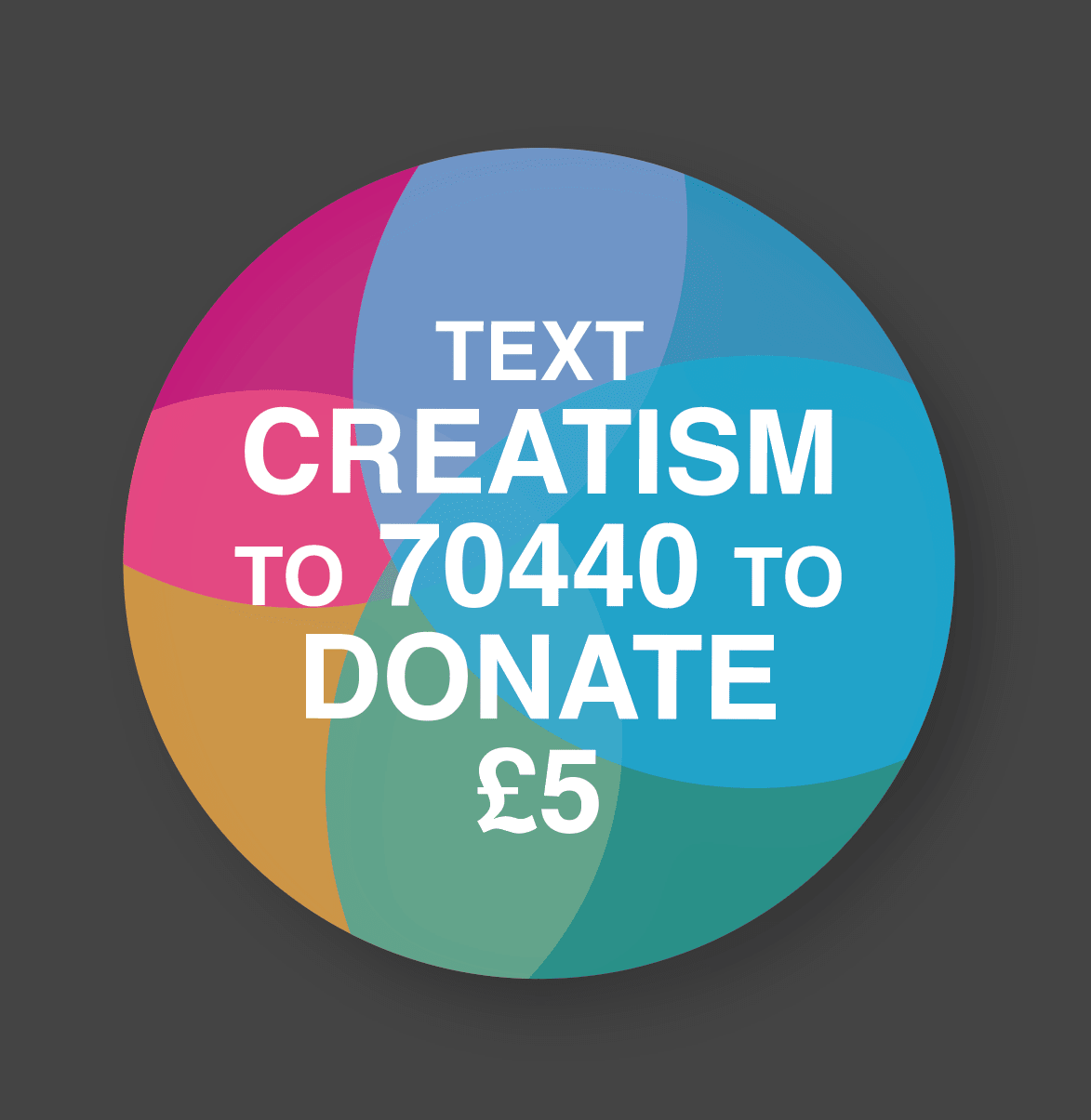
I applied a drop shadow to these pieces to push it out upon the other elements as this was a key part of the poster because it was the call to action from the brief.
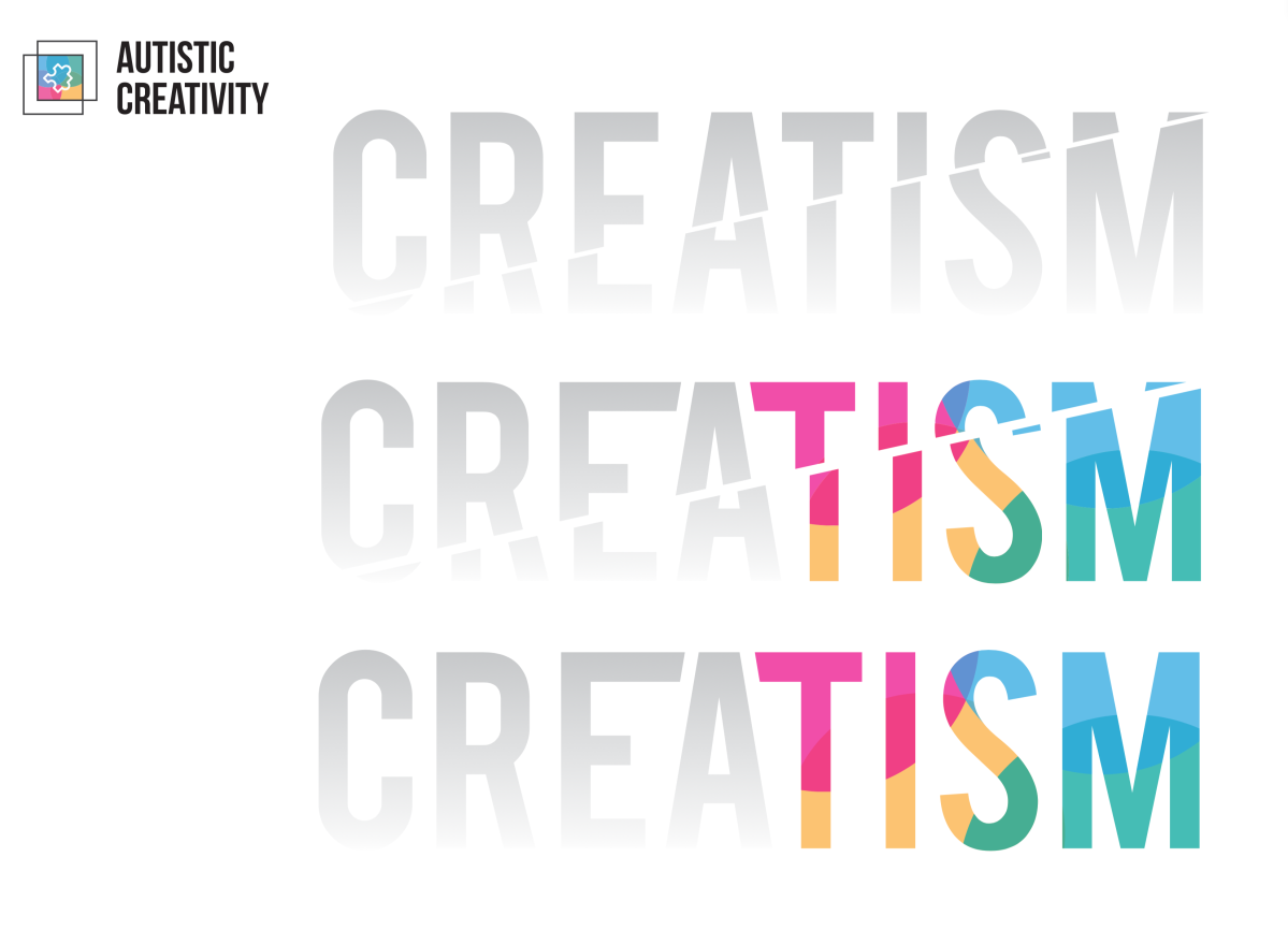
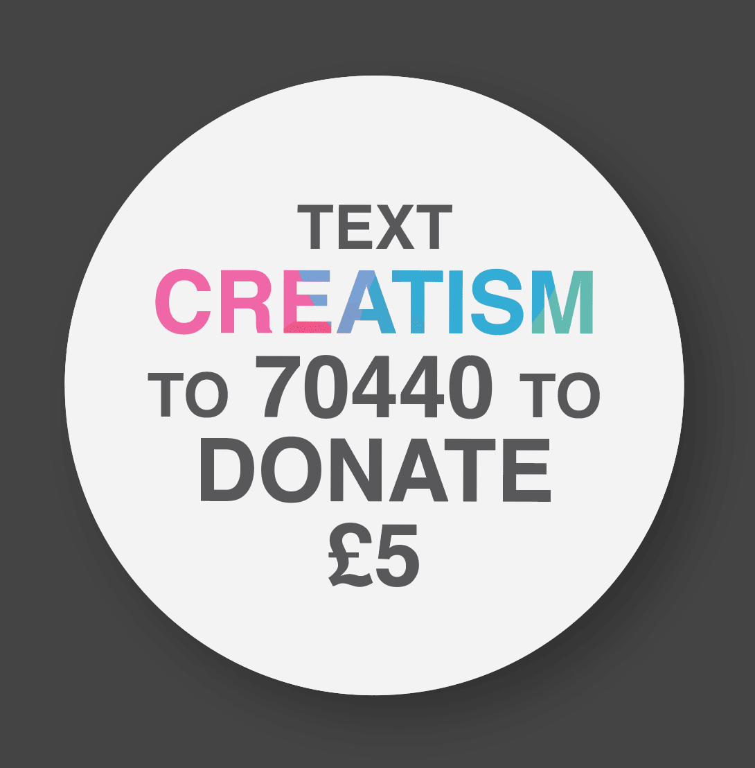
Now I decided that the colourful label was a little too strong and I felt it conflicted with the importance of the other elements too much so I had to dim it down a little. I thought it would be a good idea to mask the colours to the campaign title because then it would link to the style of the brand but still stay subtle in a way.
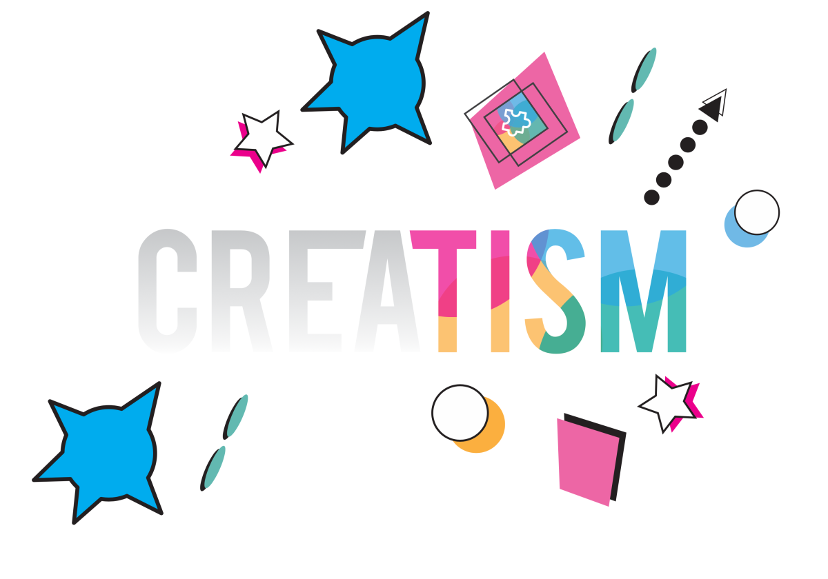
After placing this on the poster this is what I have got so far. I feel that there is still a lot of work to do but I’m not sure what that is. I also want to try and bring in the other elements but I will need to come back to this after a break.
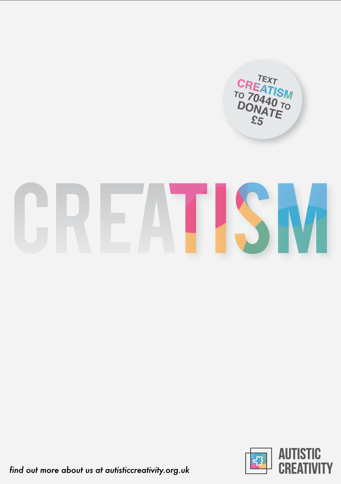
I also put a slight drop shadow on the TISM to push that out as well to show importance of the part of the word. I will be having a short break from this and will come back to it with a few ideas on what to improve on the piece. I will seek feedback and take advice from people. To conclude, I feel as if I am on the right track though I feel that I have hit a brick wall at the moment.