Burning the cups for display

Here are a few shots from when I was burning the local paper cups to signify the point being that all these big brands are killing off all these small individual businesses.

I think I went through about 3 cups that just went straight up in flames which was a bugger but the others where successful and I learnt to not keep them over the fire for too long. I wanted to go for a distorted look and not so much destroyed look as in… ashes! So what I did was I prodded them in the fire for only a few seconds, constantly checking for a charcoal look – blackened.

I experimented a lot with this part of the project and it was a pretty difficult and I did get burnt a couple of times but I guess no pain no gain! I will show the cups that were successful when I show our display. Next I will be showing my efforts in making the stencil for the poll box.

The fact sheet

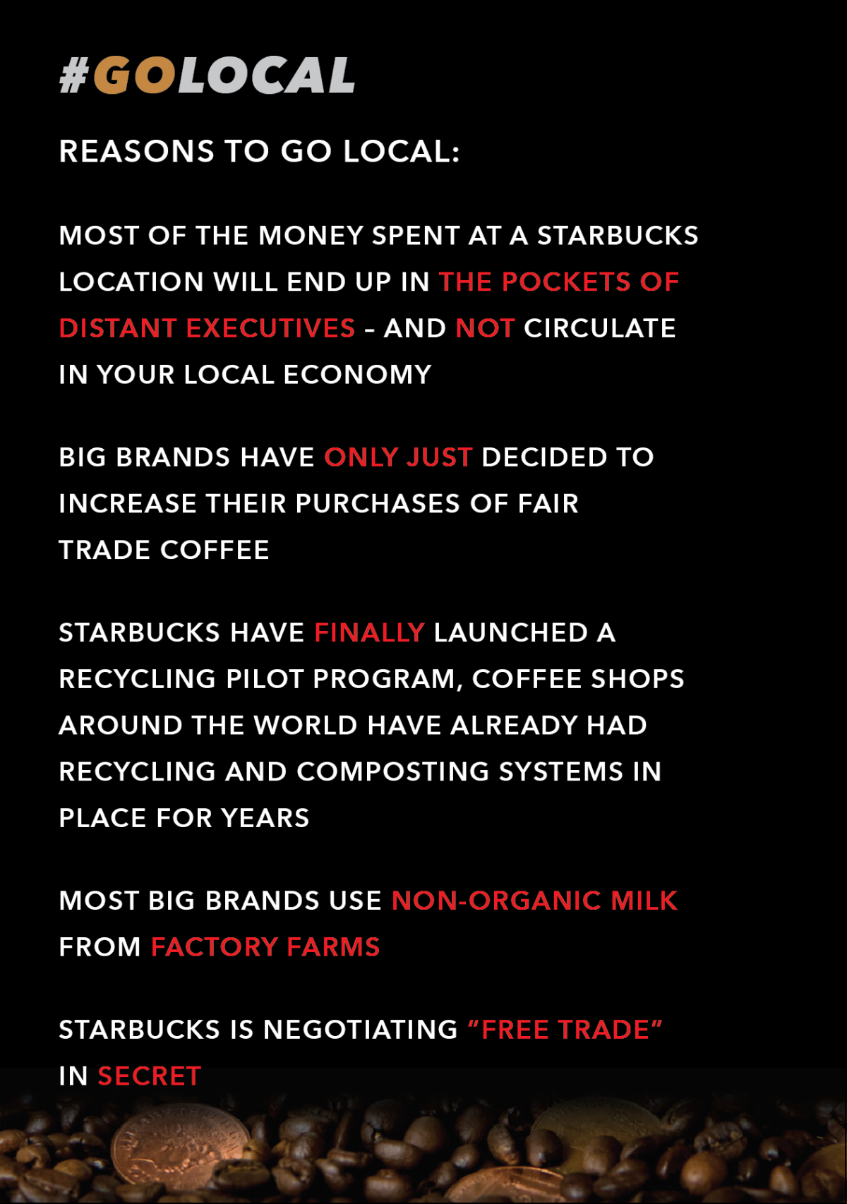
So from all the research we gathered as a team we then went through all the facts and took into account that they must relate to the poster. We heavily analysed the facts we had and kept in mind the amount of space we had for our display. I also thought of the audience, they don’t like things that are very text heavy and I feel text heavy things do not really start conversations but in fact informs people and that’s pretty much it. If you gave a striking image to spark conversation with a few facts it will work and attract better audience.

Keeping up with the consistency of the campaign brand and the elements of the poster here is what I had come up with.

Screenshot 2018-01-26 22.12.20

With the facts we’ve shown here we searched on lots of debate websites over coffee shops and mainly starbucks to link with the coffee cup within the photo. The information was hard to find but with the guidance of our tutor we managed to track down these hidden debates with slight ease.

As you can see in the screenshot that the text is clear and the font is within the font family of the logo (just not in italic). We didn’t put this in italic because when there’s bulk text in italic it is hard to read.

Keeping the campaign hashtag consistent was a huge must as it has been plastered all over our display, it should help stick in people’s minds. I dimmed it down a little for this piece of documentary because I did not want it to distract the eye too much… also I didn’t want people getting sick of seeing it!

The style of using red and white text was used again to signify bad things and highlight them subtly. This was because I wanted the style to be again CONSISTENT! The text was aligned to the left because the content was to inform the audience. The leading was spaced out a fair bit to ease up the eyes of the audience.

Having a very subtle lean again towards the poster was the use of having coffee beans at the bottom just to boost the link of our display a little more stronger. Next up I will be discussing how I got on with my stencil piece that I sprayed onto the shoe (poll)box!

Putting the poster together

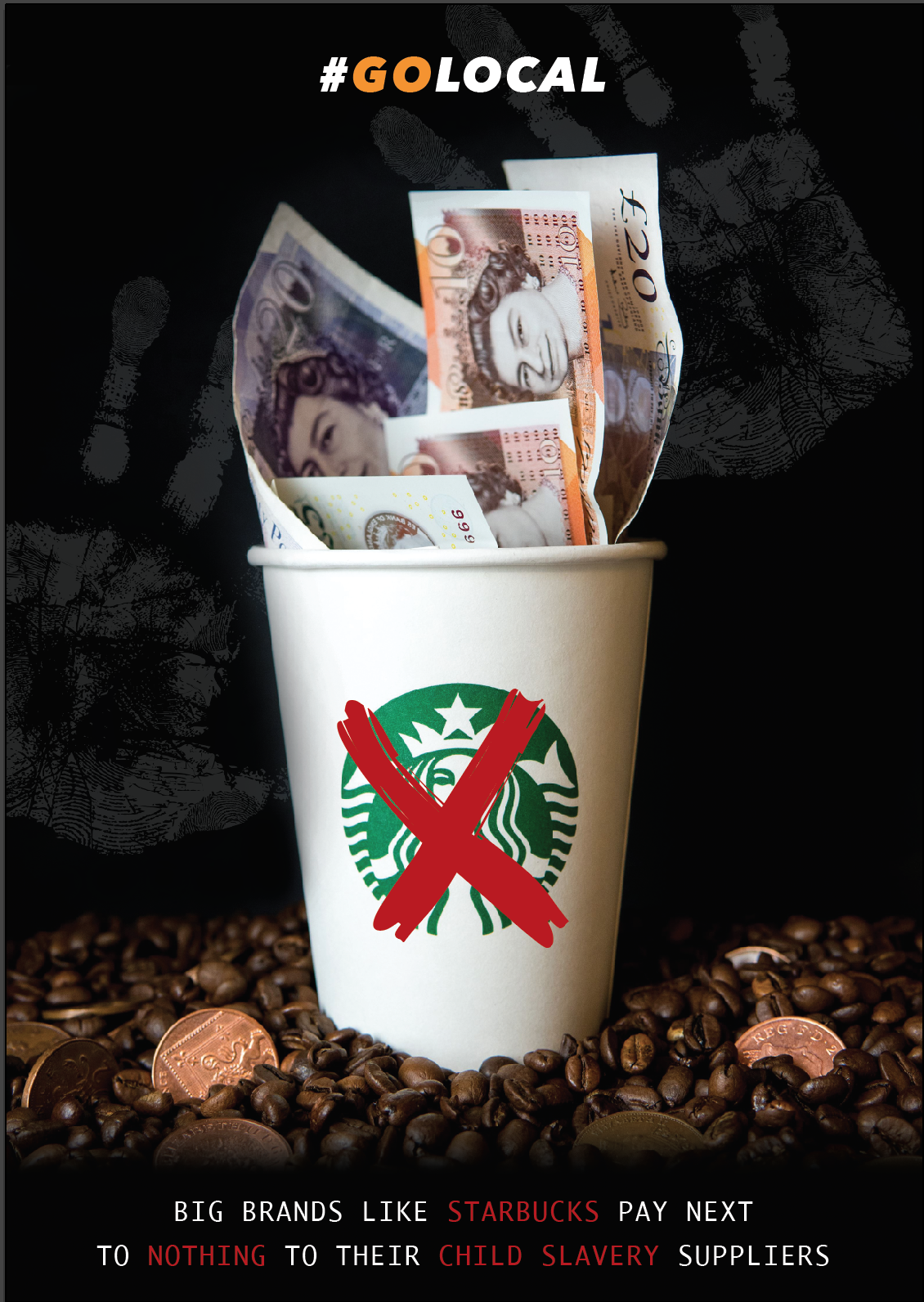
While I was working on the photograph and experimenting with the elements of it I started up Illustrator to see how the piece would potentially look. First things first was to bring in the hashtag and have it very bold but not too bold to clash with the photograph. I thought not to align it to the left nor right as that the photo itself was pretty central – it wouldn’t look right.

I then came up with an idea to put a cross through the Starbucks logo to signify people that they have bad ways. This first version was done before we thought of the idea to place the handprints in the background so the statement we had was not the final statement we came up with. This statement was just backing up the image as it is now by saying that big brands buy utterly cheap from suppliers.

Screenshot 2018-01-22 20.17.19

Changing the colour within some of the text was done because I wanted to emphasise in the red text to show that it is BAD. If the text was all just white it may look a little boring perhaps and I did notice that while I was designing the piece.

After asking some people for feedback we discovered that one person said that the text is all just a bit too “samey” – it’s too much of the same font. We weren’t so sure on their opinion but we did try other fonts and the closest I got to liking was the one below. I liked this one slightly because it did kind of match the rest of the poster and other font. Also it looked like a font that is used to present serious facts.

Screenshot 2018-01-22 22.22.32

I soon went on to feel that this typeface wasn’t great afterall and after asking the group I felt the need to move back to the other font. This is because I thought it didn’t actually match the poster and other font in the end and the font was to thin and didn’t flow with the poster very well. I know that the other font could have maybe been used too much and we could have had a secondary font but for such a small start up campaign, I didn’t feel it was necessary.

Screenshot 2018-01-22 20.19.45

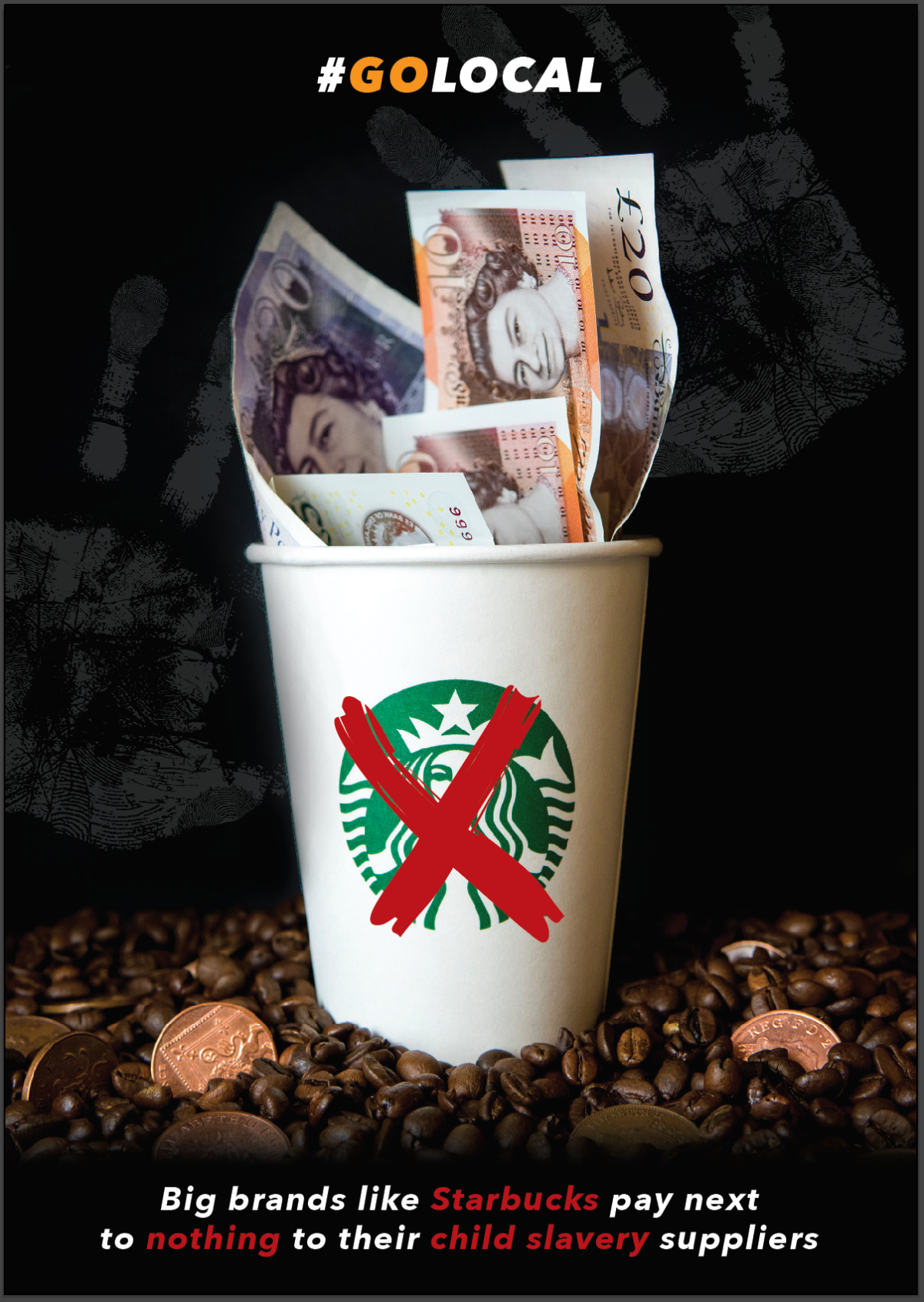
Here is the final version that will be printed on A3 on a gloss sheet which will then be hung up in the cafe in our University. We are all happy with it and will improve on it if need be after feedback from the audience. Next I will be looking at creating a fact sheet to go with our display just to back up the golocal point very heavily. We will keep this consistent with the style of what we’ve got so far.

Retouching the photography

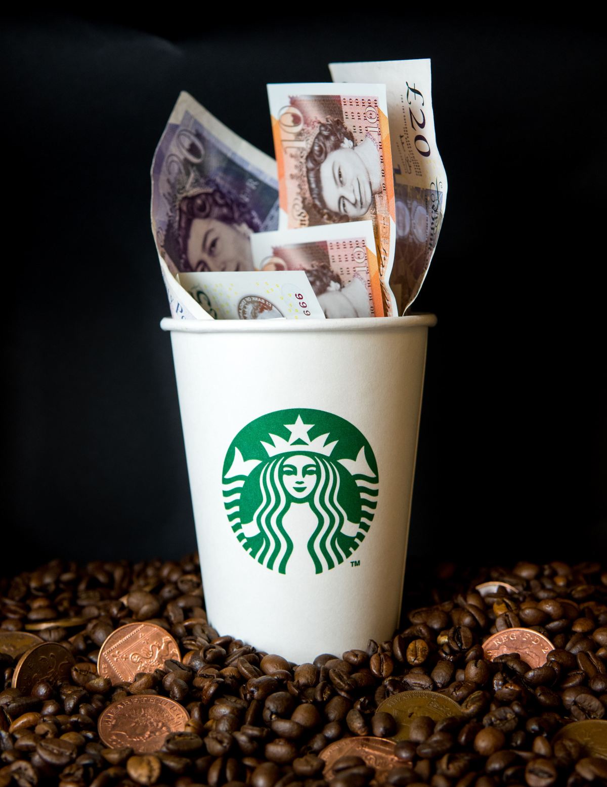
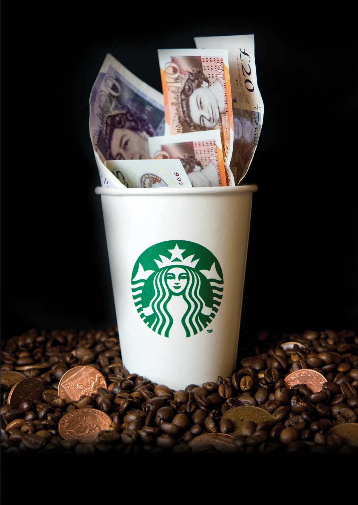
When it came to editing the photo it was easy to spot some obvious areas within it to clean up on. Below is the original. I could have left the smokey looking mark in the backdrop on the top left to add a bit of effect but didn’t feel like it would work and it just looks rough.

27265014_1695890887098925_211482007_o

With this photo I thought that the lighting and the colours were all up to scratch and didn’t really need editing which is a great advantage to when it comes down to photo editing, as much as the photo is perfected in the shooting stage, the less work will need being done to it in the later stage.

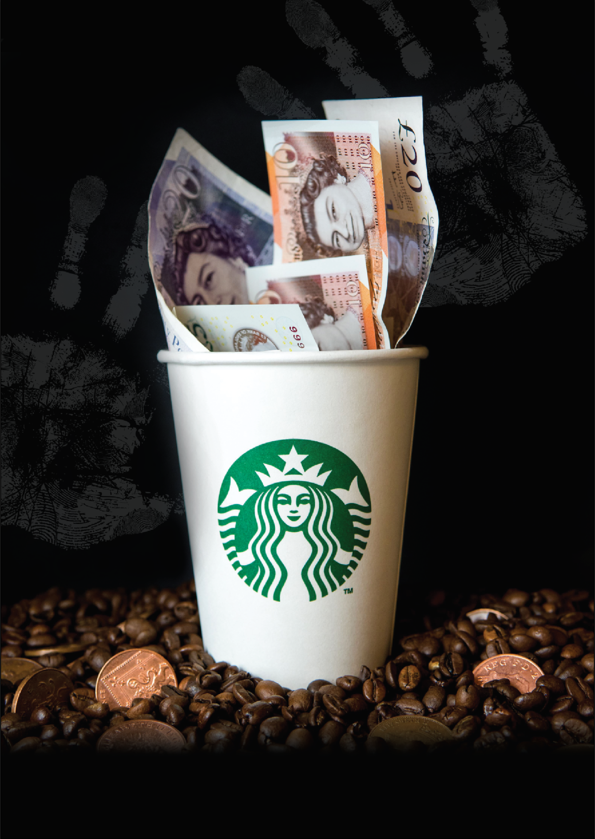
Slightly visible in the image below I have used the retouch tool to get rid of marks on the cup itself and the notes coming out from it. I did this because I wanted to make the photo look almost too clean especially with the cup that is the thing thats transacting the message of the poster, so we start off with the dirty coins merged into a pile of coffee beans to signify the poverty of the suppliers, along stomps on top of it is a big, clean Starbucks coffee cup overfilling with clean, fresh notes upon notes showing their huge profit.

Screenshot 2018-01-25 17.50.13

The message within our poster is trying to tell people to go local and that coffee shops such as Starbucks do in fact use child slavery according to this source, https://www.theodysseyonline.com/5-companies-using-slave-labor the post was published in June 2017 so it is pretty recent. To show this point ever so subtly, I thought of the idea of having hand prints in the background to show that child slavery is behind the scenes of the process. Having the handprints placed behind where the big money is also signifies that they should be getting more money.

Screenshot 2018-01-29 19.59.38

Howard Schultz is the executive chairman of Starbucks and is American meaning that a lot of the profit is going to him who is not local at all to a lot of areas. Starbucks and other coffee shops do try and come together with local communities but they don’t really bring attention to the point. Anyway that’s not the point, big coffee shop brands have destroyed local businesses and don’t help the community as most shops don’t employ locals.

Going back to the topic of editing the photo, I considered that there will be a bit more content on the poster such as some text and maybe even a cross through the Starbucks cup to back up on the fact to signify that people should stop buying from them.

Moving on to the next stage I will be looking at putting the other content into play, looking at different typefaces to match the style of the campaign logo.

Polling design

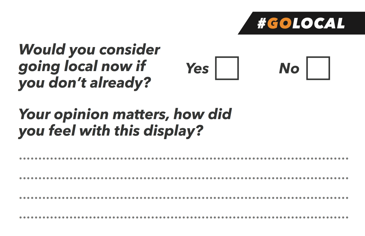
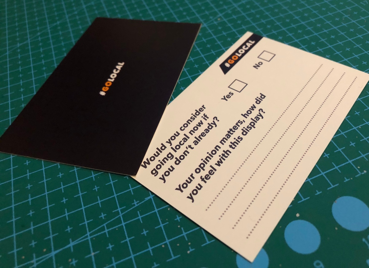
As a group we decided on having something similar to a poll box to collect feedback from the audience. This was the first piece of design that we were going to make for the display so I had to make sure that there was a style of some what. Like I said in the previous blog I had already sent a piece out to get printed… well this is it. These were to be printed on business card sized to be convenient and to be able to fit into a poll box with ease. The question we want to ask the audience is simply “how did you feel with this display?”. We also wanted to see if our display worked in anyway so we wanted to put a simple yes/no question asking if they would now consider going local if they don’t already?

We felt that the size was perfect for these 2 questions and we are only after a small sentence on the feedback that we will possibly get to see for any potential patterns within the feedback.

Below is the back of the card being simple yet bold and sticking to the campaign identity of being white and orange on a coloured background considering that the photo that is being taken for the poster is going to be on a black backdrop.

Screenshot 2018-01-26 21.23.42

Keeping with the style of the campaign I chose to go with the same font for the questions only a little lighter to expand the choices for when it comes to the poster. The italics used in the text surprisingly work well and signifies going forward to a better future I feel. I like using italics to express words that act upon creating a greater future. The use of the dotted lines was to give guidance to the audience giving them the idea on how they should answer the question but still giving them freedom with what to write.

Screenshot 2018-01-26 21.24.33

Keeping the hashtag title consistent by putting it on the back also helps to drill it into the audiences mind, to make it stick to their minds as it is also such a easy saying. I did some test prints to make sure it was all in working order and that the spaces within the dotted lines were big enough to write in and they were. Below is the final outcome and the printers I ordered them from were fantastic with their express delivery with no extra charges!

IMG_1985

Next I will be looking at editing Nicks photo in photoshop just touching up a few areas here and there.

Starting to think DESIGN!

So as I had mentioned before, here I will be discussing about the decisions we made as a group and will be critically analysing our brainstorming and each of our individual skills so then I can kind of take control in the design process.

The idea was as followed, to include a photograph of a Starbucks/ Costa or whatever cup filled with notes and beneath a pile of coffee beans mixed with pennies to signify that they pay so little and charge extortionate prices for their beverages. This would be portrayed as an A3 poster we had decided, this is because it had to be a bold piece and included some detail within so it had to be printed large for clear understandment. We also discussed about including child hand prints in the background but very faintly to lean towards the fact that some companies use child slavery.

To make the piece more physical we were to get some local coffee shop cups and burn them to show that they are dying because of the top branded coffee shops branching out everywhere. These cups would all be laid out on a table either underneath or next to the poster of the display depending on our layout. We found out that we will all be present with the display so we can recommend local coffee shops to go to. We are also going to include a poll box for people to write down feedback and feelings about our display.

From group brainstorming and discussion along with looking at the others work from previous projects I grew to understand each and others strengths. So we have Nick who is fantastic at photography from HND 2, Sam who is from HND 1 with skills in illustration and crafting and Lena who is from the BA who strongly works well with animation and typography. Unfortunately all members weren’t present for the past week so we didn’t get much input from the group as a whole.

So it was pretty obvious who we had doing what job within the project, We had Nick set out to gather some coffee beans, a Starbucks cup, some pennies and a makeshift set up for his photoshoot. Below is his set up along with a RAW image of what he had shot before editing.

I had told him to experiment a little with different angles and layouts of the elements within the photo but I was extremely pleased with the first image that he shared with us and I think we will be sticking with this image. There are a few areas to touch up which I will go on to do within Photoshop and will make this evident in a post yet to come.

Sam was given the task to get a shoebox and turn in into a poll box for our audience to engage in our display. Also assigned to Sam, Nick and I was to find out a little more information. I have to admit I hate researching but felt it was only fair that we all did a fair part of it.

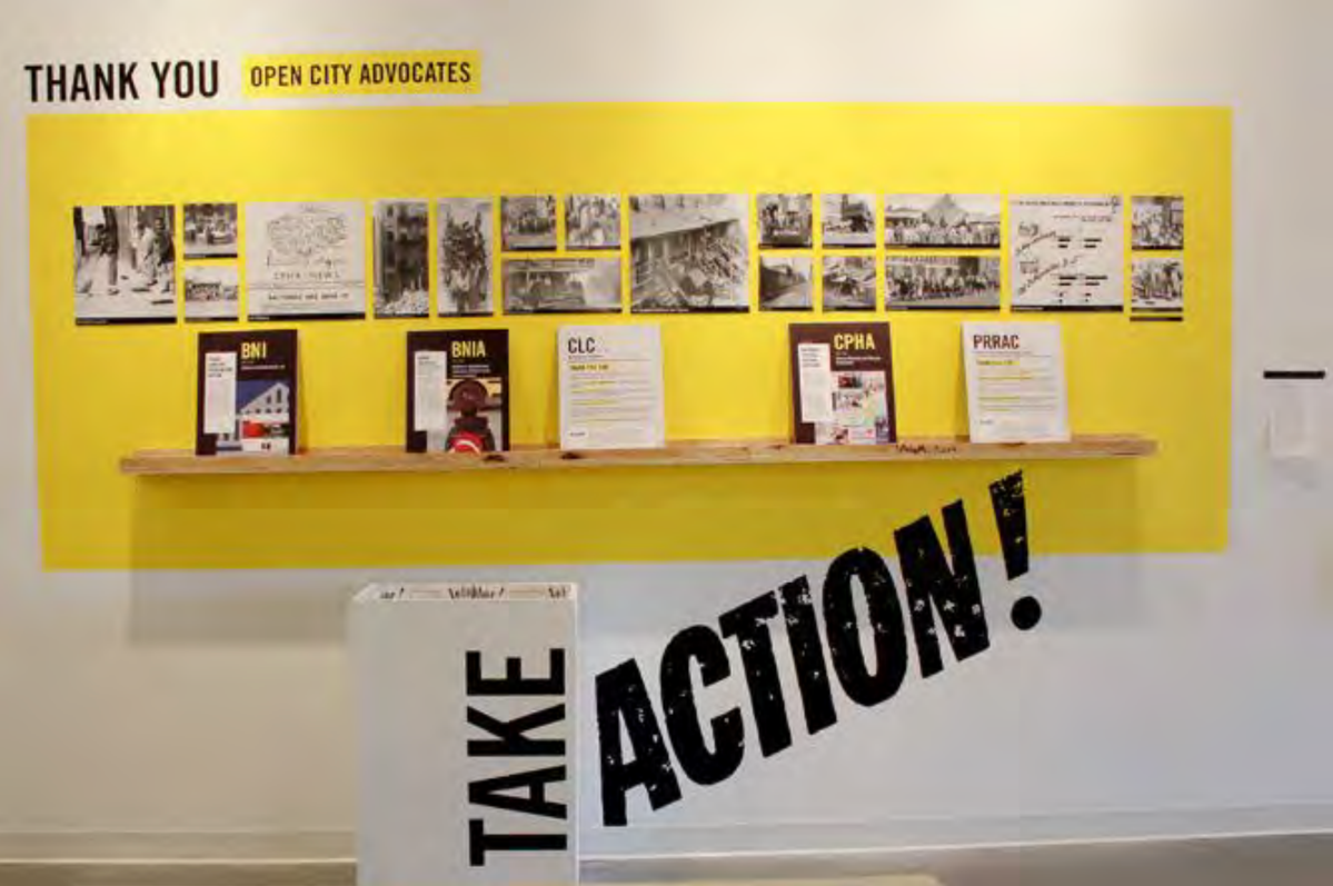
During this time, I on the other hand was designing our campaign and how we’d approach the issue. I wanted to go for something strong and powerful that could be used on social medias so it had to be a hashtag of somewhat. I had in my mind a very straight to the point hashtag being simply #GOLOCAL which I then introduced to the group and they loved the idea so we stuck with this. I went for this idea after seeing the display below because it’s kind of forcing people to do something to change something for the good. This was useful and worked as good inspiration for the title of our campaign.
Screenshot 2018-01-12 14.06.02

At first I looked at just having a black and white thing going on shown below with a nice big bold type to really stand our piece out. But then I noticed with all the text in white it may cause some confusion as to what the hashtag says so again I went to the display above and looked at the colours used within and went for a striking yet friendly colour being orange.
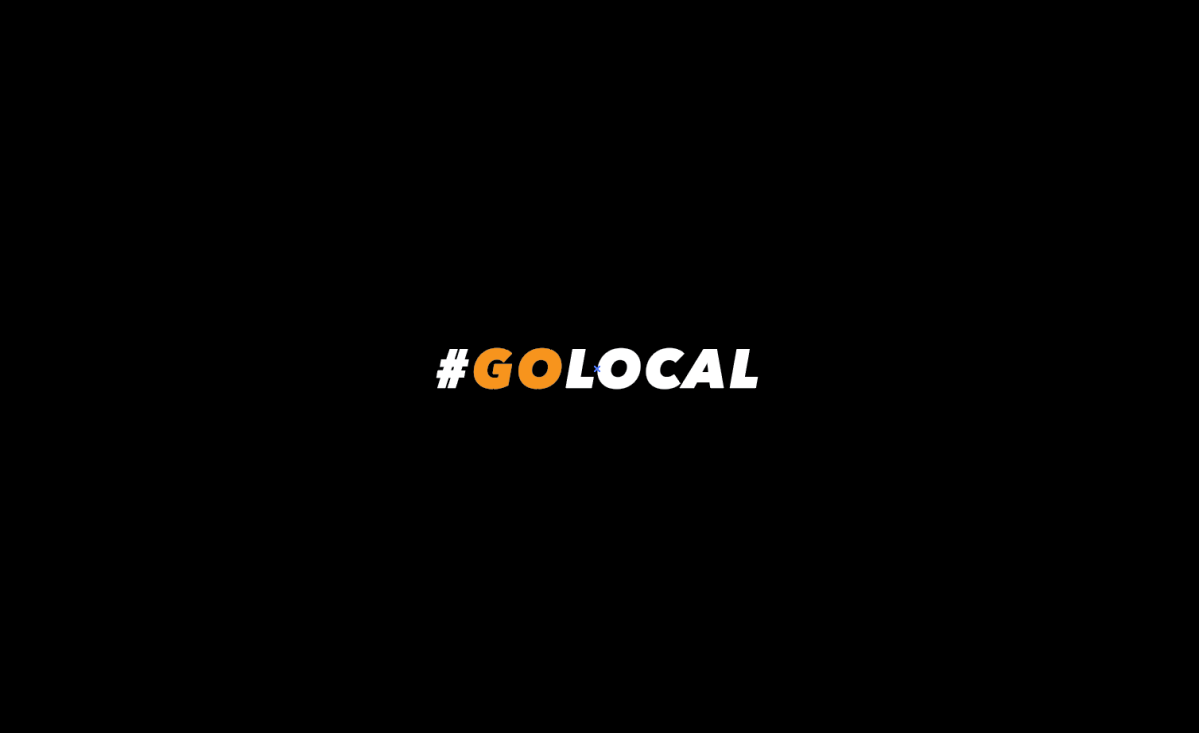
Screenshot 2018-01-22 19.57.14Screenshot 2018-01-22 19.56.56

Here has solved the issue of confusion. After showing my lecturer Sancha, she recommended that we don’t print on black as it will use a lot of ink and if we had to photocopy more then it wouldn’t be good for the environment. Usually I’m one to take advice but it was too late as I already had sent something out to print by the time she gave me the advice – lesson to learn, don’t get too carried away and always ask for opinions first. I feel we won’t have an issue with the print outs as that I ordered 250 pieces just to play it safe.

Within the title I went for a very bold font to catch the eye and match with whats soon to come the striking image. The kerning was a little too tight at first so I spread it out a little just about making sure that none of the characters overlapped. It’s is all in caps to gain attention as that it is telling the audience to take action, to do something, just like the open city advocates display.

Next up I will be showing my design process of the polling system which was assigned to me. I will be implementing the logo into the piece and I will discuss how I will be trying to design ethically.

Moving on

Moving over to finally piecing together a solid piece of work our group decided to brainstorm some ideas and started to think on what and how we should work on our display. Our group was a person down but we were still strong and confident to carry on short and let our other member know as soon as she was back.

So my new idea didn’t go to plan because I had been thinking about it for a while now and I really thought that it probably wouldn’t work because we are pretty short on time unfortunately. The idea was to be a video piece that is available to users when they go into a supermarket, the video directs the user through a virtual reality of a market street in London full of good vibes and friendly faces. The video will guide the viewer through the market street on the phone and making sure that it is safe to in the audiences whereabouts being a supermarket full of doom and gloom. I thought this would be a fantastic way on getting people to convert to going to farmers markets instead of big named supermarkets.

I loved my idea but unfortunately I felt the rest of the team wouldn’t be so sure on the idea. I’m not fussed though as I would like to work on something like this in the future as I feel it would probably take a huge impact. Also a lot more time would be needed to put into it and I also considered everyones learning outcomes and thought it would not work in their advantage.

Moving on we told each other how we wanted the final piece to look like, we wanted it to stand out from the others, be bold and striking, start up a conversation. So we came up with an idea to focus on the subject we had picked a few days ago and strongly focus on the point to get locals to get their coffee from independent traders instead of the likes of Starbucks and Costa.

We had to find facts and fast to get people to want to change where they go. We done some group research and found some interesting facts about how money going into big brands such as Starbucks is ending up in the pockets of distant executives, not the local economy. Also how big names have only just decided to increase their purchases of fair trade coffee when they are earning millions. And another one I thought was needed to be seen was the fact that Starbucks uses non organic milk from factory farms.

Moving on from finding some facts I will critically discuss our methods of designing our display and marketing our campaign in my next blog.

Experience Design and creating a game for practise

After looking at ZombieRun! we were then informed by our lecturer that the technical term for the type of design was known as experience design.

Experience design comes in many ways which include: Everyday, Recognised and Group memory. It can be portrayed as such, Active engagement in a physical sense, not just mentally. Loss of ego (self) and boundaries – no agenda (like an aesthetic experience). Designing for the experiences of others is like choreography or staging a show. Specific experienced cannot be guaranteed (like Intentional Fallacy). Experiences live (“read”) beyond the object/artefact. Fluidity of experience and how it unfolds: – stages – time – narrative – intensity – objects – spaces – textures User co-designs or there is collaboration = interactive in some way.

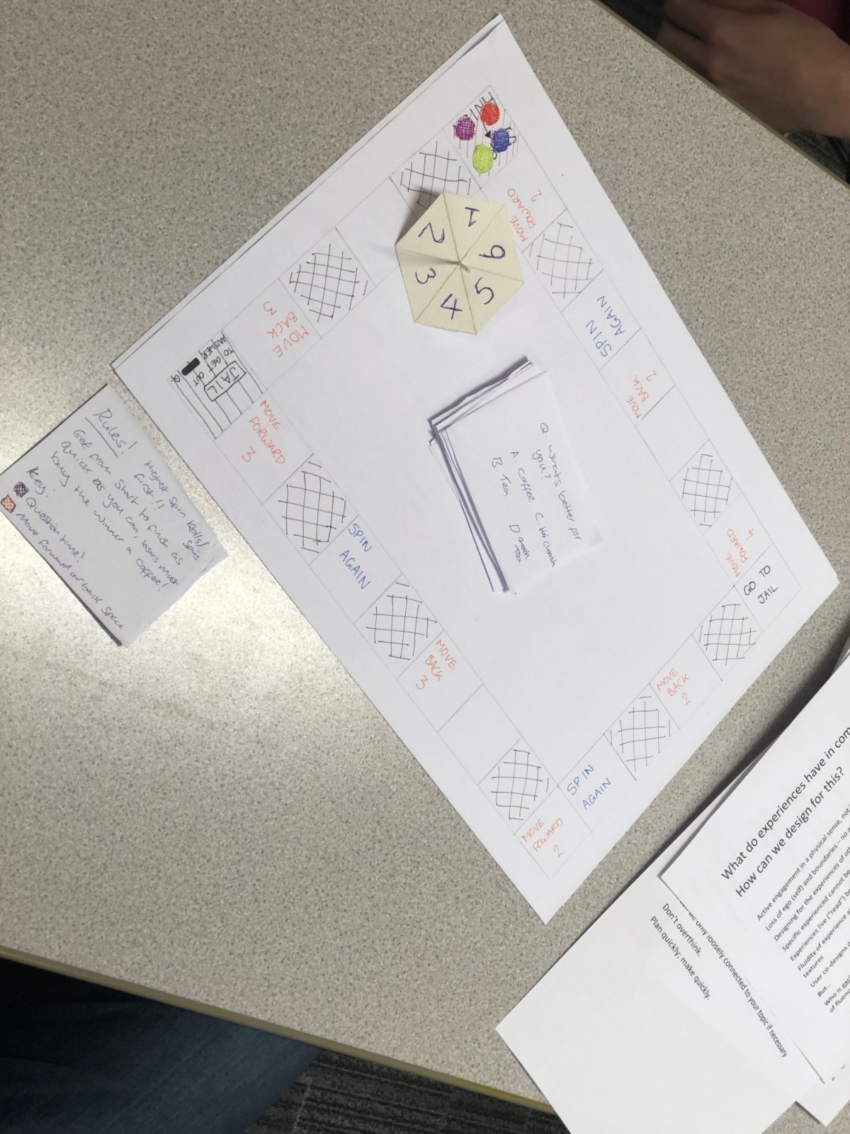
In order to help us think in this designable way we were then given an objective to create a game to inform people about what our display was going to be about. We decided to go with a nice easy board game similar to the well known monopoly game as we only had 40 minutes to think of something and prototype it. Ours was made up of a few different types of spaces including, Go forward spaces, Go backwards spaces, Go to jail spaces, Jail spaces and Question spaces. We gave the audience motivation to win by saying that the losers would have to buy the winner a coffee from our local coffee shop.

The questions were all to do with coffee and there were a few interesting facts within the pile of questions thus if correctly answered would move the player more steps forward to win. Here is a visual of our BETA board game.

IMG_1930

Below is some feedback we got from people acting as persona’s which would help for our future display and we will look back on these reflections to make sure there is no confusion in our display.

In my next blog post I will discuss a new idea that may have been scrapped by the time I write it but there will be a separate post for this.

Our given topic to discuss and display

The topic we were given for our group activity and final display piece is local currency and economy. We have looked strongly into the whole farmers markets idea and how people should shop locally instead of big corporate supermarkets such as ASDA, Tesco, Lidl etc.

With farmers markets they are more locally produced and trust worthy. If you buy from these guys you know you’re helping out even if they are a little more expensive, they kind of have to to feed their family and keep a roof under their head. Buying at a farmers market brings more equality to the whole food trading industry.

Another point was brought up that packaging is very bad for the environment, I know loads of it is recycled nowadays but wouldn’t we rather just cut the crap instead? seems pretty pointless right? Most markets out there sell open products such as fruit and veg which is then put into a recycled paper bag, which is a lot more eco friendly.

Now we discussed about each of our outcomes to the assessment and one member told us that he needed to include photography in the piece as that was the option he had chosen at the beginning of the year. We looked at ways we could include photography with in our final display and felt that it wouldn’t work… Though now I have a good idea on what we could possibly do after looking at inspiration which I will talk about in another post!

We then went on to discussing a more specific subject being local coffee shops and how they’re getting destroyed by big brands such as Starbucks and Costa who can be seen as businesses who do dodgy doings for their supplies. Some of their supplies are sourced from child slavery. Starbucks pay next to nothing for their ingredients according to the foundings of one of our group members.

So we really wanted to portray this fact in that the likes of Starbucks and Caffe Nero are cheating their way to greed and fortune while other small locals are dying off because they cannot keep up and can’t grab the audience. I brought up the fact that it may be due to bad branding or not much effort put into the advertising area which plays a huge part though I think the team did not want to go in this direction.

1658033e5b5d498

The idea we had was to include a photograph of a Starbucks/ Costa or whatever cup filled with notes upon notes with beneath a pile of coffee beans mixed with pennies to signify that they pay so little and charge extortionate prices for their beverages. This would be portrayed as a poster of a series of posters. We also discussed about including child hand prints in the background but very faintly to signify the fact these companies use child slavery.

To make the piece more visual we were to get some local coffee shop cups and burn them to show that they are dying because of the top branded coffee shops branching out everywhere. These cups would all be laid out on a table underneath the posters of the display each with blurbs showing the viewers where to actually buy their hot beverages.

We will discuss further on our project and look at possibly drafting them up in our next session tomorrow. I feel a lot more confident now as that I have attended more meetings and have become well enough to do so. The illness was a major set back but I feel that I am back on track and fully included in our group work.

Looking at inspiration (ZombieRun!)

In today’s activities as a group we had to look into some current projects that may help inspire us for our own display. Our group were assigned to look at a gaming/ fitness app known as ZombieRun!

ZombieRun! can be described as VR (Virtual Reality) and what it does is it places the individual in a scenario, where there has been a zombie outbreak and what the individual must do is run! So the app is to motivate people to go out running, to keep fit and motivated.

Our group looked at all aspects of the game itself, looking to see if there were any flaws in it and what made it a great project. Below is a mind map of how we looked at the project.

img_1928.jpg

Picking up some points here, we thought it could be seen as a little dangerous as that if a user had got so indulged into the game they could lose sense of awareness, which could then lead to an accident. Supporting us on the flaw are incidents with the app known as Pokemon GO! There has been a number of incidents due to this game and is because people lose sense of awareness after becoming too addicted to the game.

The app could also be seen as getting a bit too repetitive and the user could lose interest very too soon unless they constantly update it with new content and new scenarios possible? We hadn’t researched too much into the app so we wouldn’t know.

We couldn’t see much in this piece to inspire us for our piece in which I will discuss in my next post, we are looking at how big brand coffee shops are dominating local businesses and how the corporate brands are doing dodgy doings for their resources. The only thing I kind have got from this ZombieRun! is that it was interactive and it really did motivate people in doing something. Possibly with our display we could bring in something physical that viewers could interact with.